ADOBE REMIX - ASH THORP
Michael Rigley for ALT Creative Inc.
As a leader in creative platforms, Ash and I saw a natural partner in Adobe and an opportunity to build something amazing together. After some initial introductions, Adobe was kind enough to invite Ash to create his spin on the Adobe logo remix – bringing me along to help out with design, 3D and animation. Ash conceptualized the spot as a journey through the creative process and how the brand helps traverse the act of creating.
ADOBE REMIX – AT
ALT CREATIVE INC
Design, Animation
Promotional / 2:30 / 2015
As a leader in creative platforms, Ash and I saw a natural partner in Adobe and an opportunity to build something amazing together. After some initial introductions, Adobe was kind enough to invite Ash to create his spin on the Adobe logo remix – bringing me along to help out with design, 3D and animation. Ash conceptualized the spot as a journey through the creative process and how the brand helps traverse the act of creating.
CREDITS
Director / Lead Designer: Ash Thorp
Designer / Animator: Michael Rigley
Process Reel: Franck Deron
Producer: Monica Thorp
Music Composer / Production / Pianist: Angus MacRae
Mastering and Recording Engineer : Joe Rubel
Cello: Peter Gregson
Voice: Susanna MacRae
Recorded at: Urchin Studios, London
Special Thanks: Brett Morris & Capacity. The entire Adobe family.
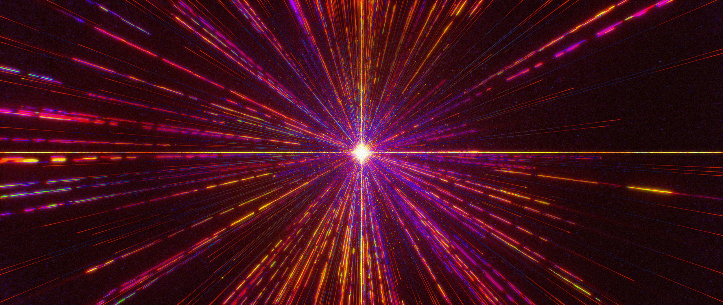
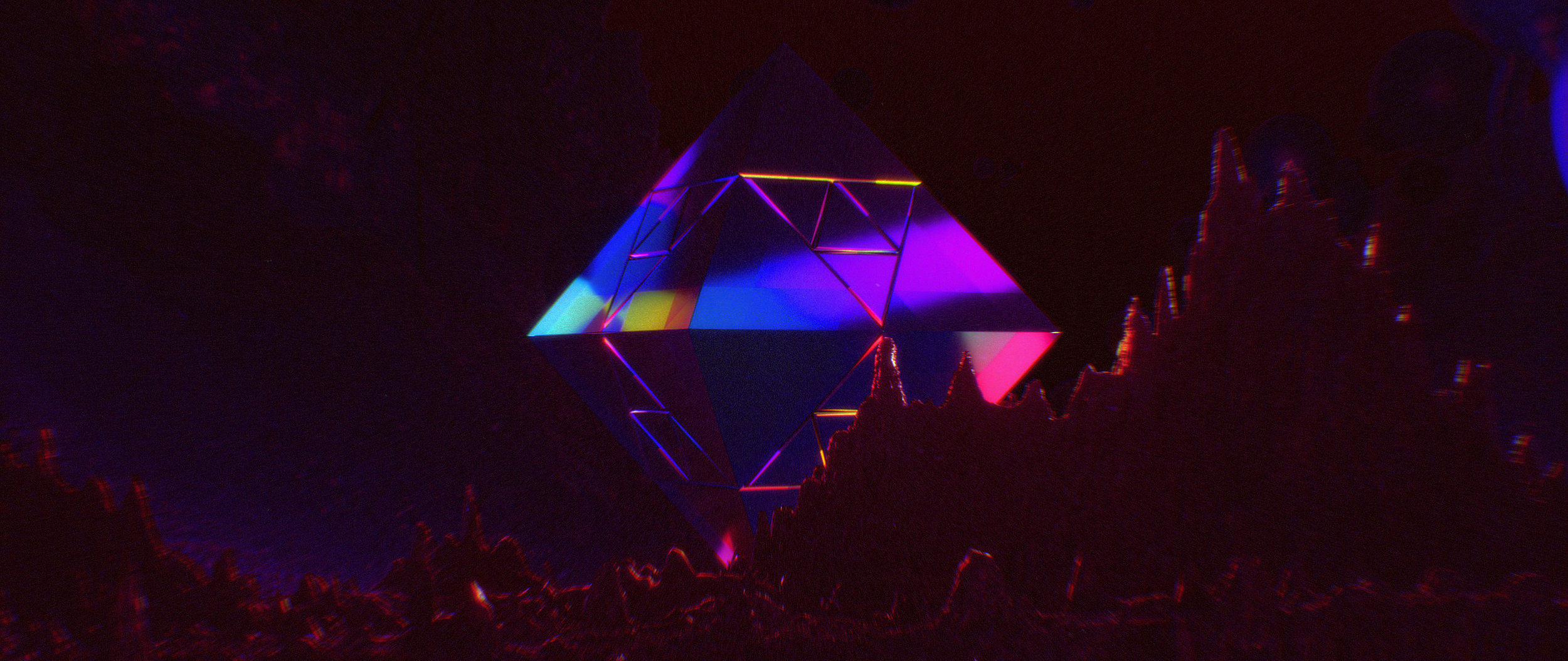
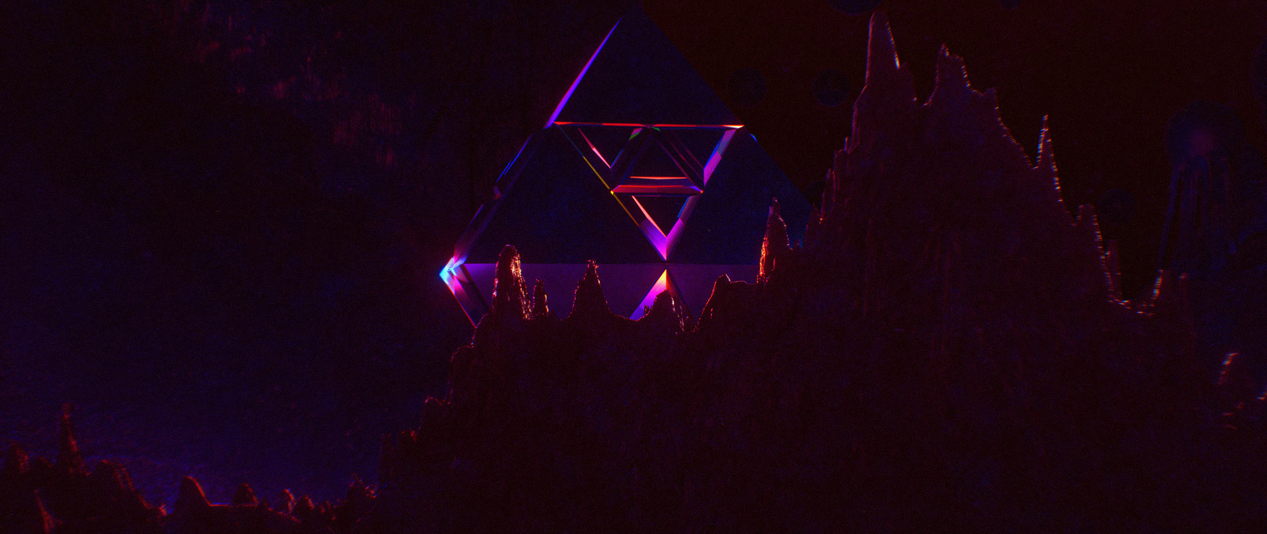
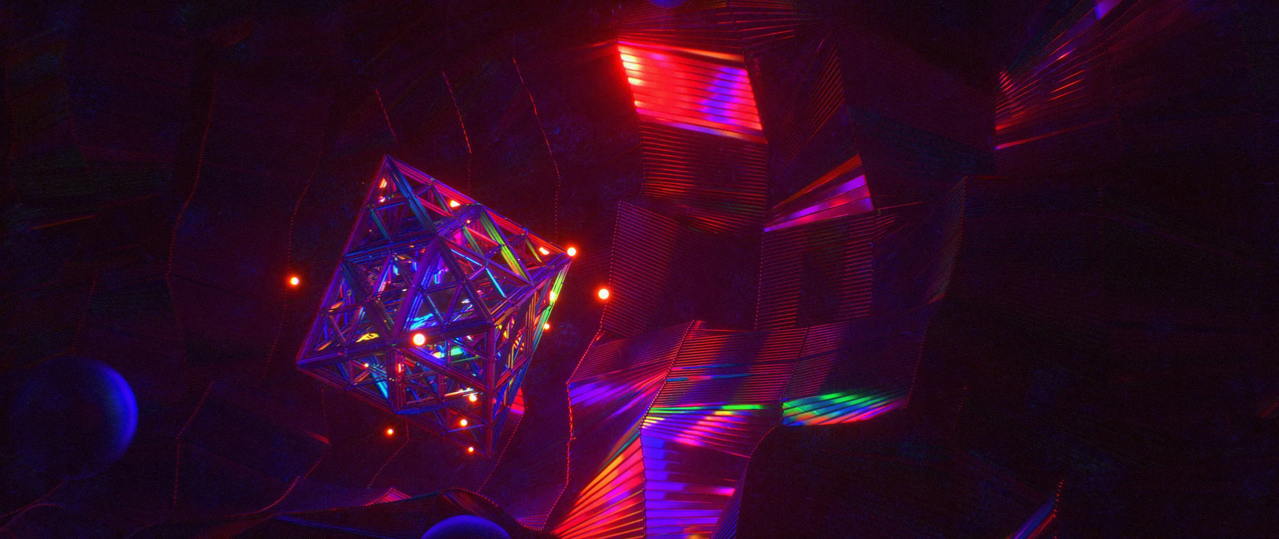
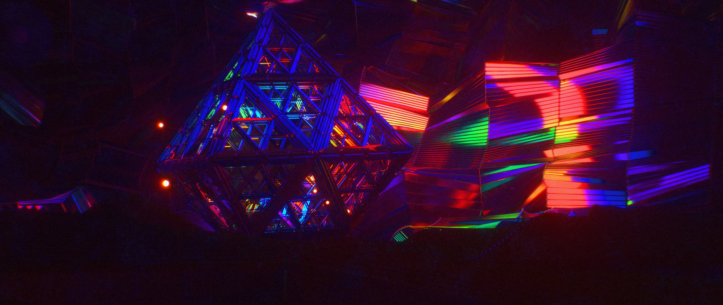
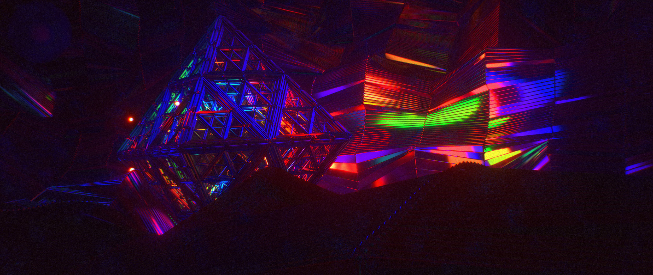
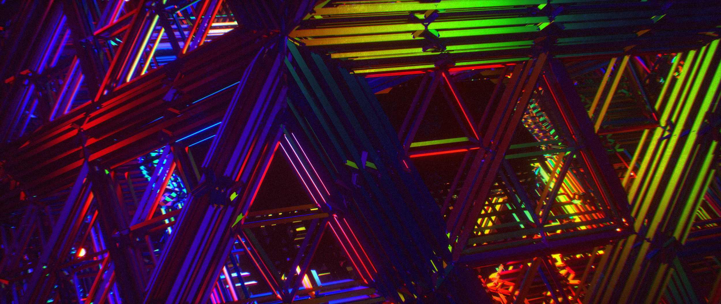
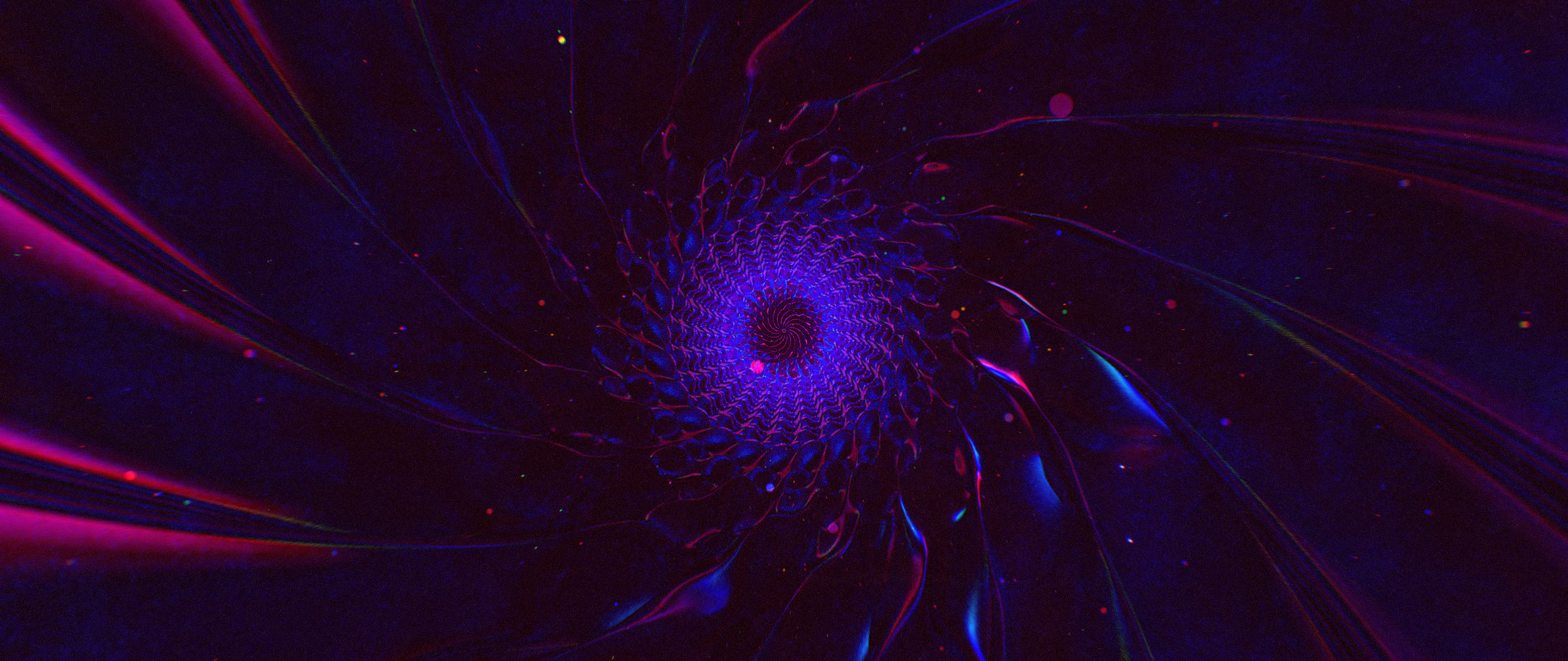
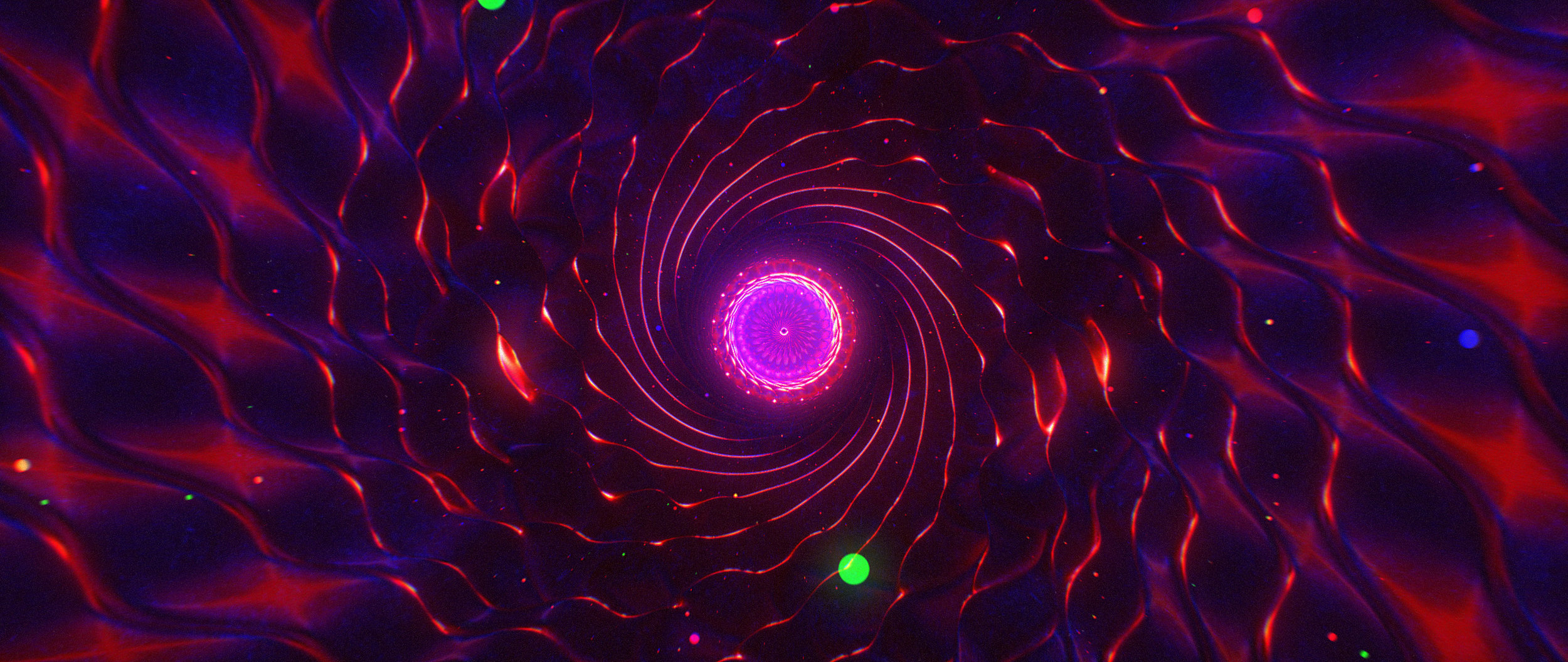
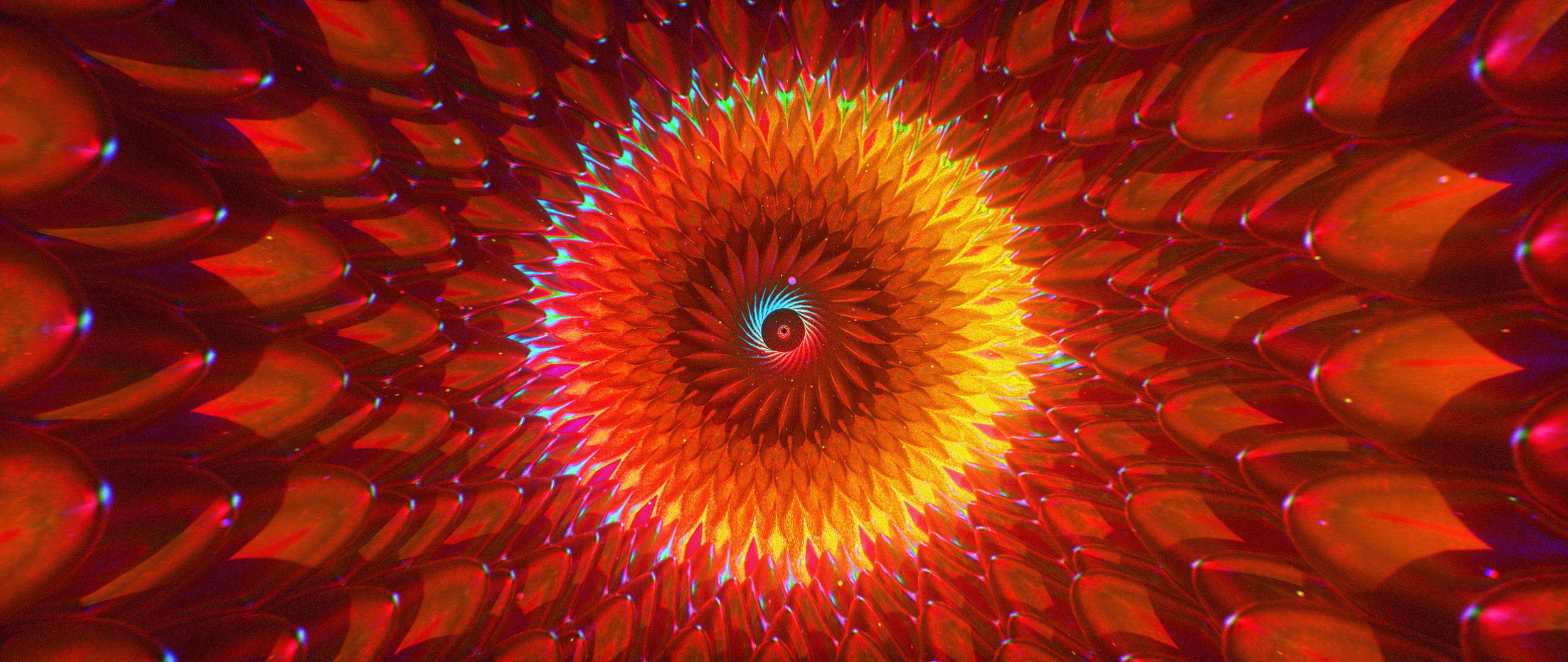
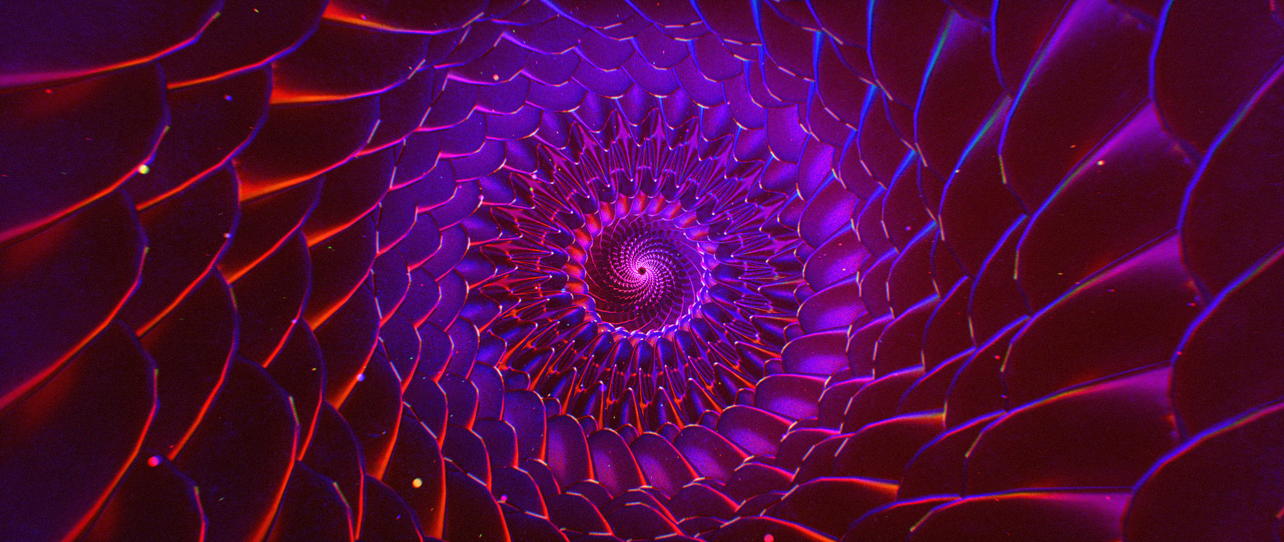
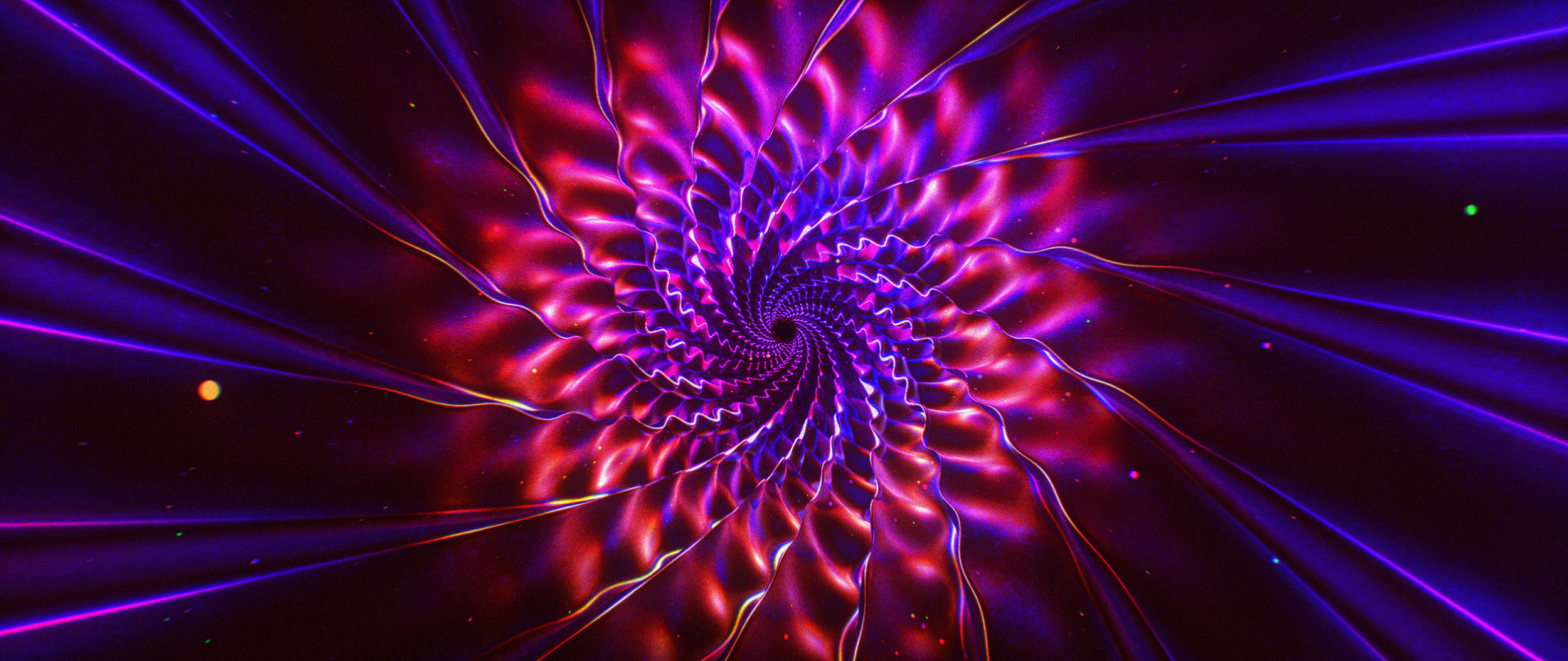
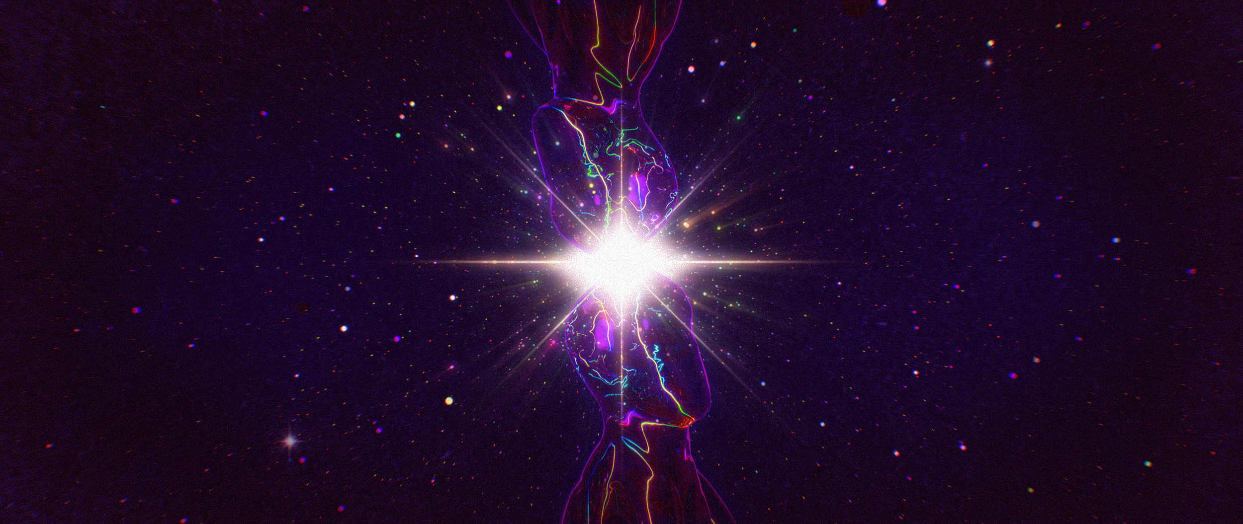
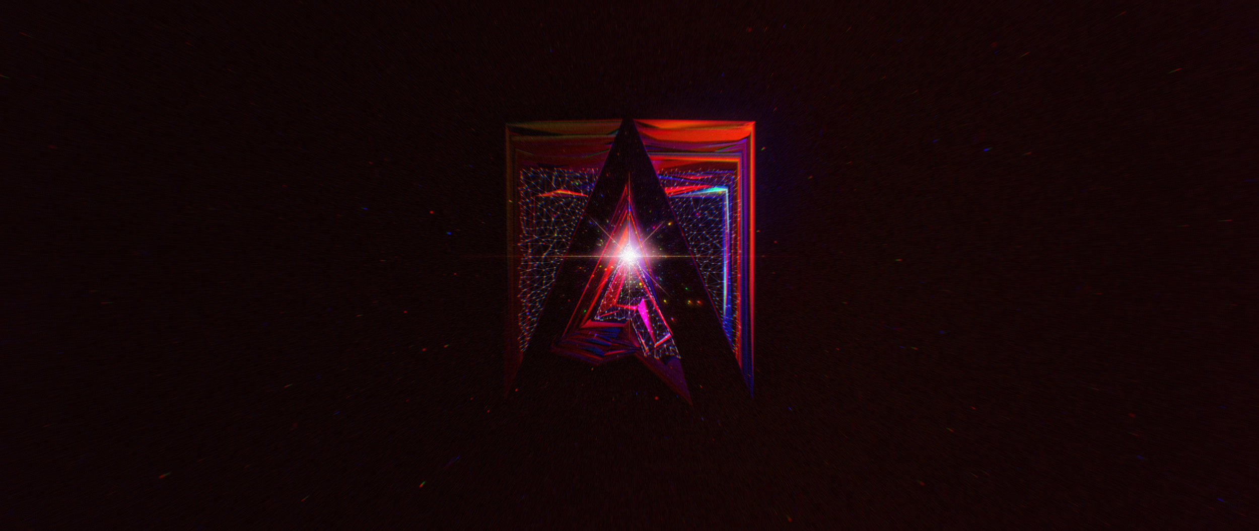
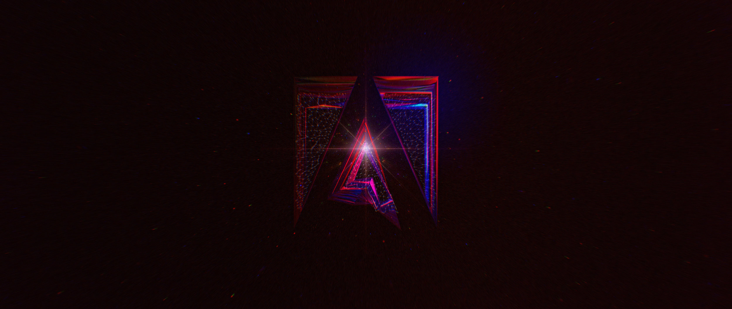
Stills
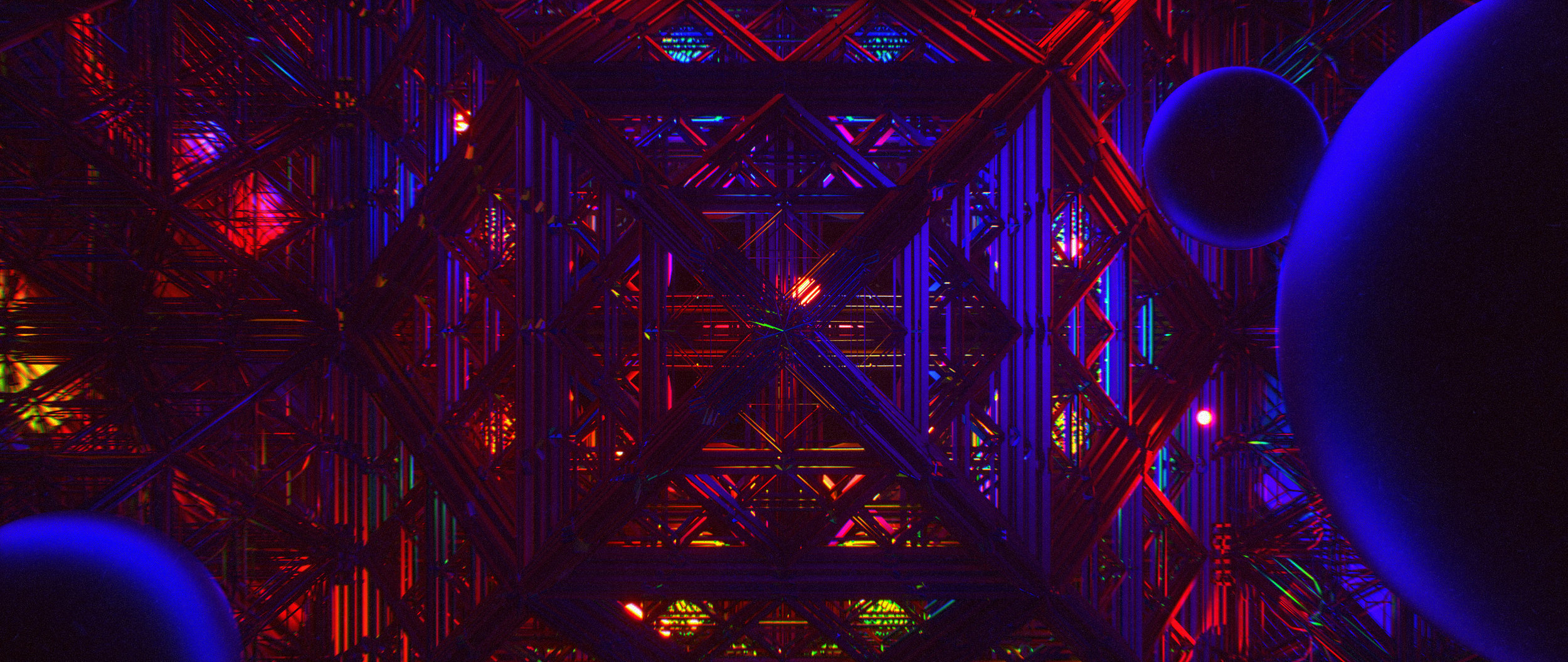
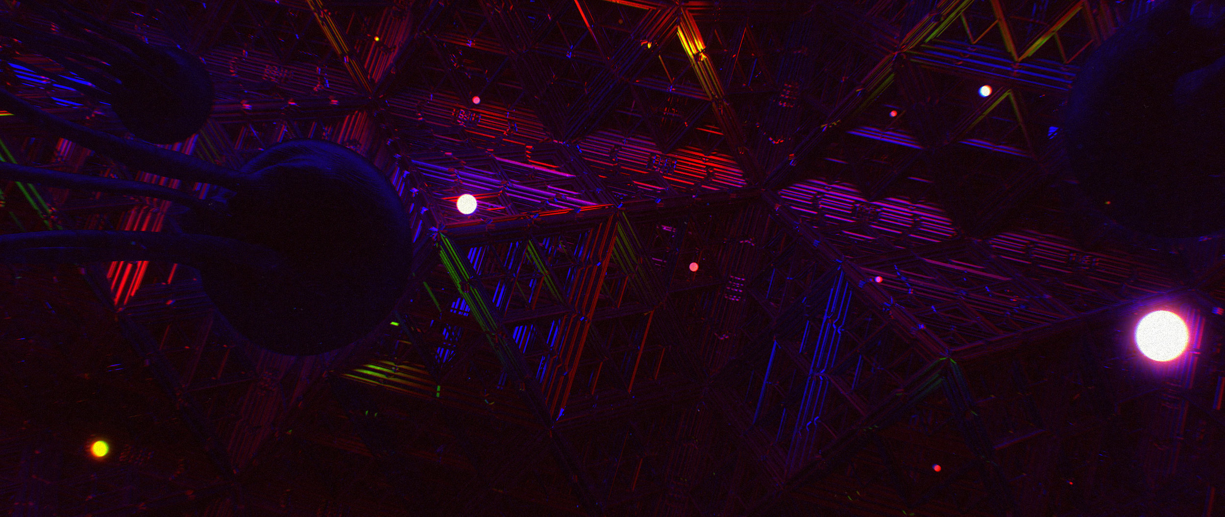
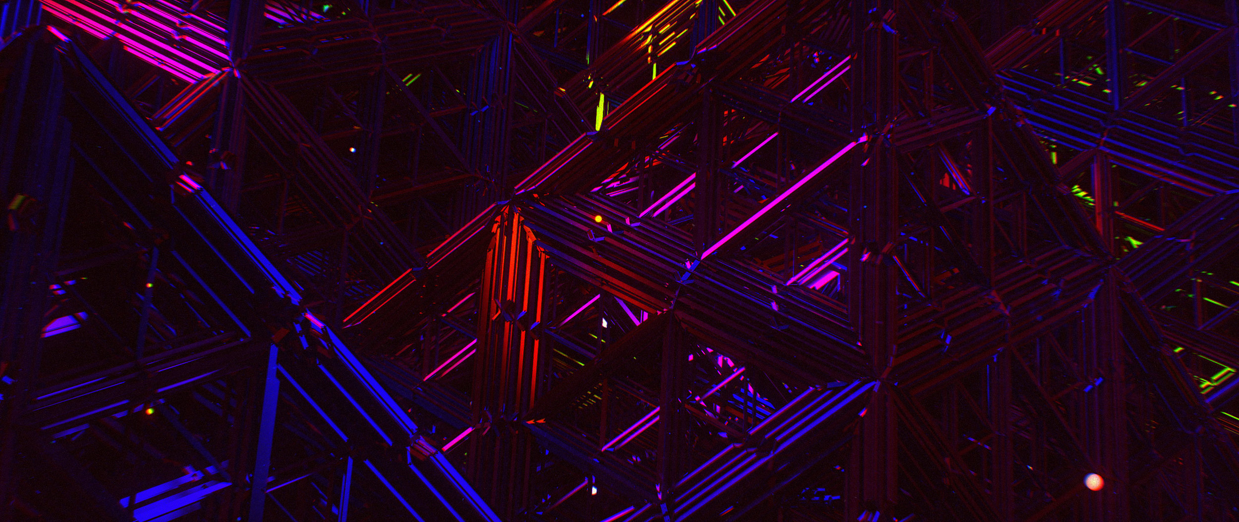
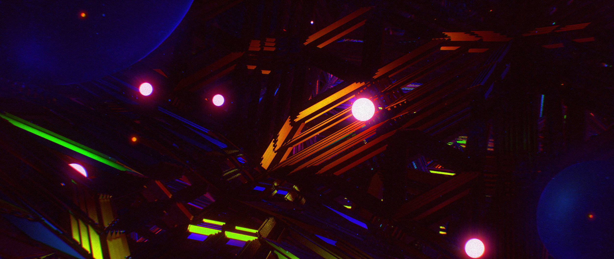


Design Process
We were honored to join the amazing lineup of artists that have been part of the Remix project. We wanted to properly explore during the design phase of this job, advancing a multitude of ideas.
The design development portion of the project lead us down a variety of paths resulting in redesigning the project three times and coming up with an assortment of looks and concepts.
INITIAL LOOK SKETCHES
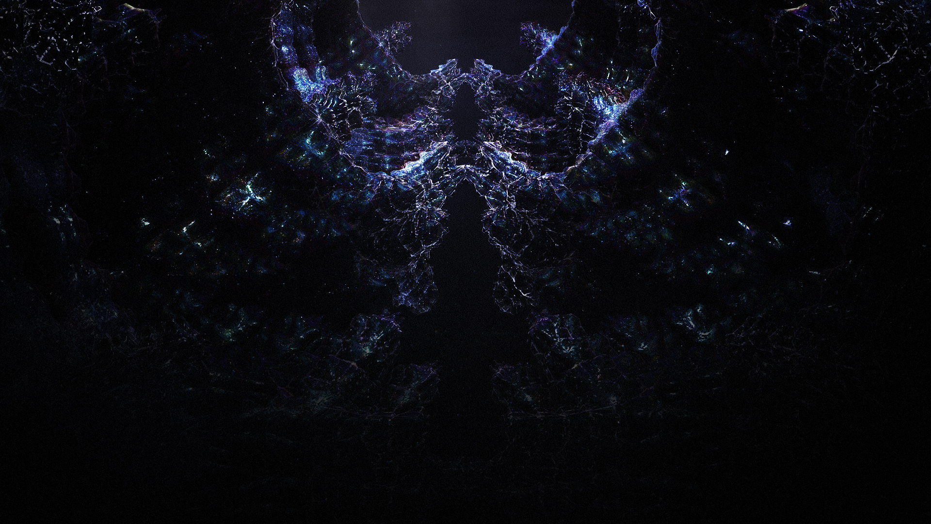
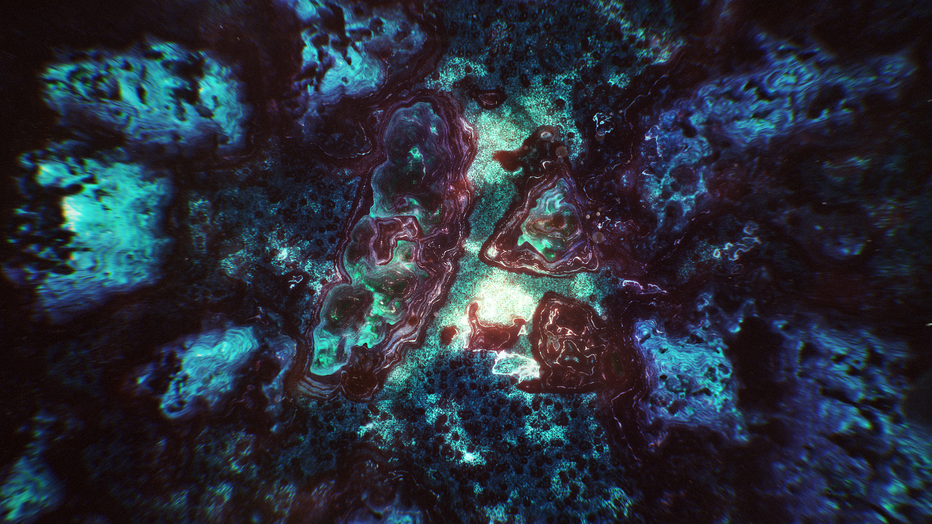
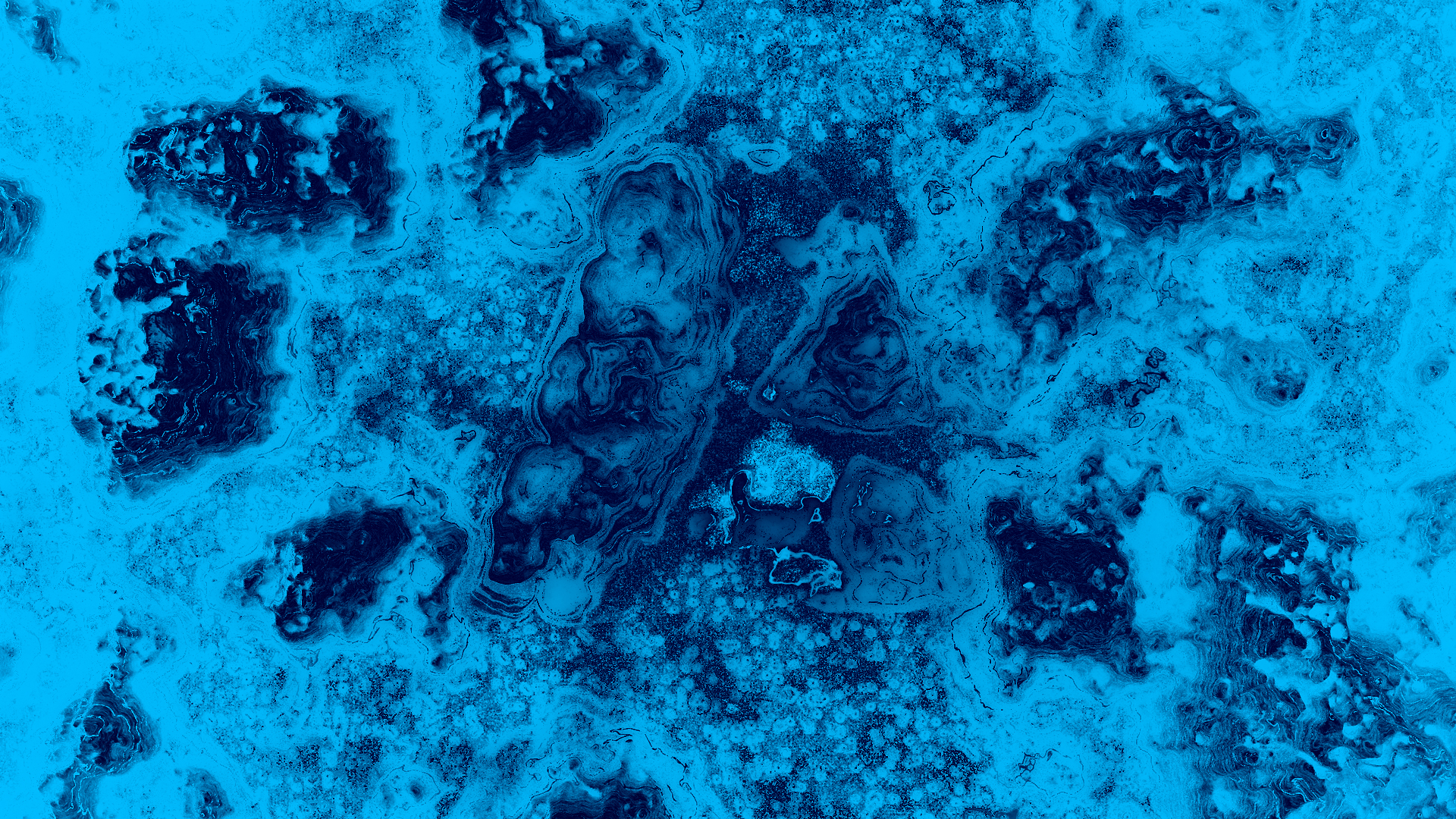
CONCEPT DEVELOPMENT AND LOOK REVISITED
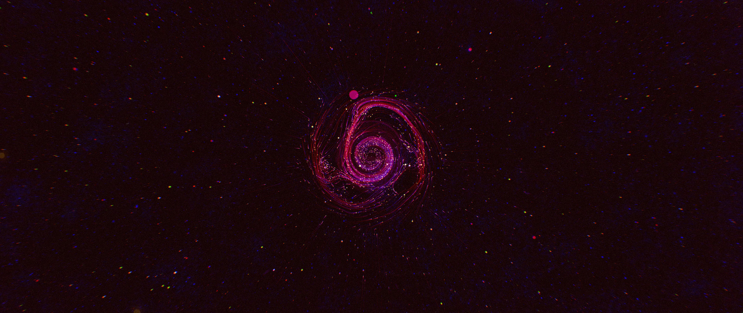
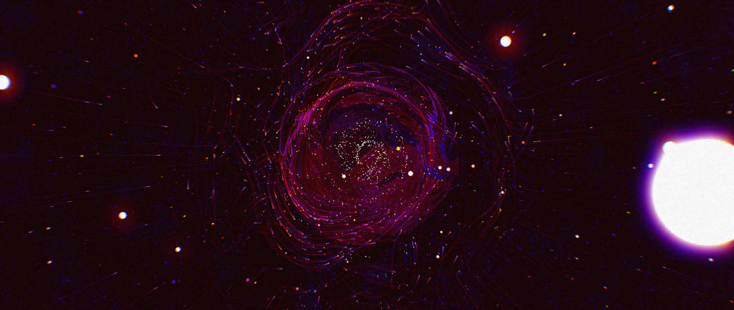
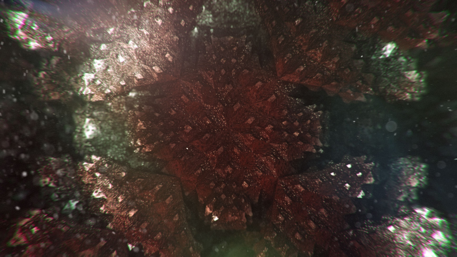
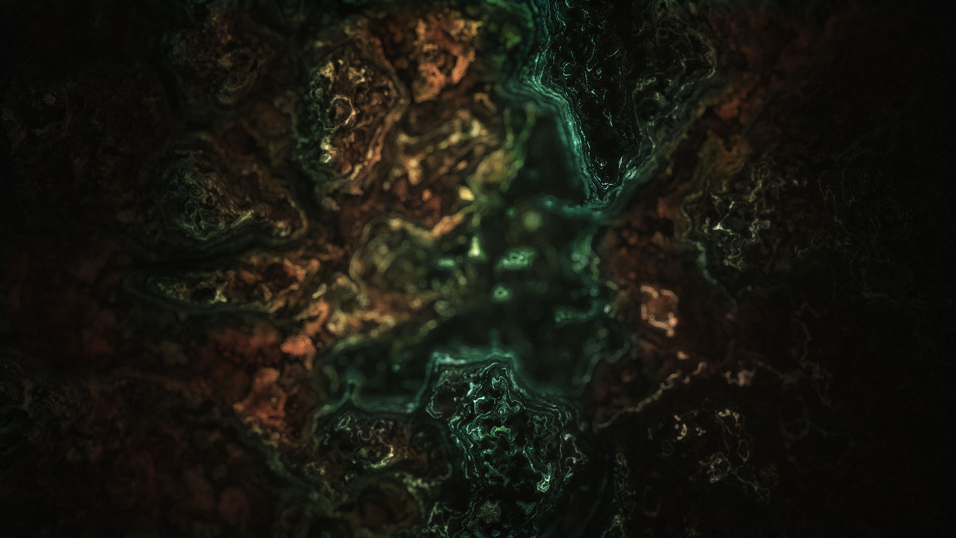
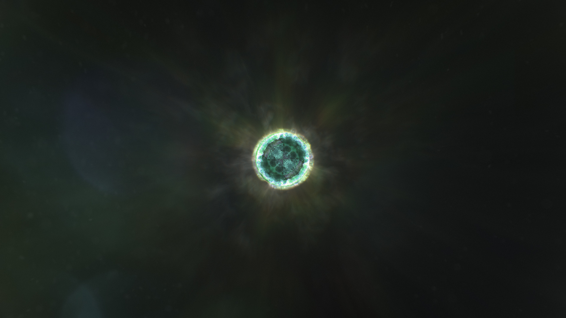
After the first round of sketching frames and tossing ideas around, Ash started to carve out a new concept that revolved around building the creative process into a narrative journey through space – creating a remix around the idea of the brand more than the visual of the brand.
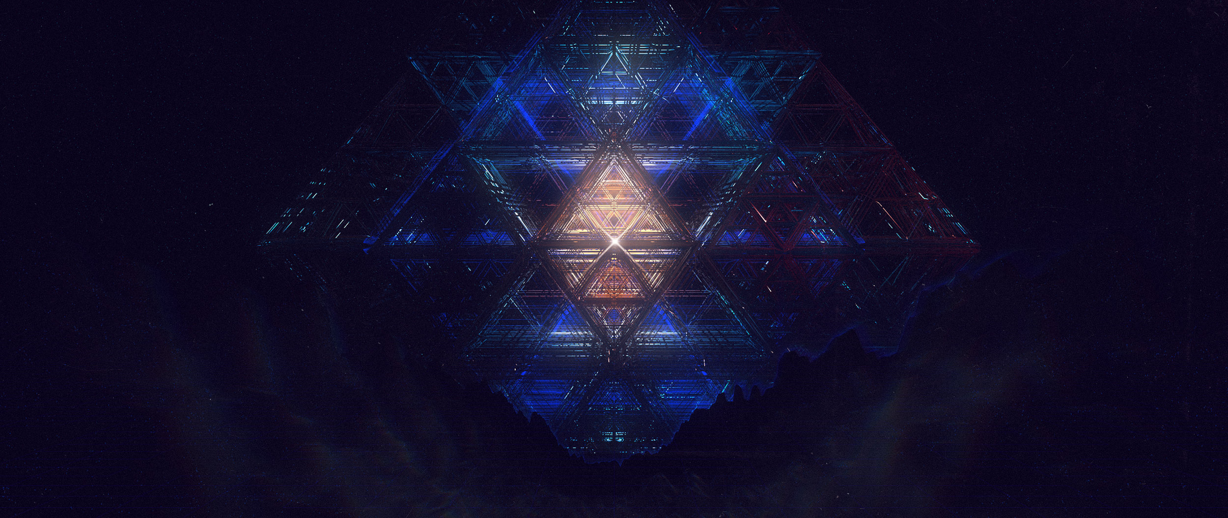
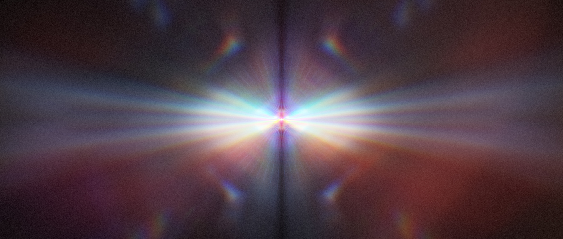
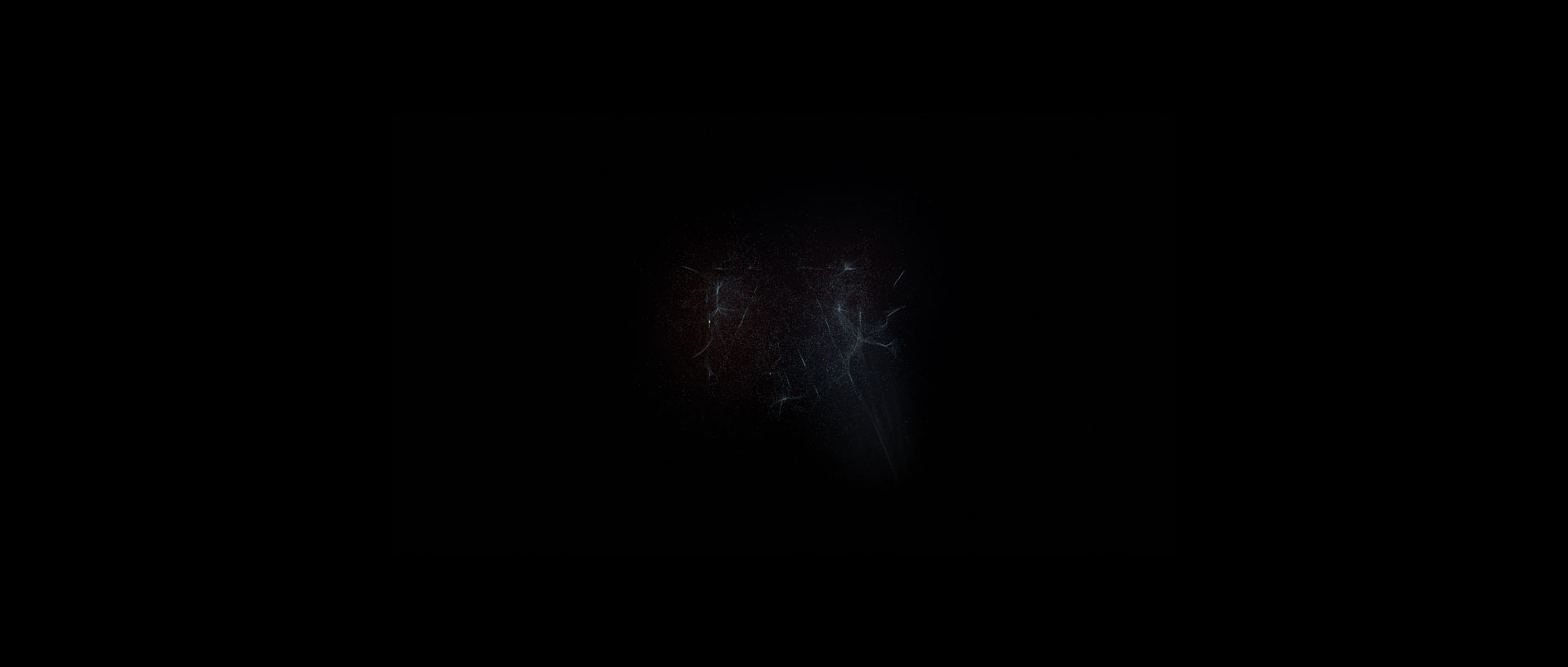
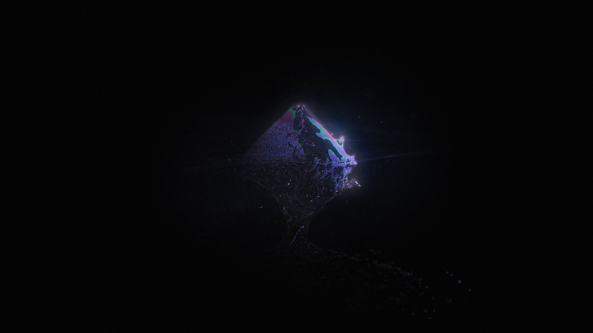
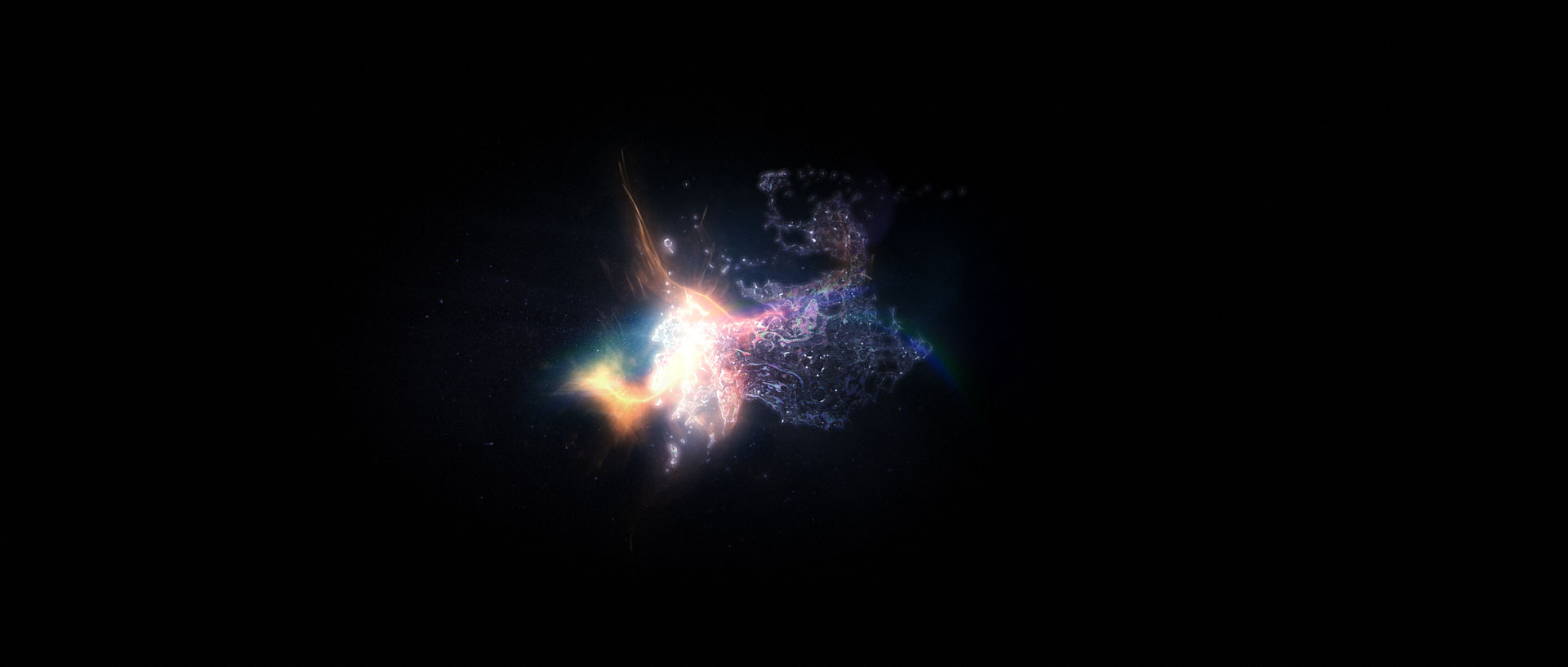
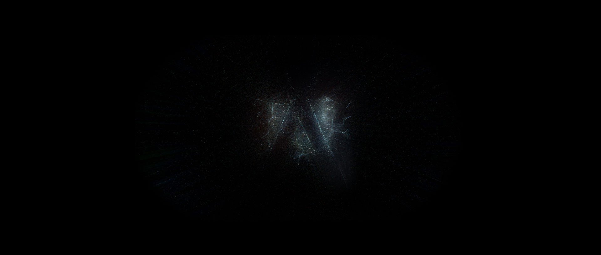
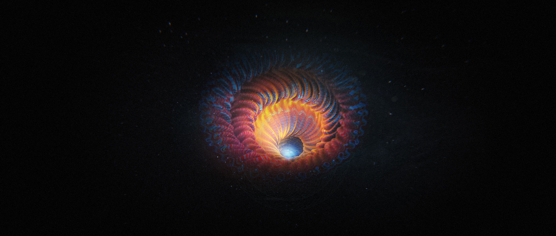
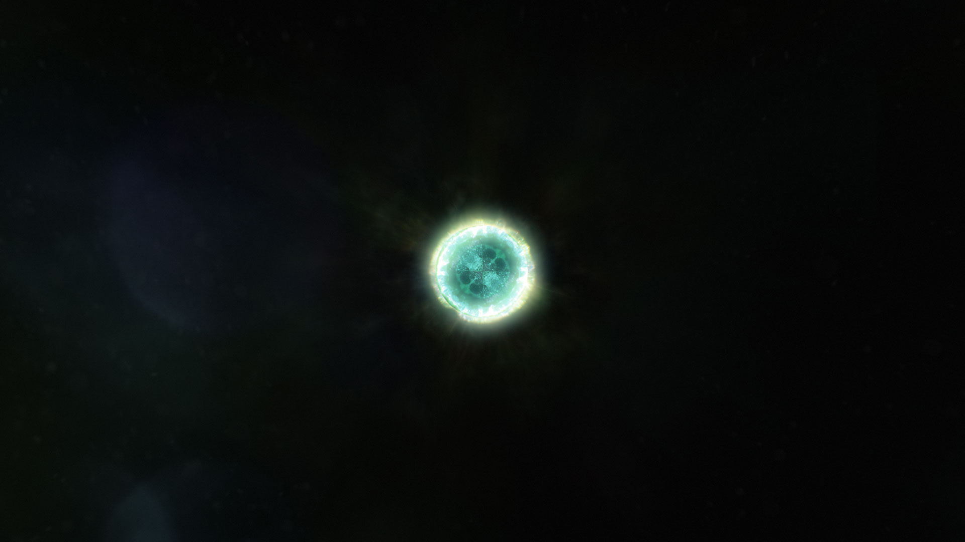
Starting with a spark of an idea, building into structural geo, mutating into fluid forms – all originating from the brand. These are some frames I built for the initial pitch to Adobe that outline the story.
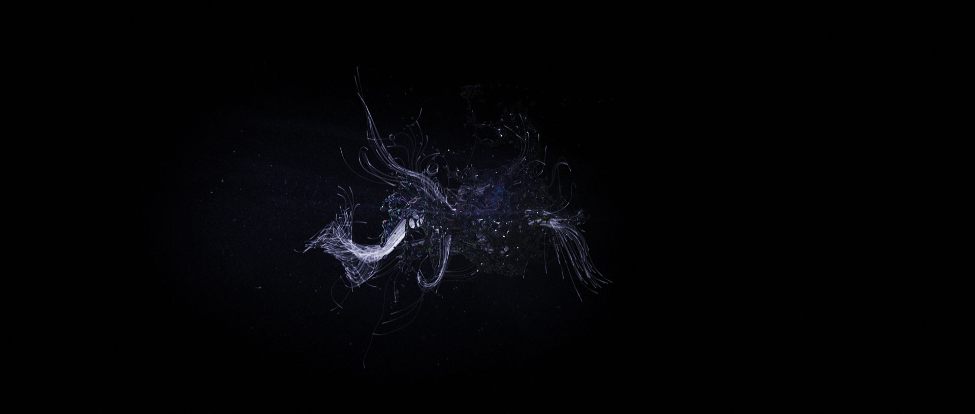
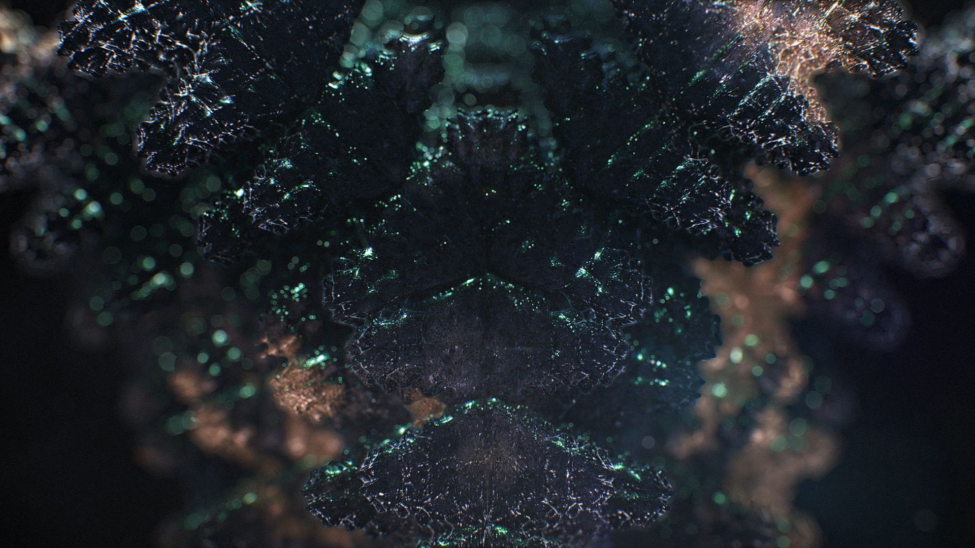
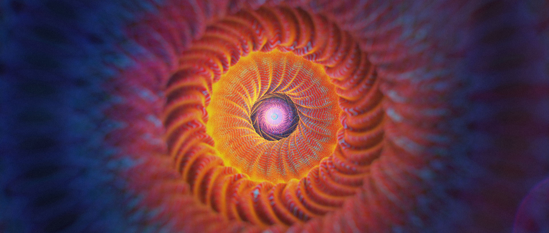
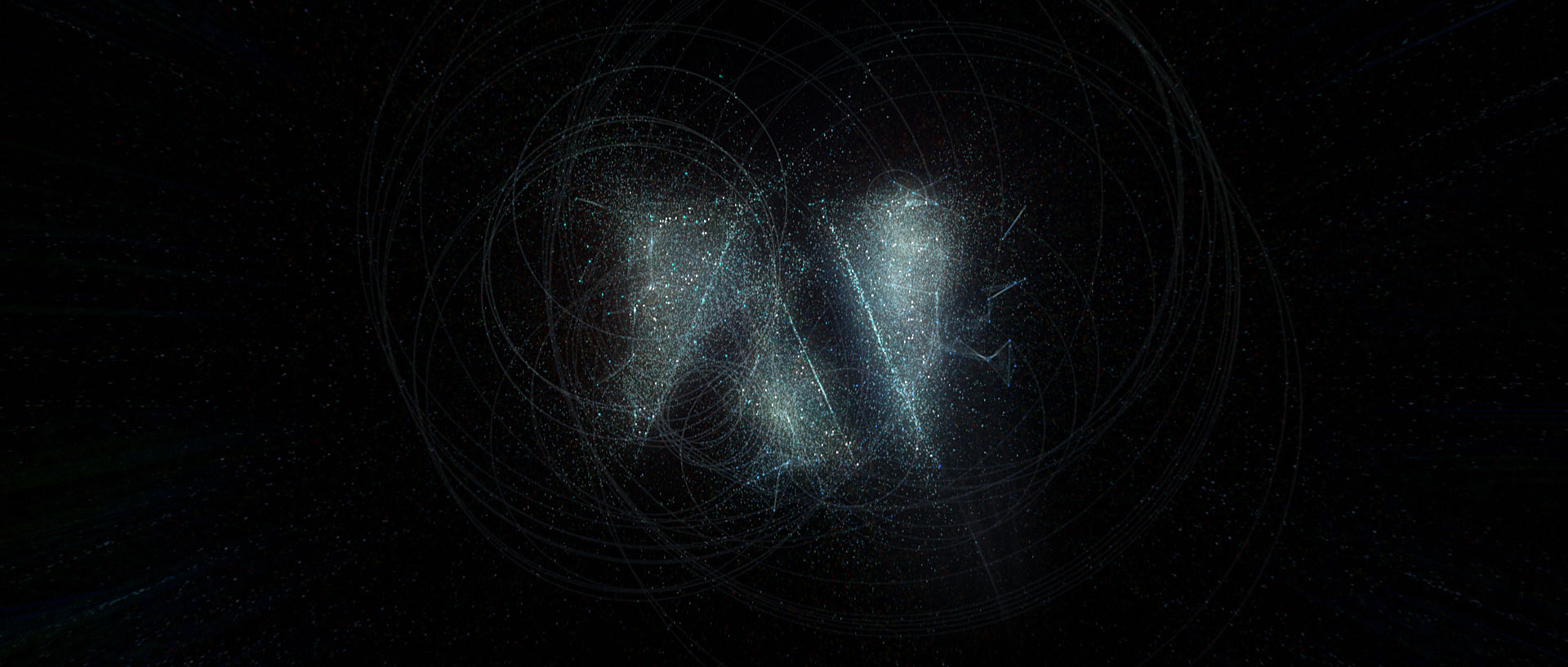
FINALIZED DESIGN
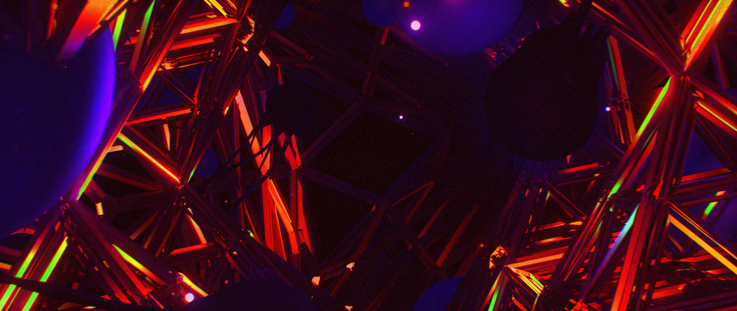
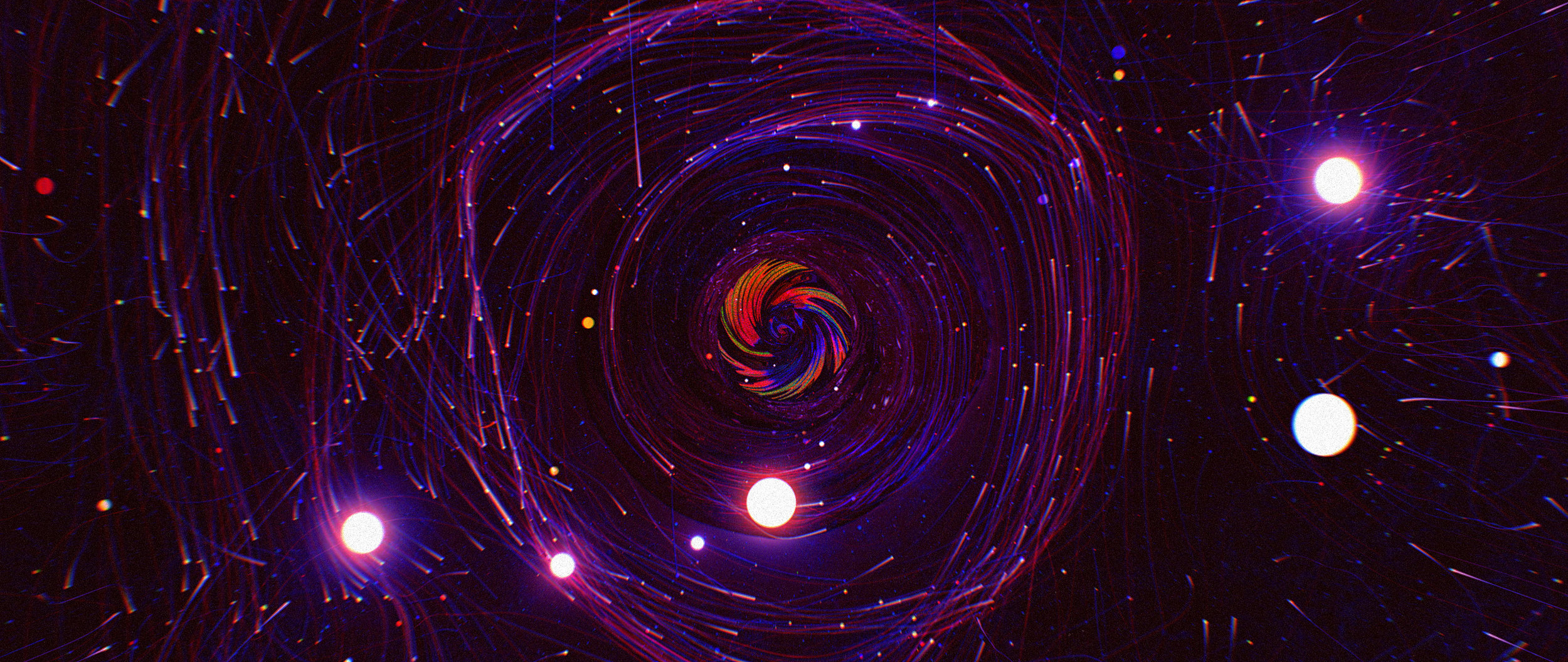
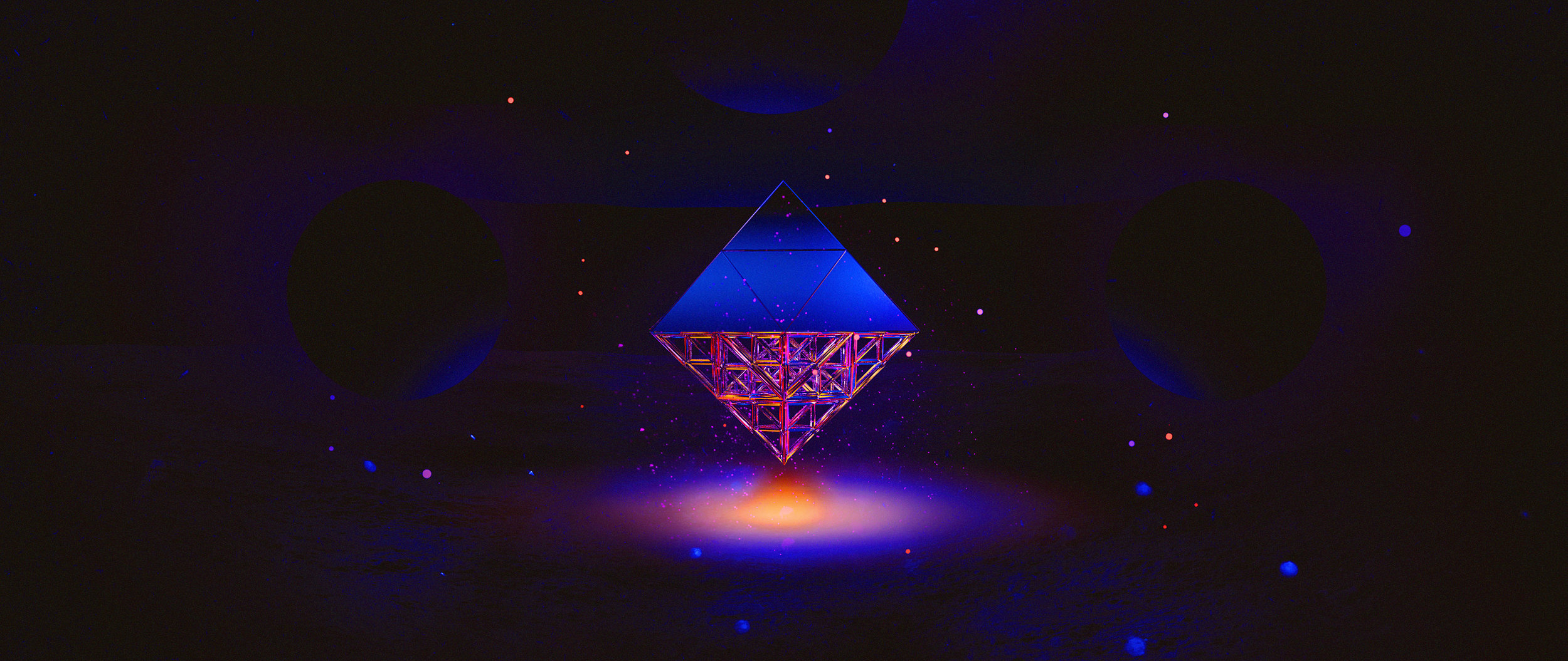
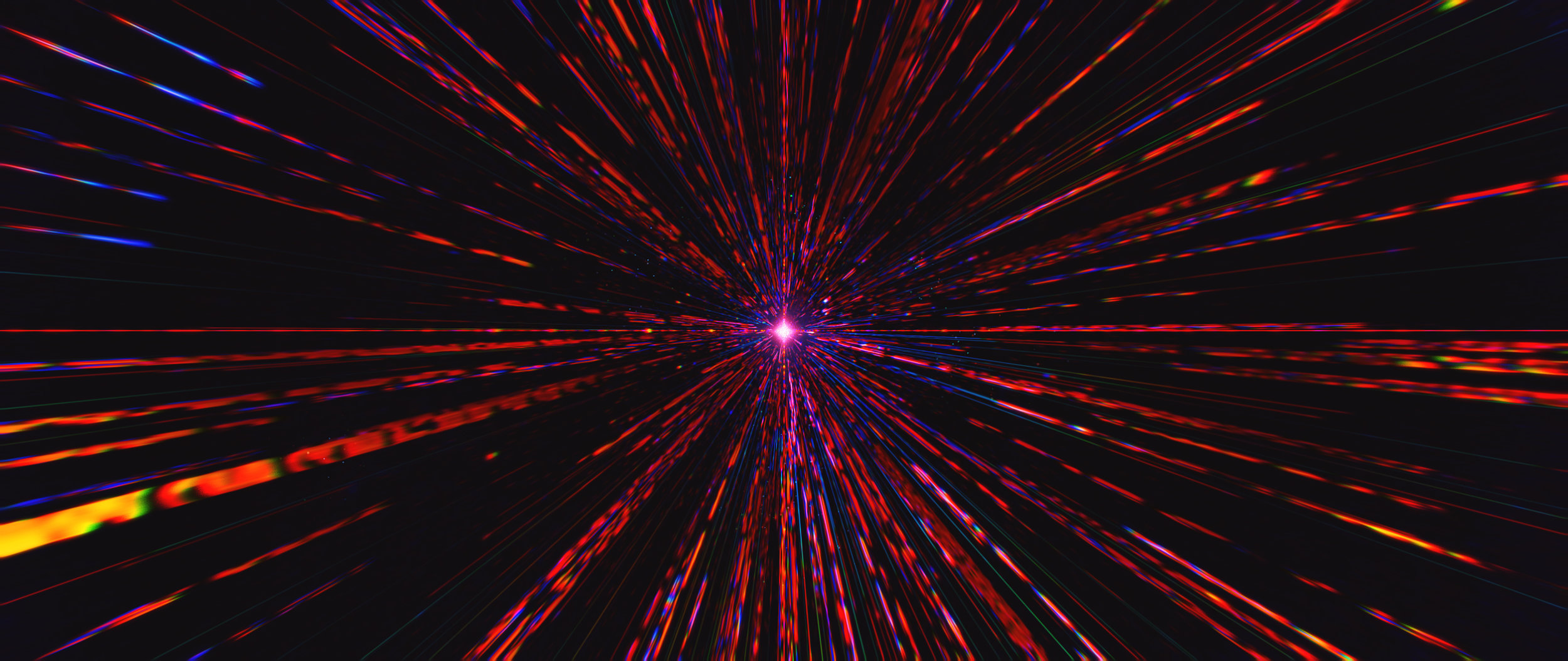
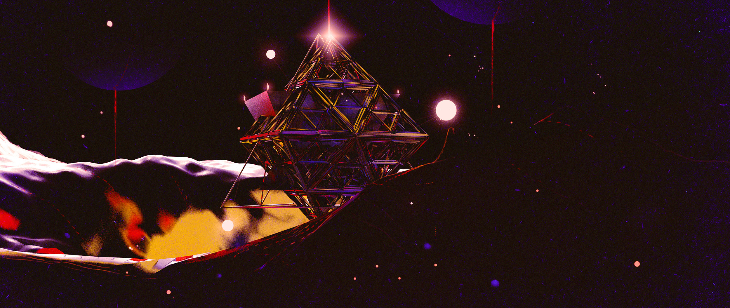
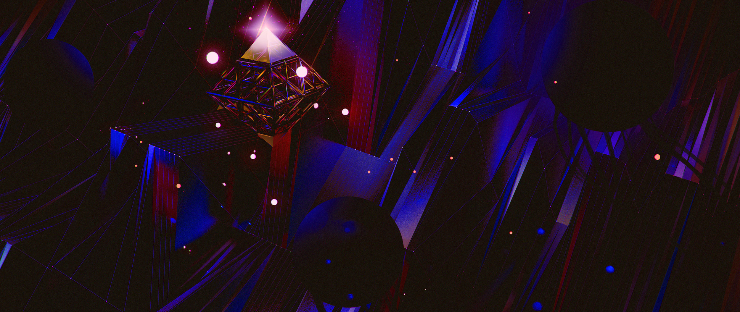
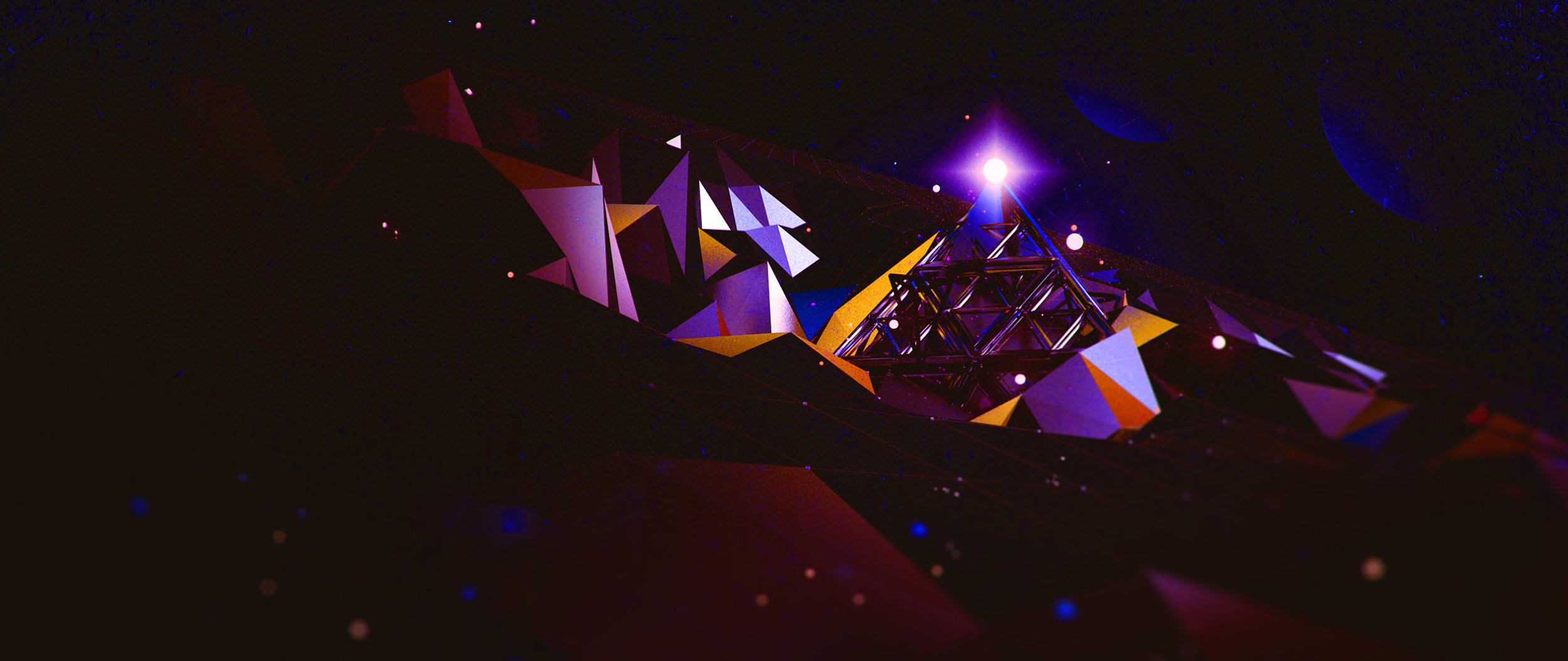
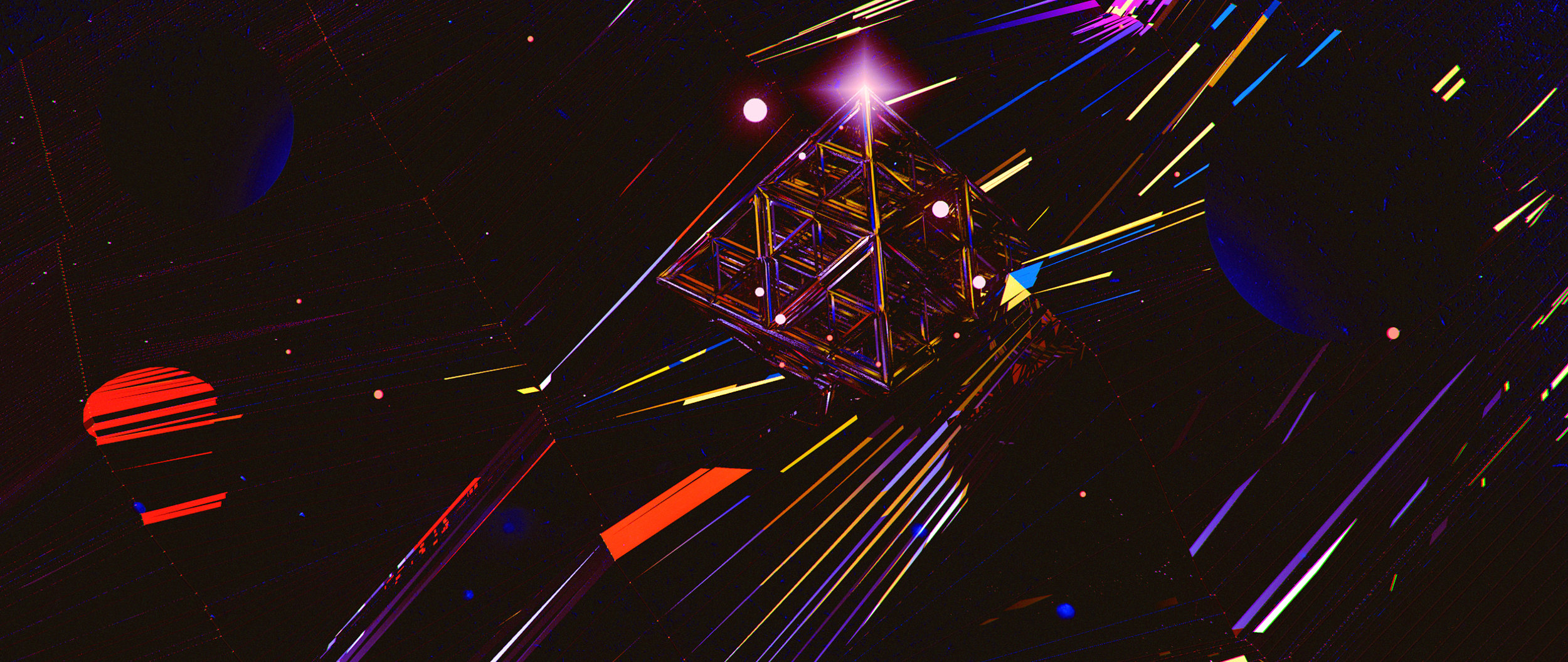
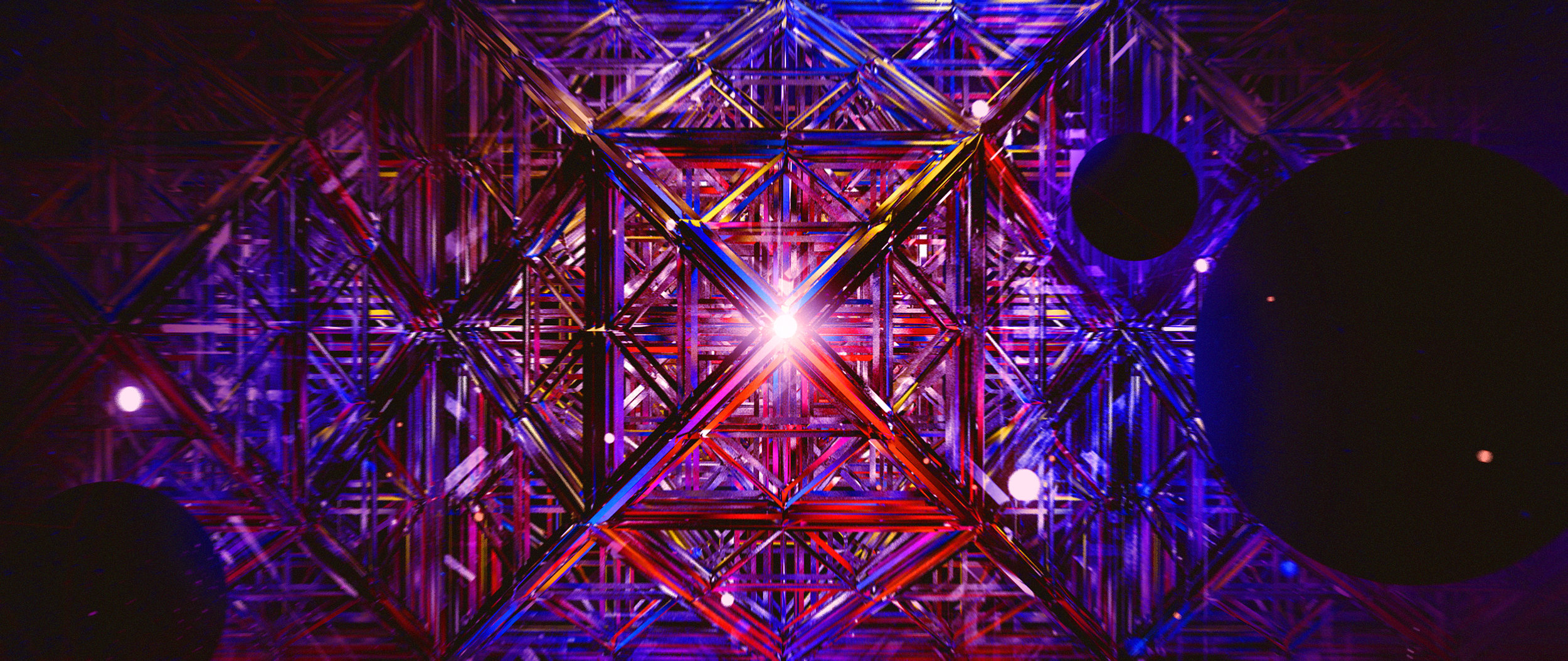
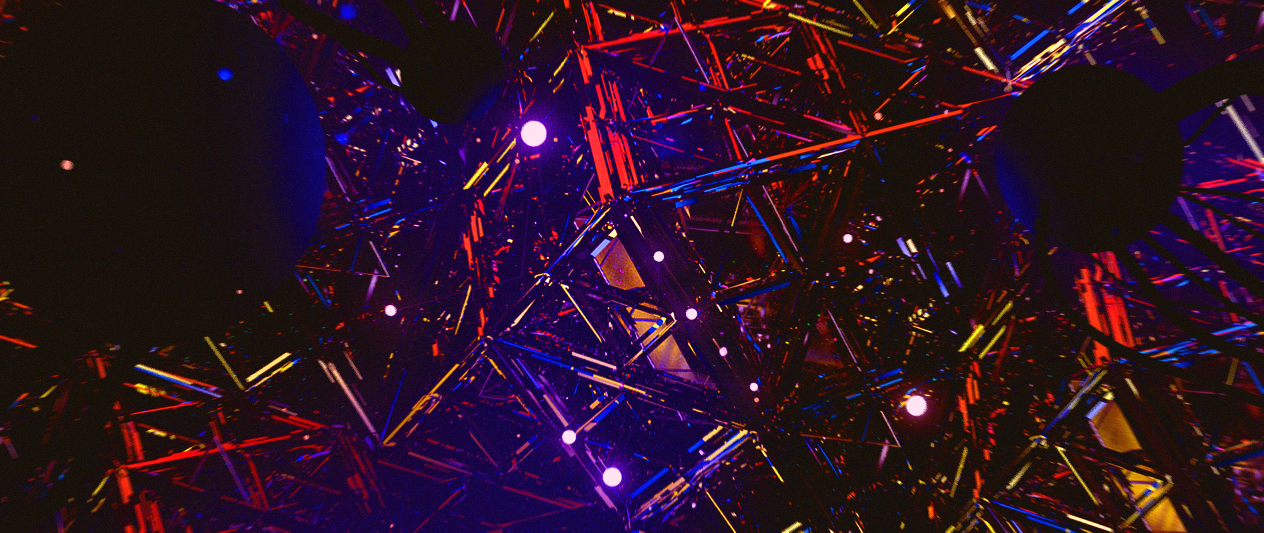
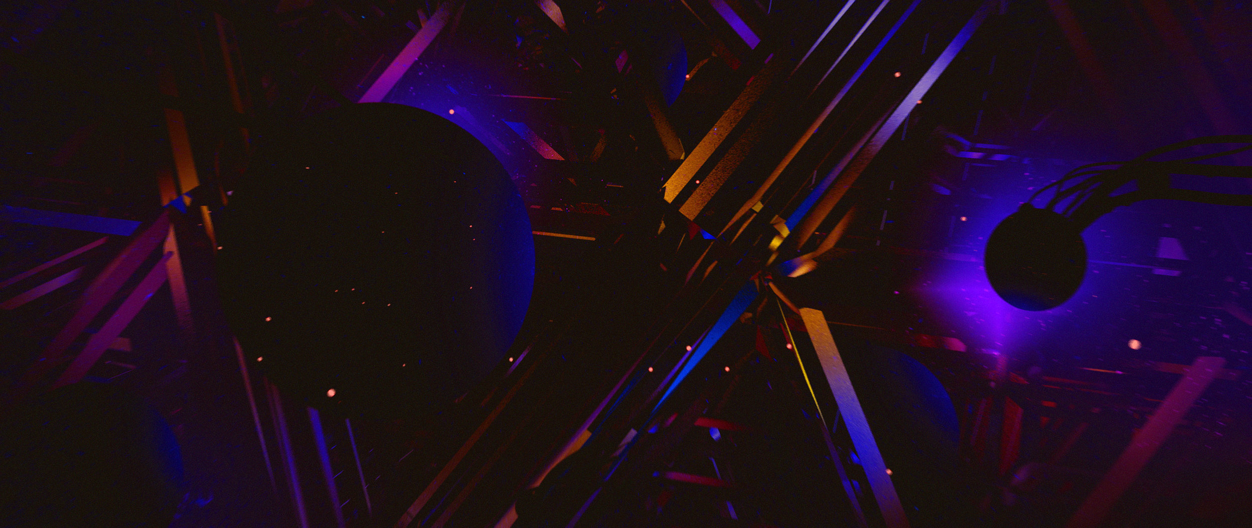
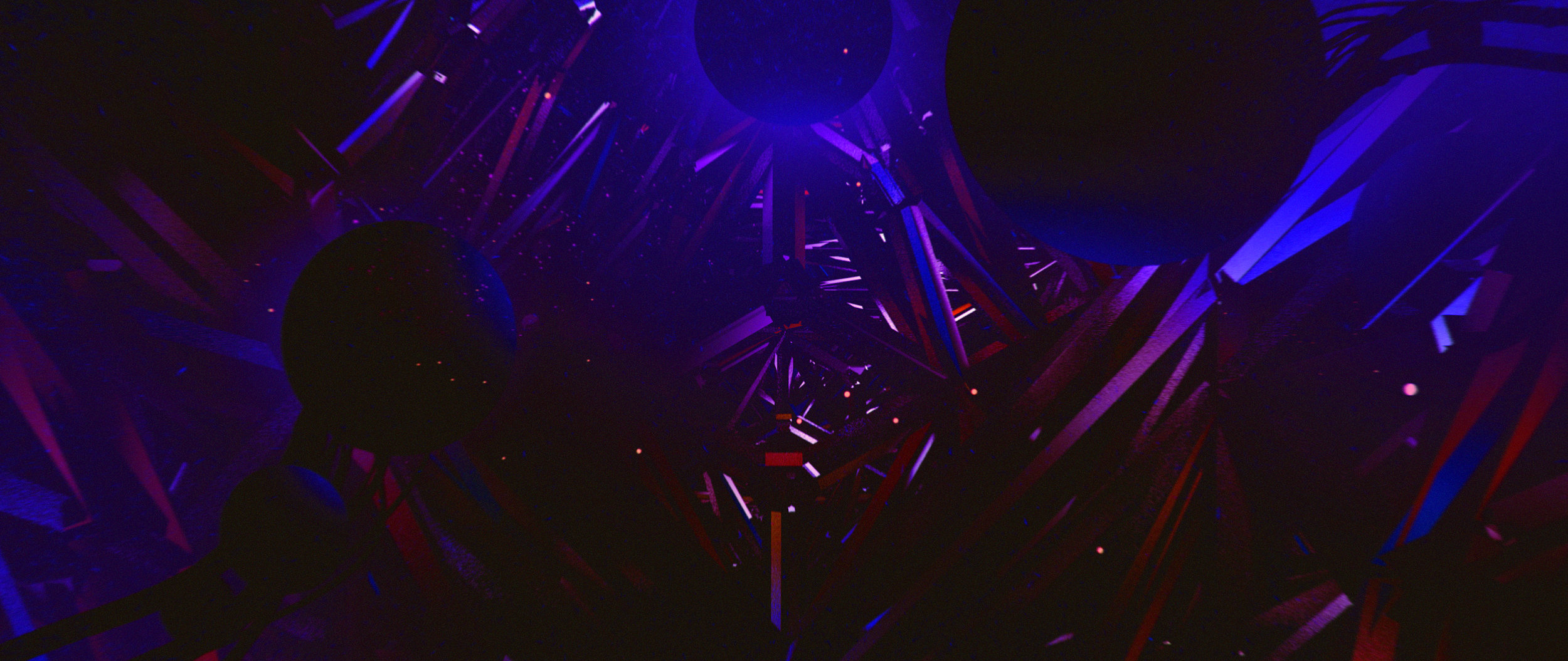
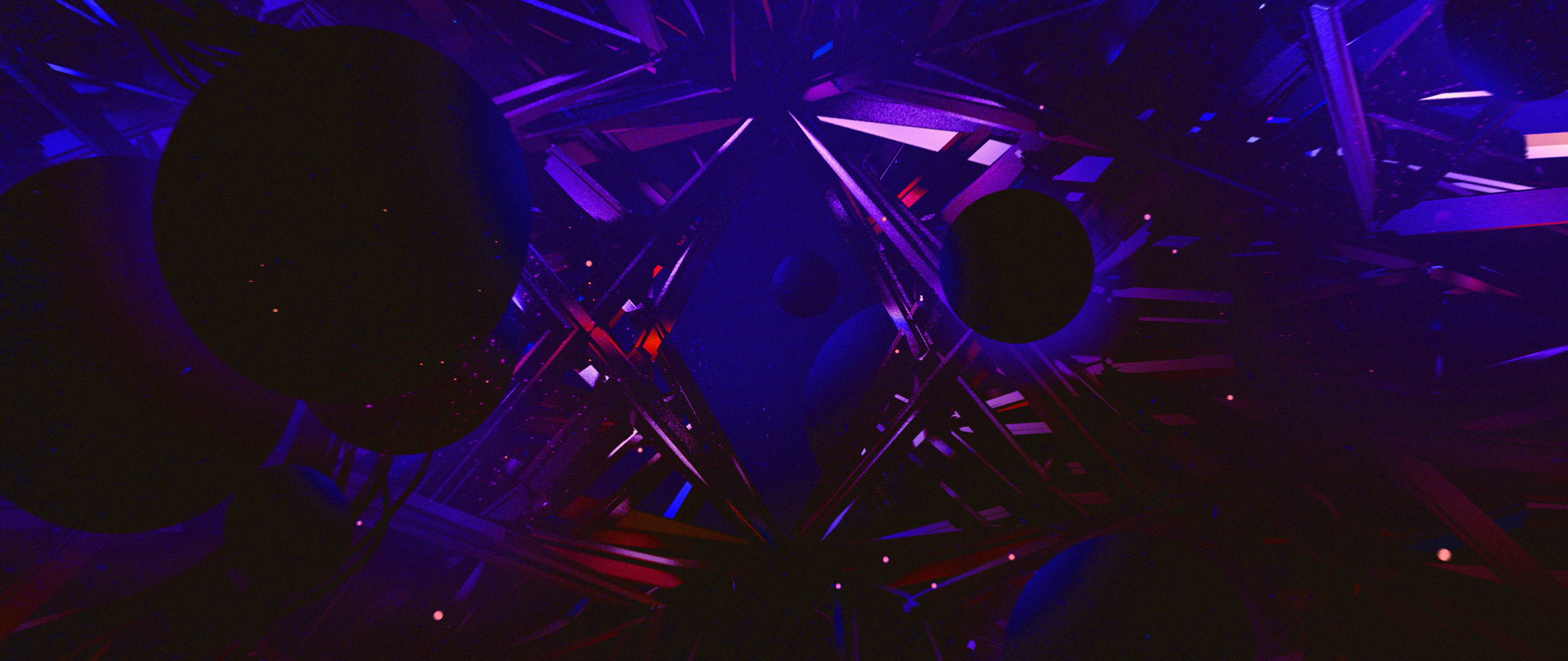
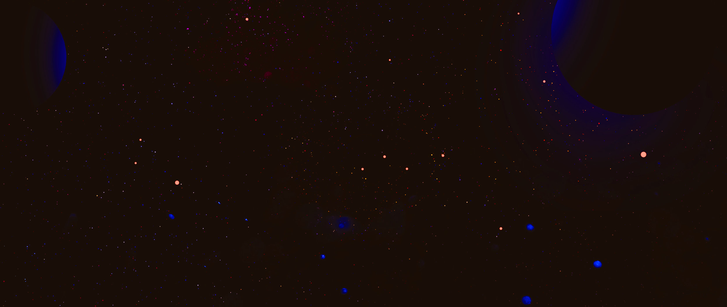
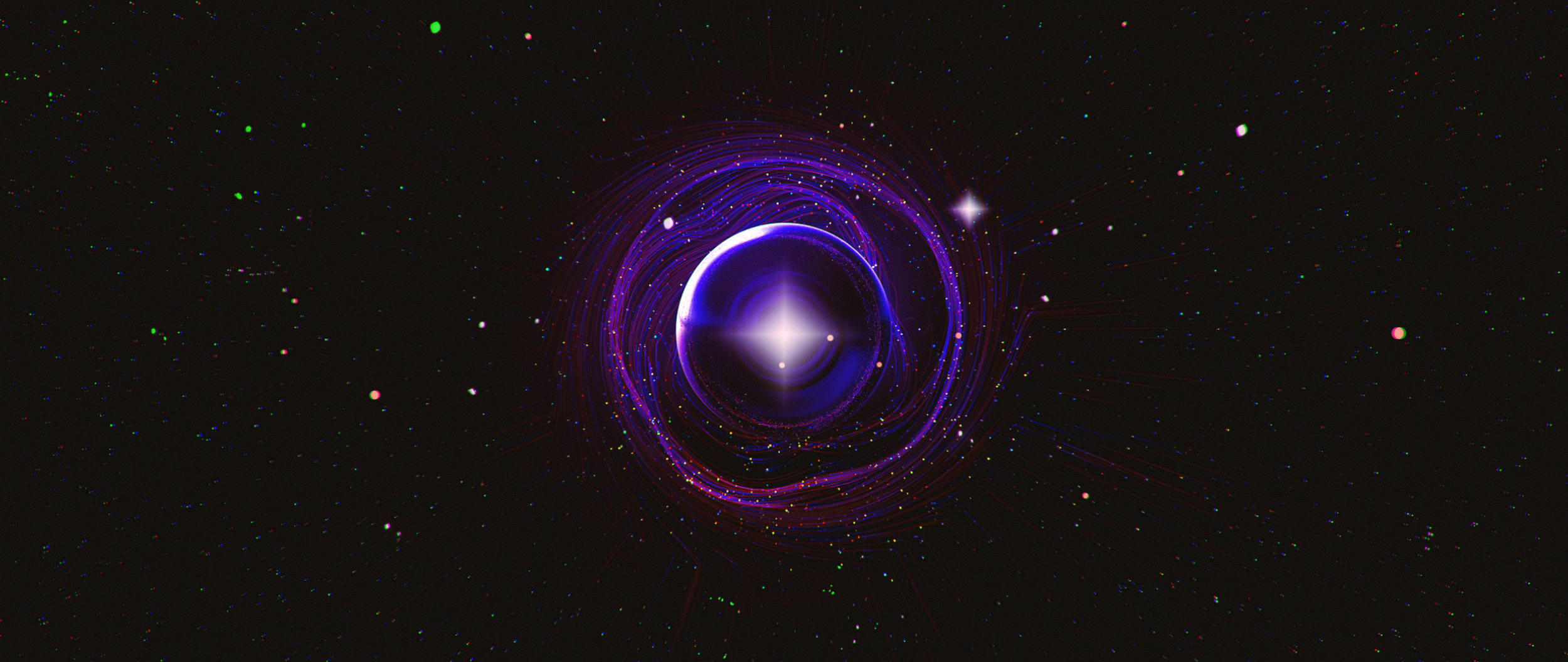
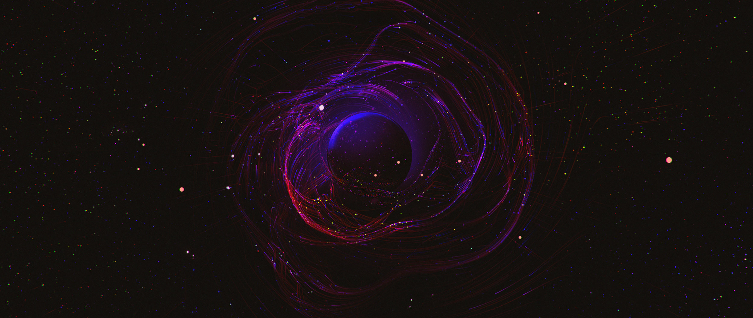
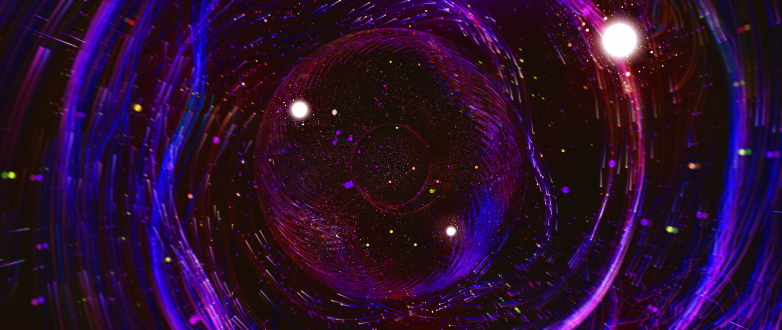
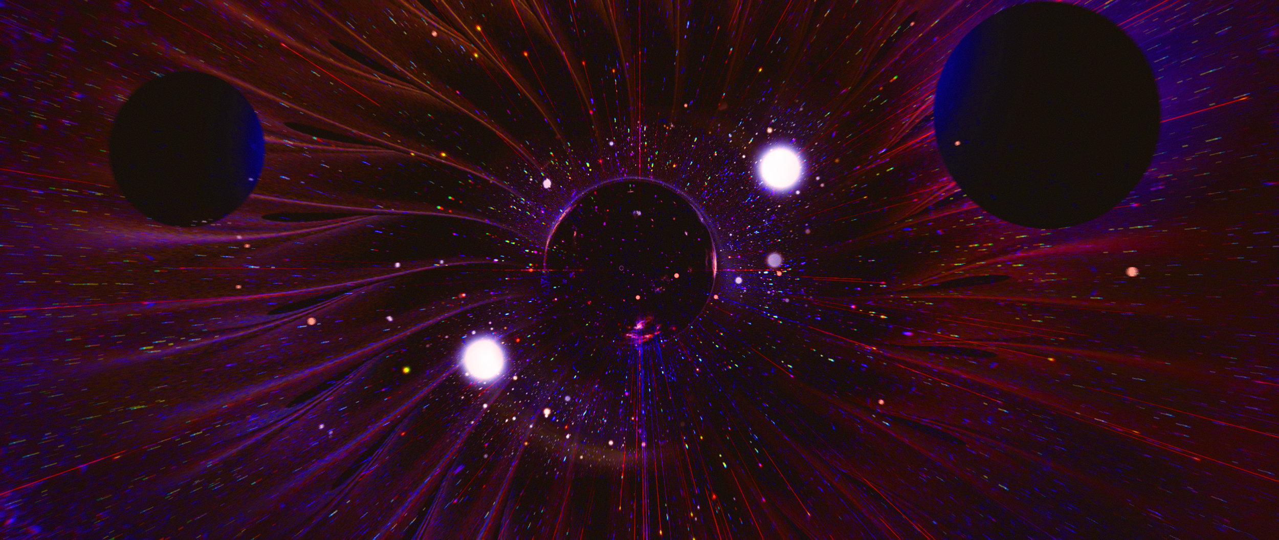
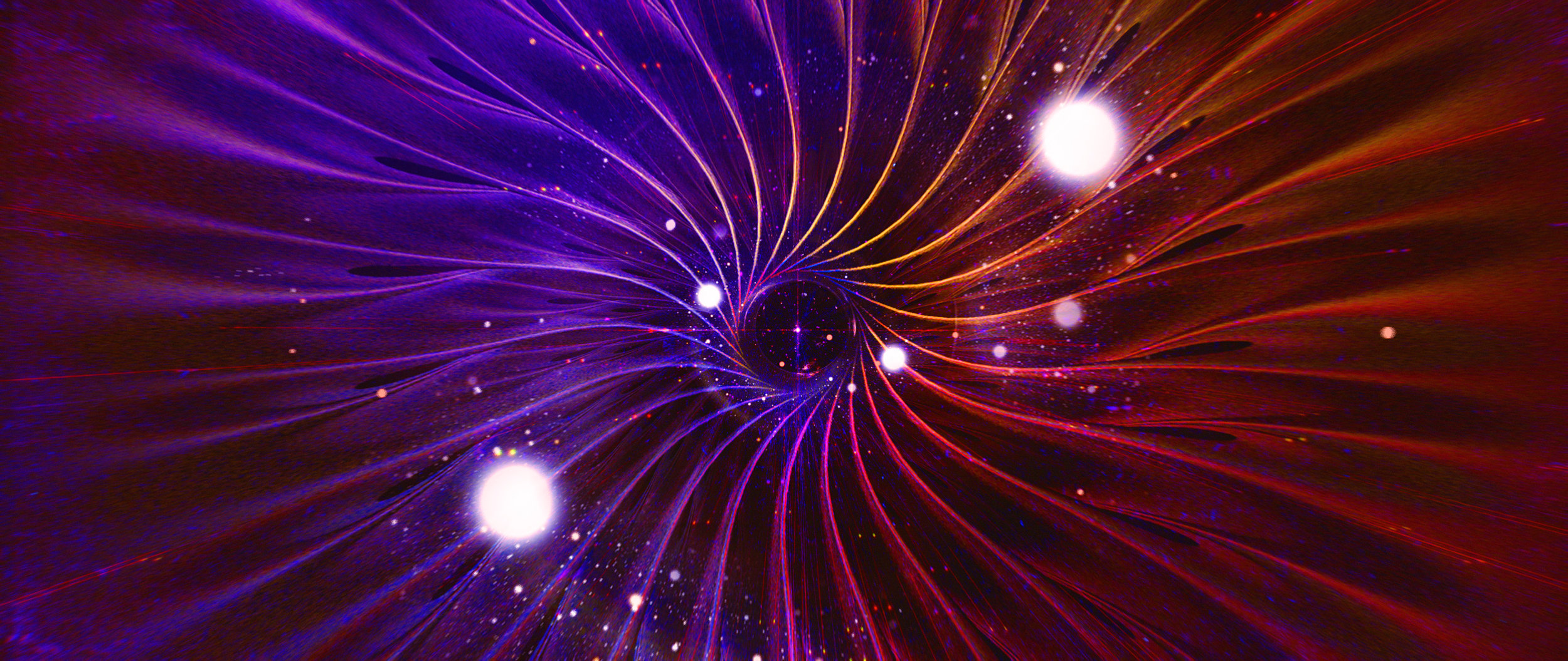
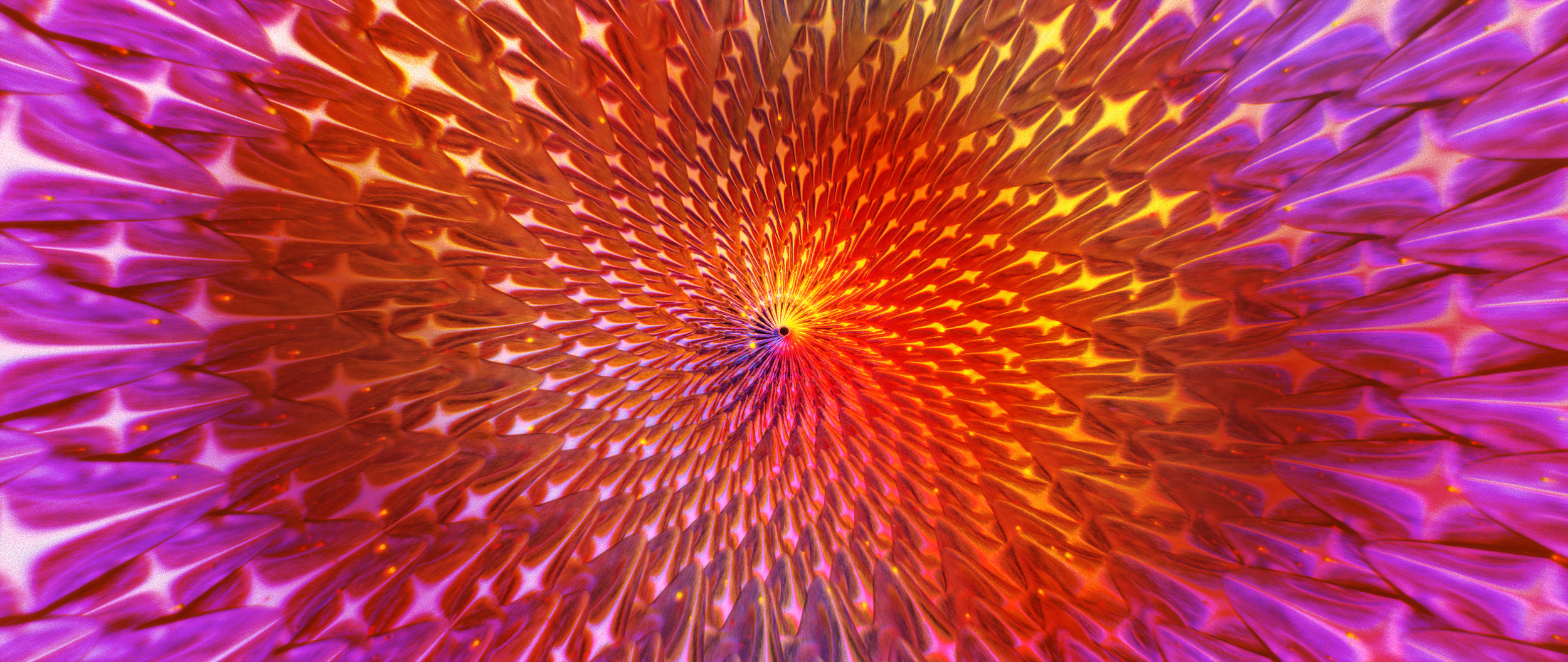
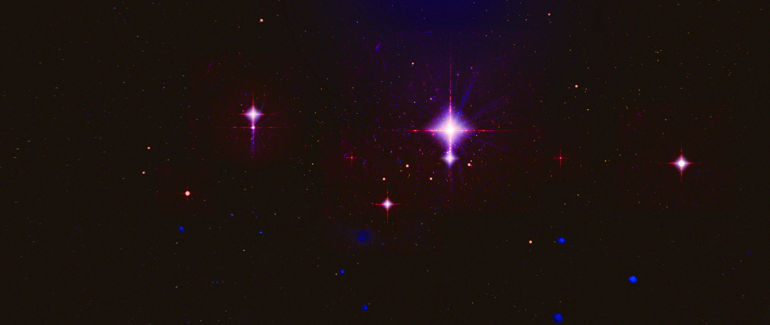
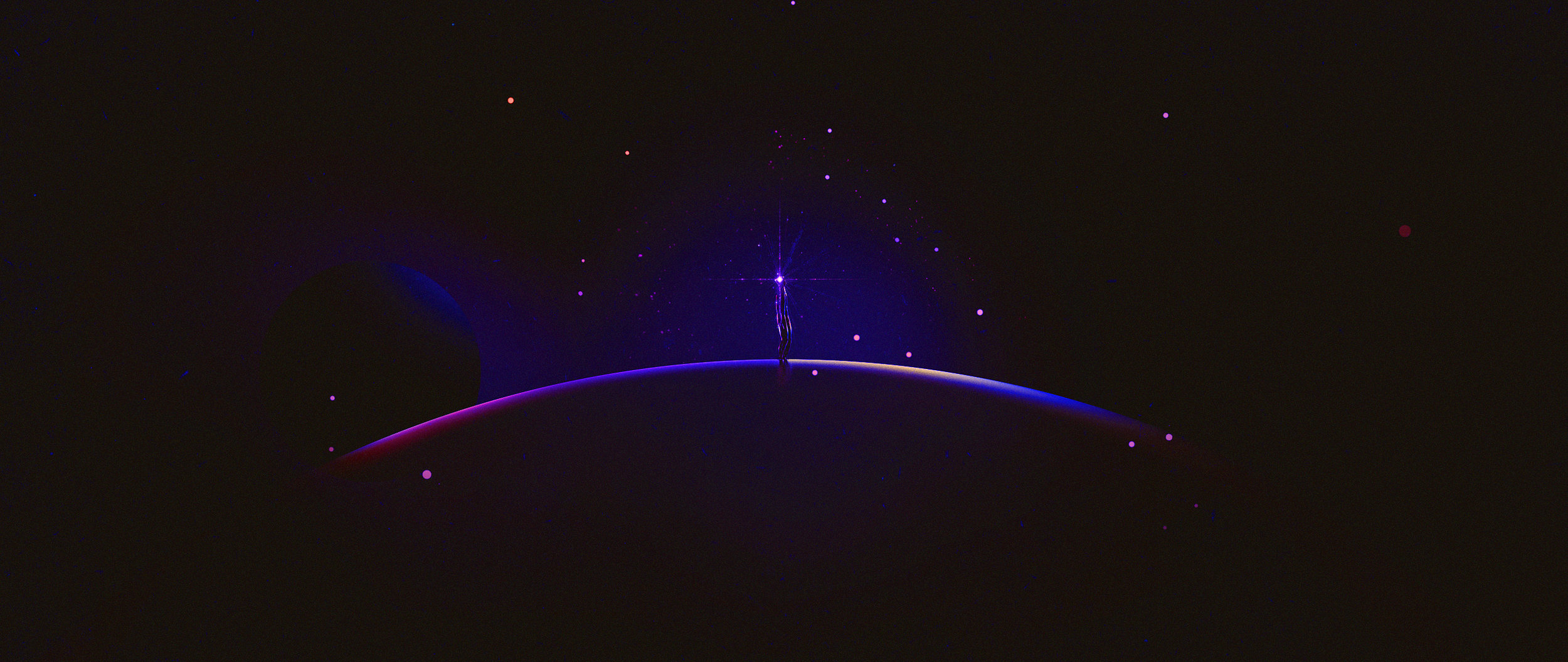
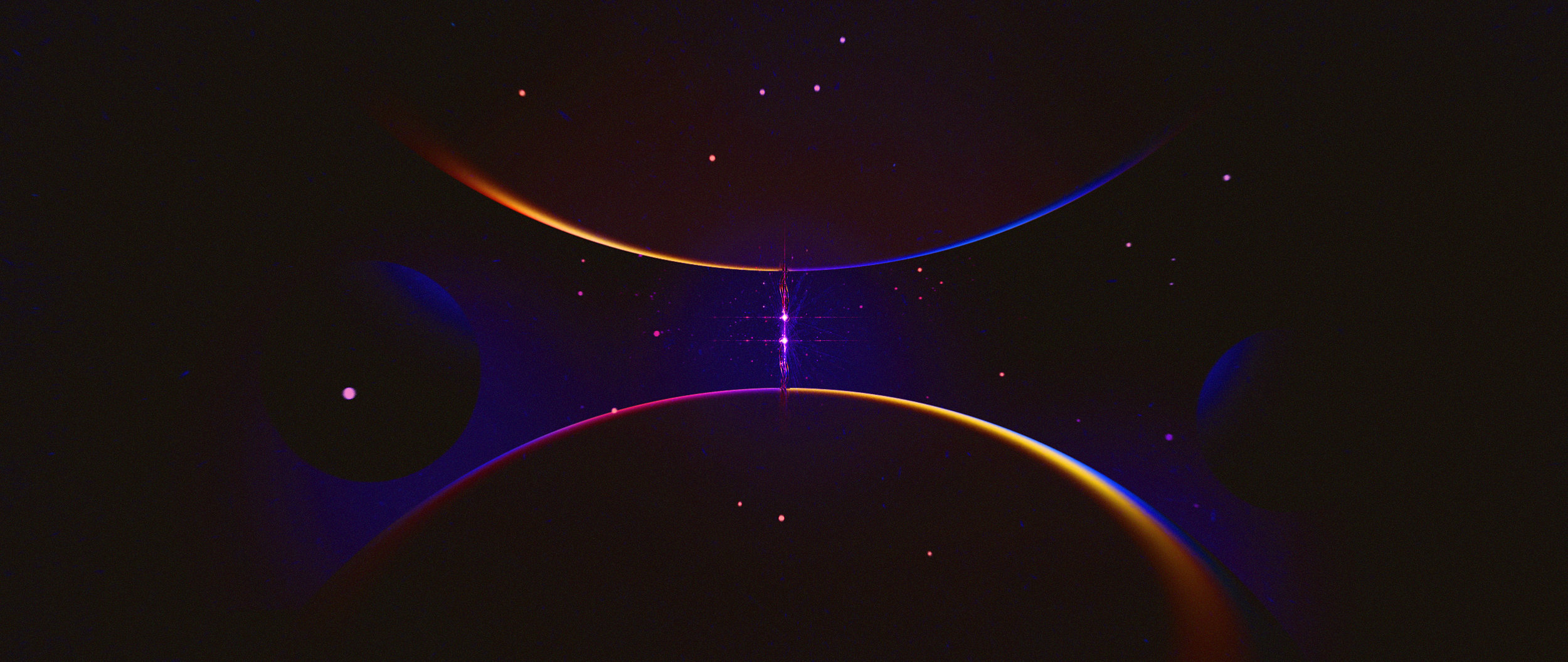
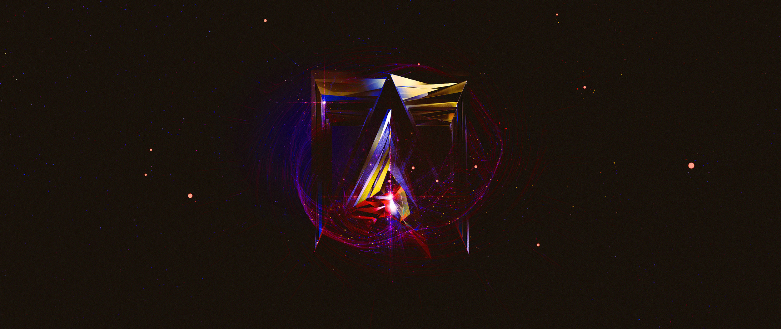
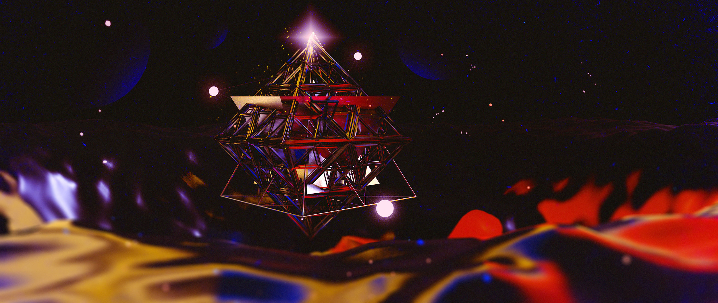
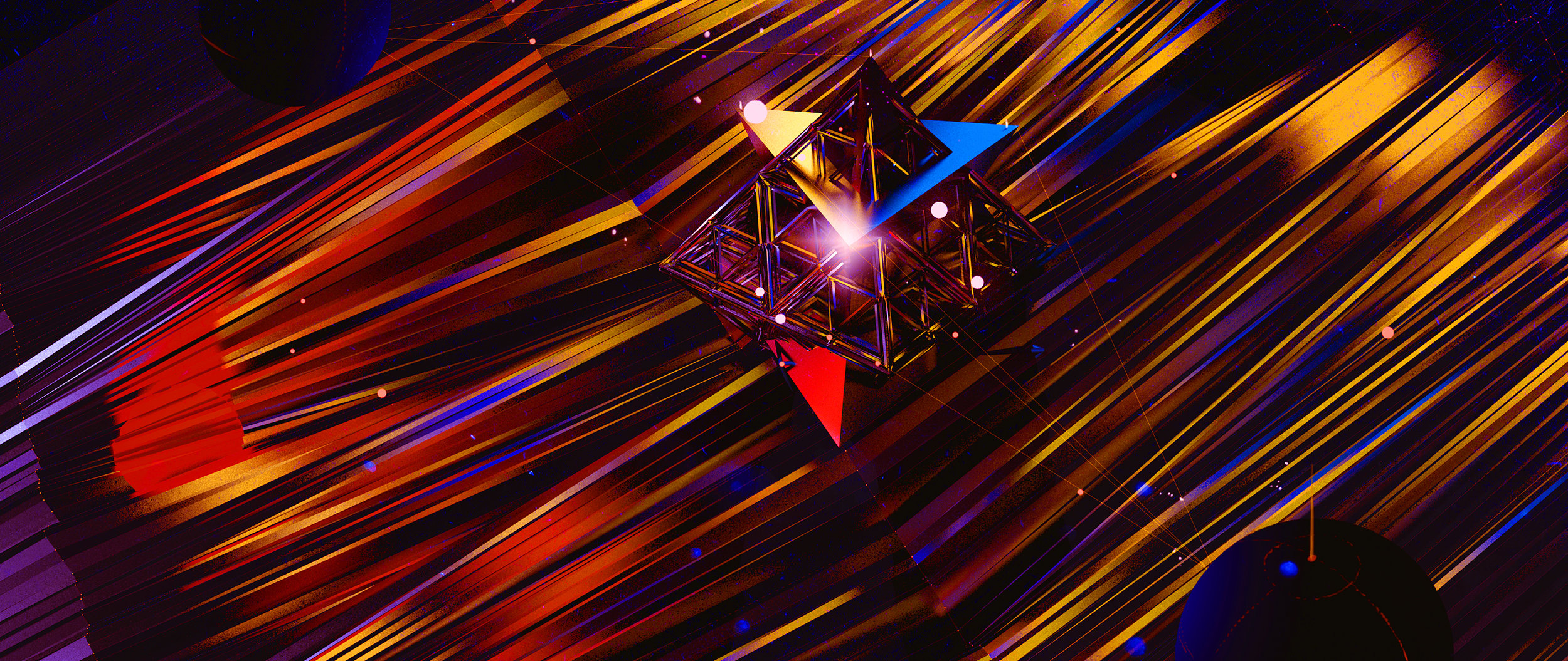
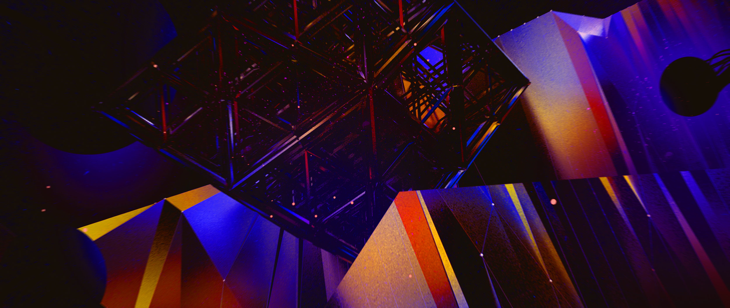
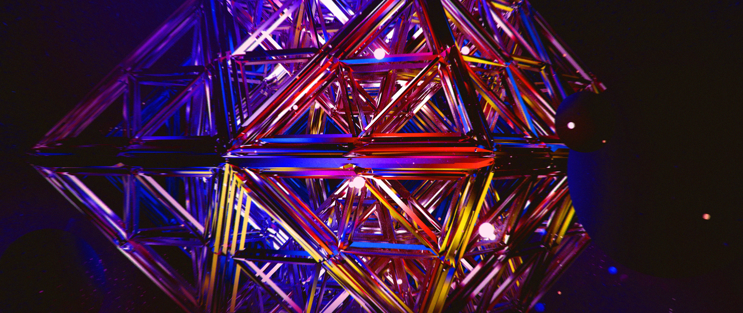
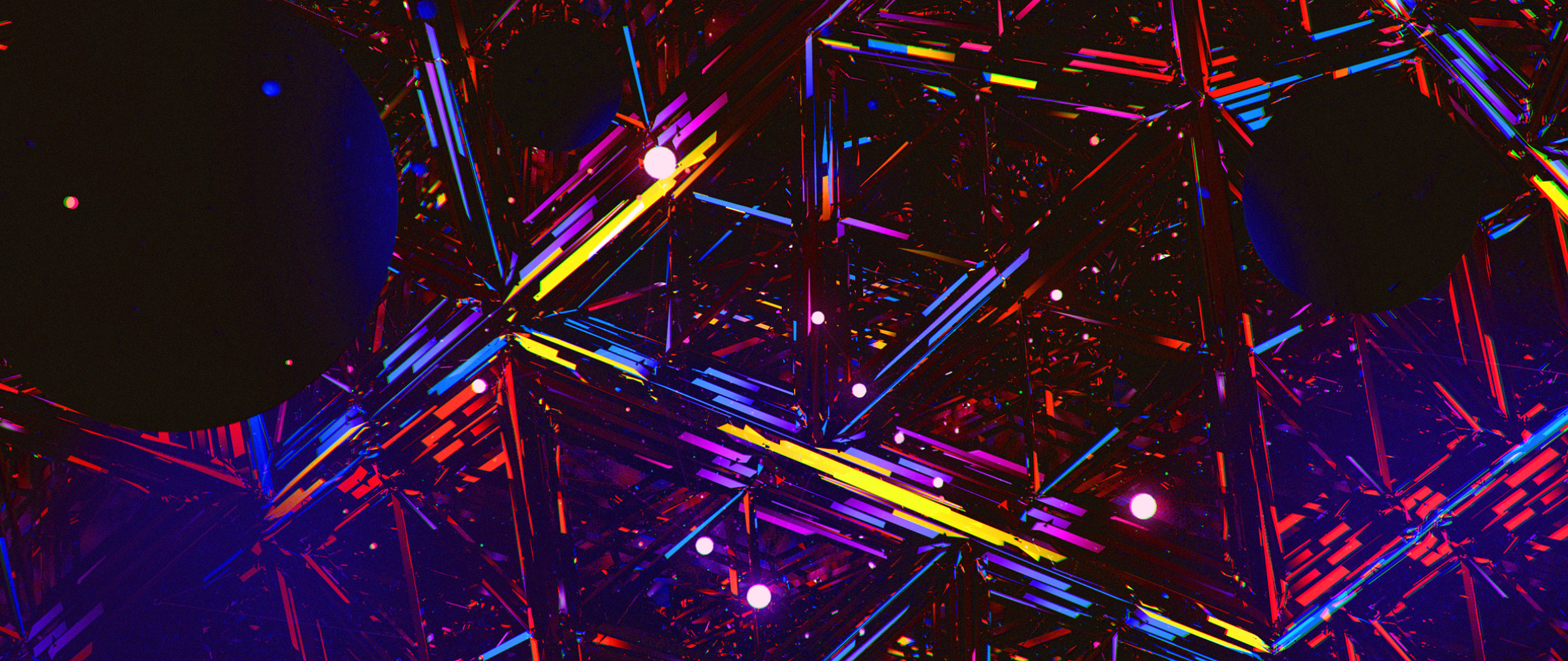
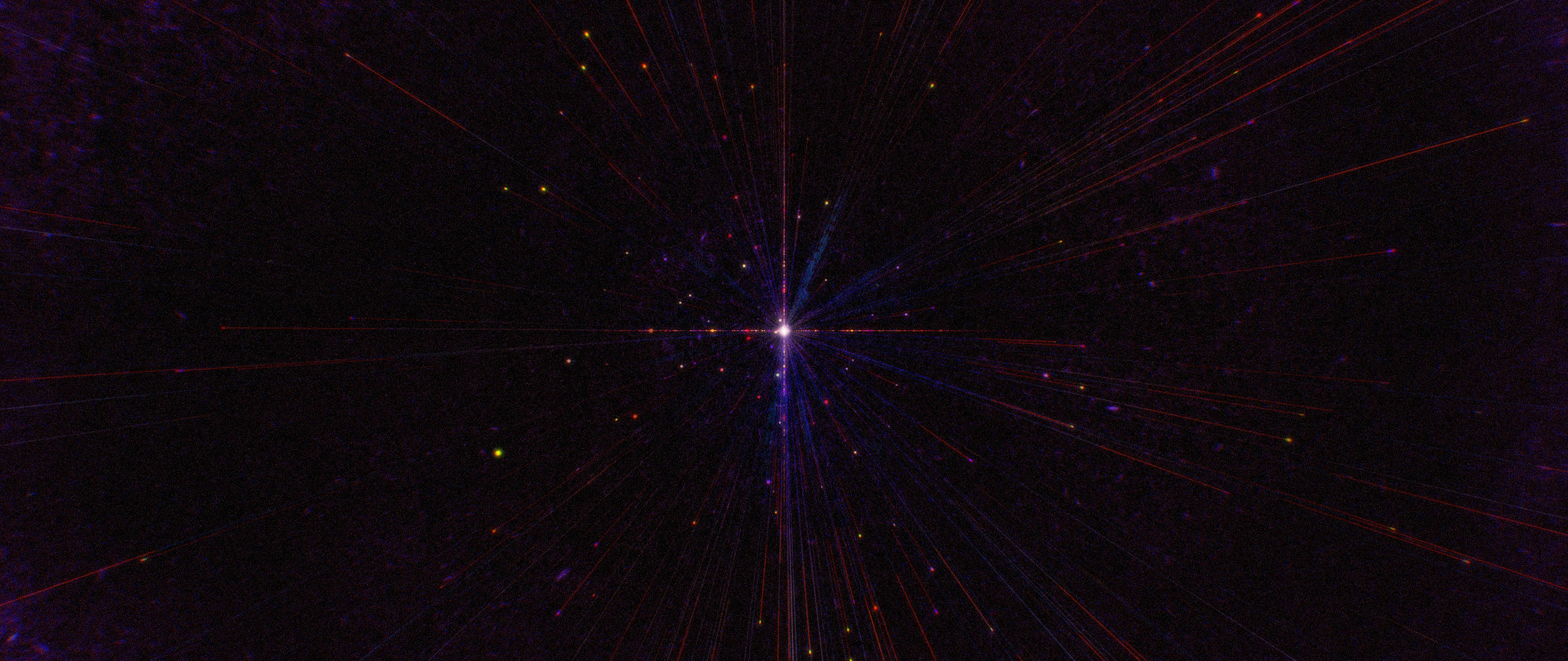
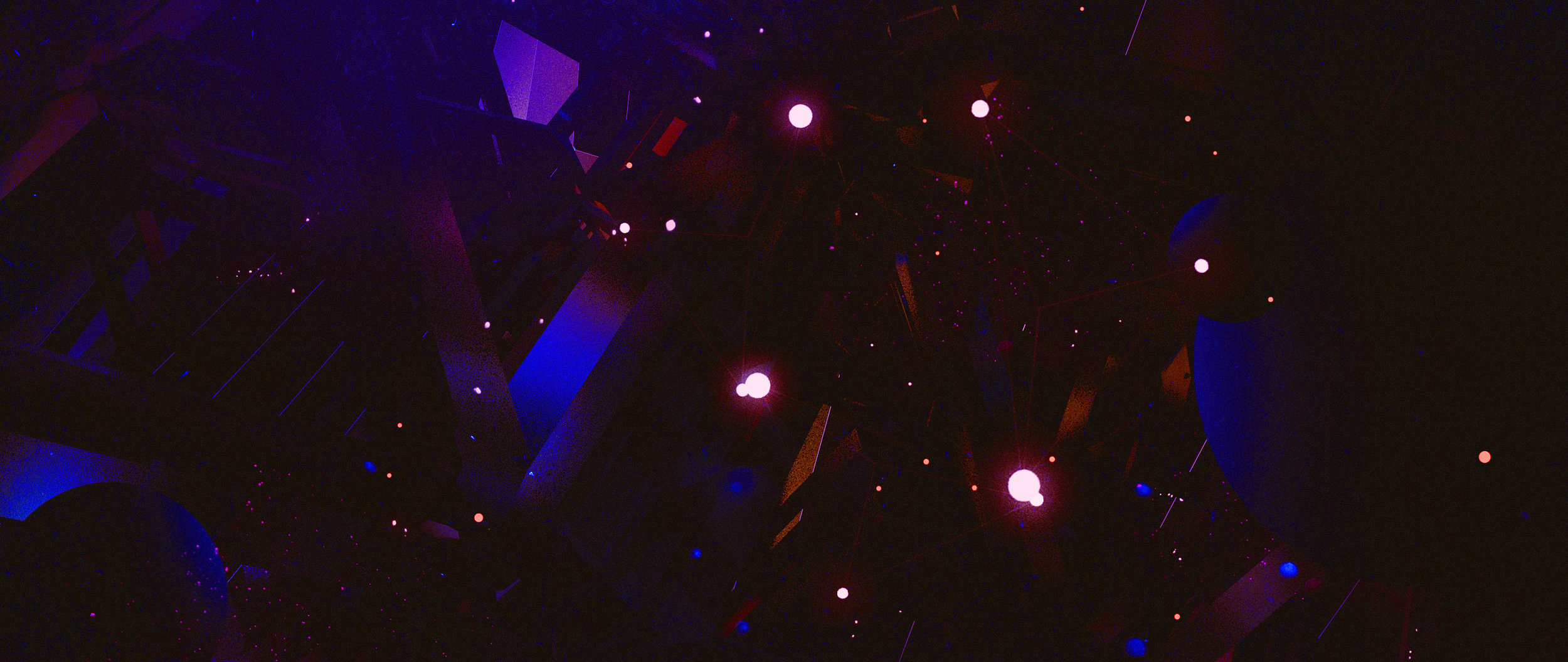
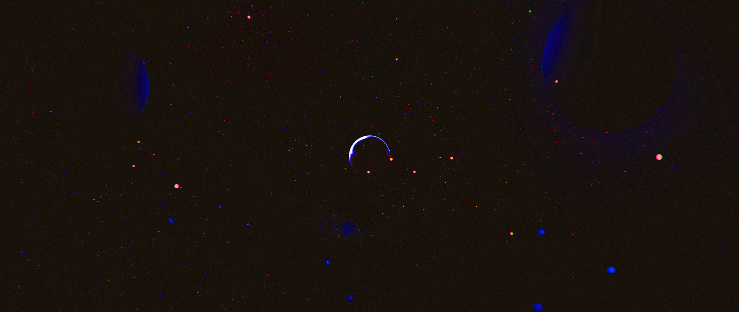
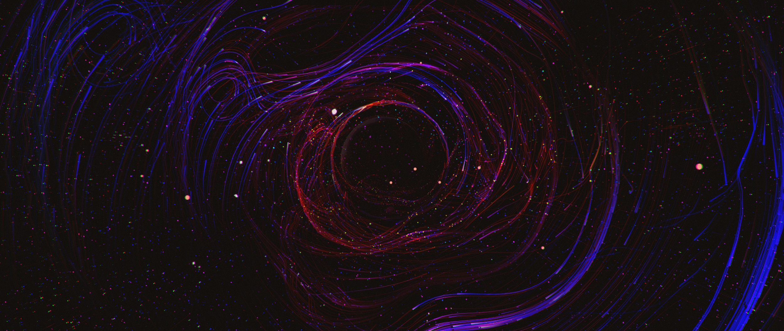
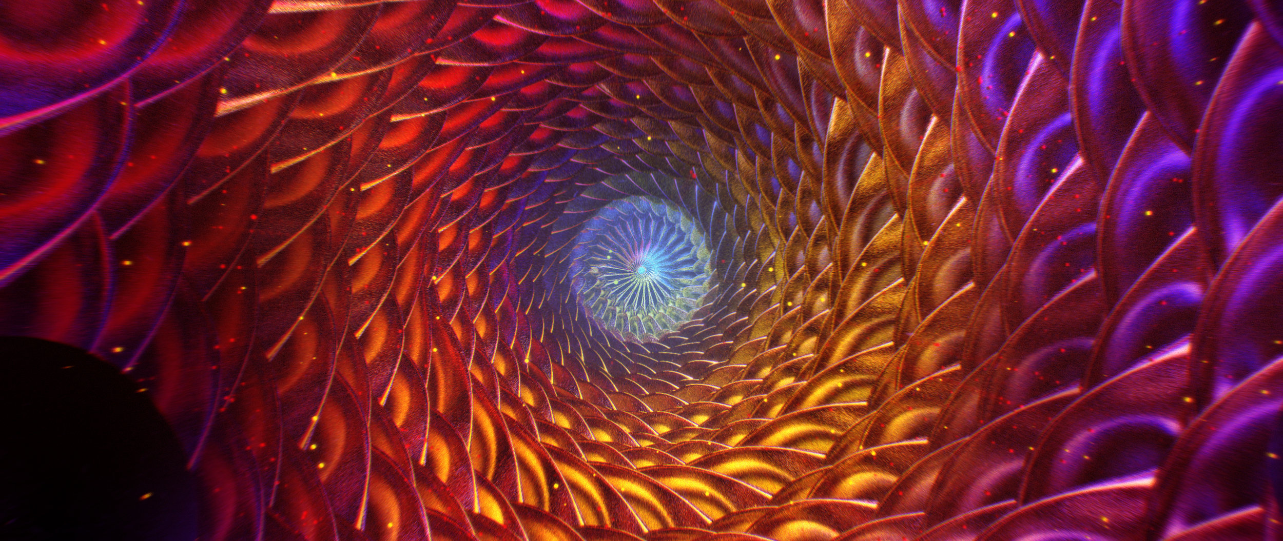
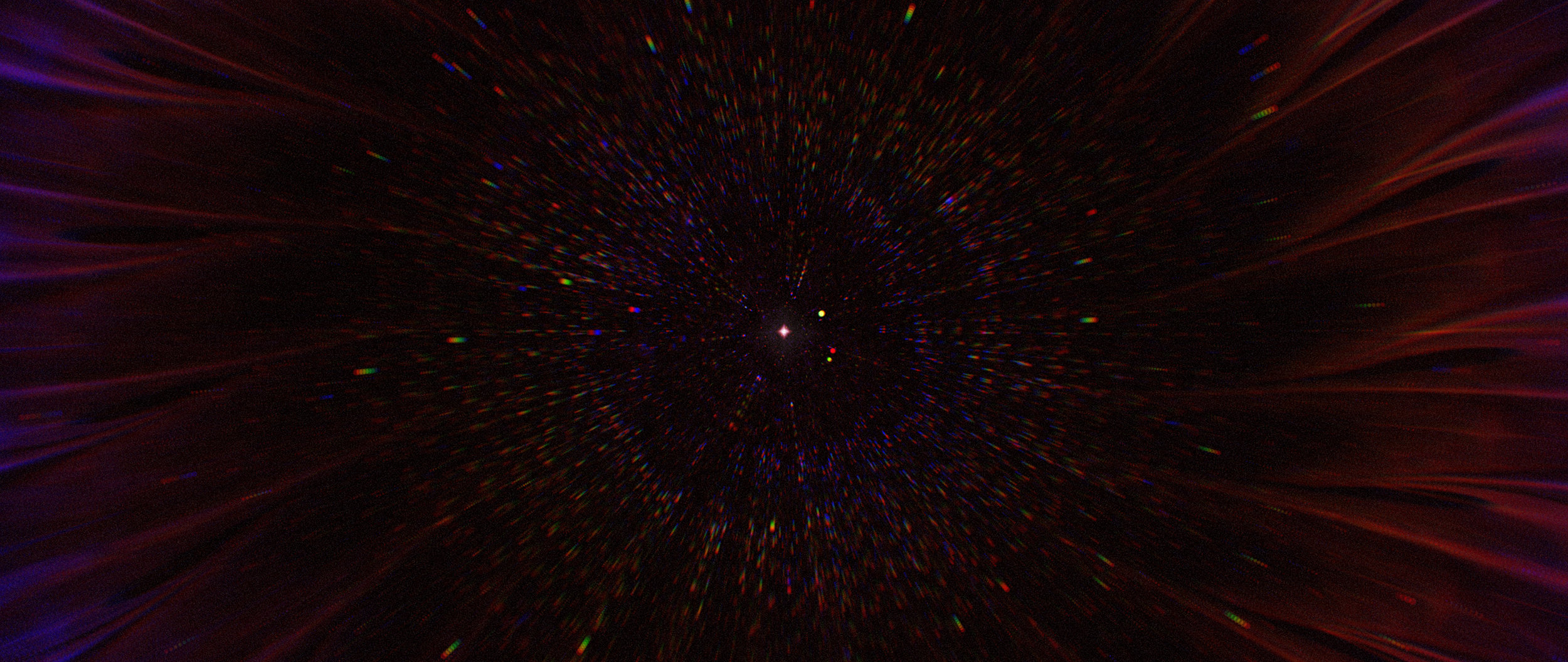
Ash wanted to maintain the original concept but push the look further and inject some influence from his illustration background. The final look became a mashup of elements I was building in 3D, some hyper saturated render styles from Ash and painterly elements assembled in Photoshop.
PRODUCTION PROCESS
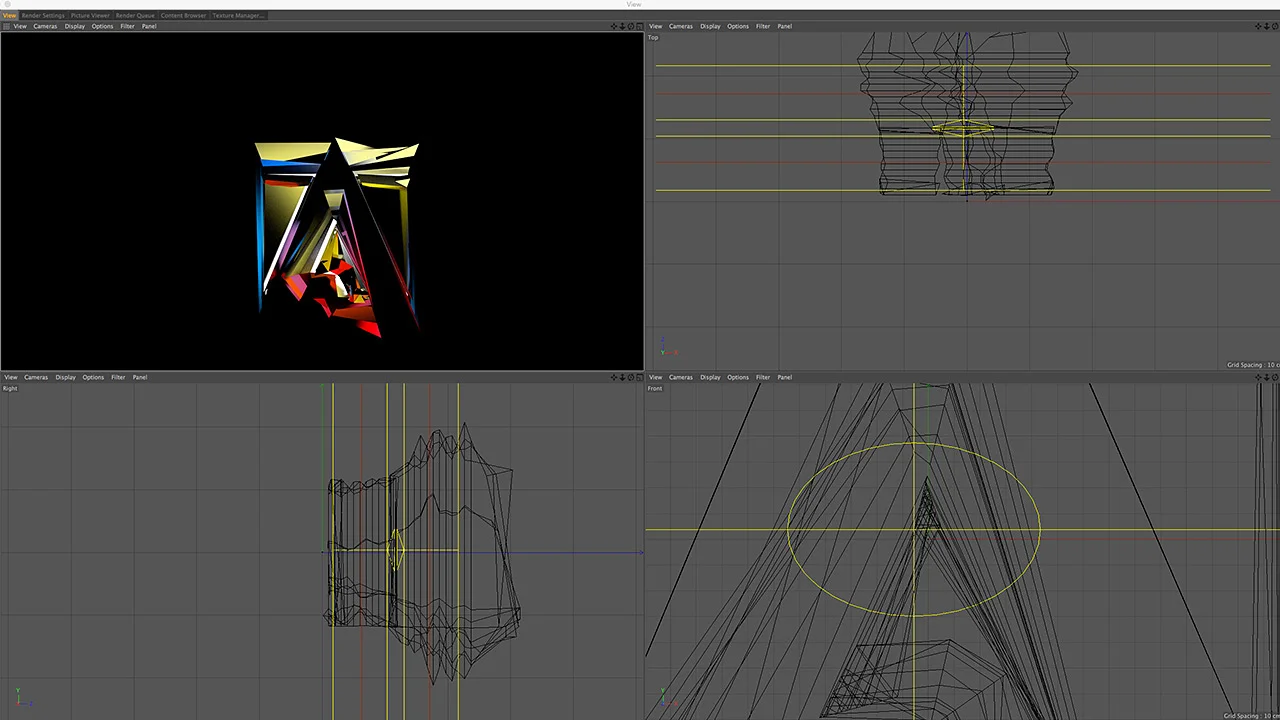
The challenge was to translate a visual language that lies somewhere between 3D and illustrative design into an animation that makes sense as you travel through space. We naturally leaned on Cinema 4D to create the basis for the worlds within the spot but our largest challenge for execution was achieving the finalized design in 3D and finding a way to render the duration of the film within our limited resources.
We looked to Octane to handle some of the render workload. Once out of 3D, the look really came to life in compositing. After Effects was our go-to tool for piecing this thing together and rebuilding the style first established in our design phase. After compositing we pushed the shots to Premiere for assembly.


