METRIC
LEARN SQUARED
Design, Creative, Production
Short / 1:10 / 2017
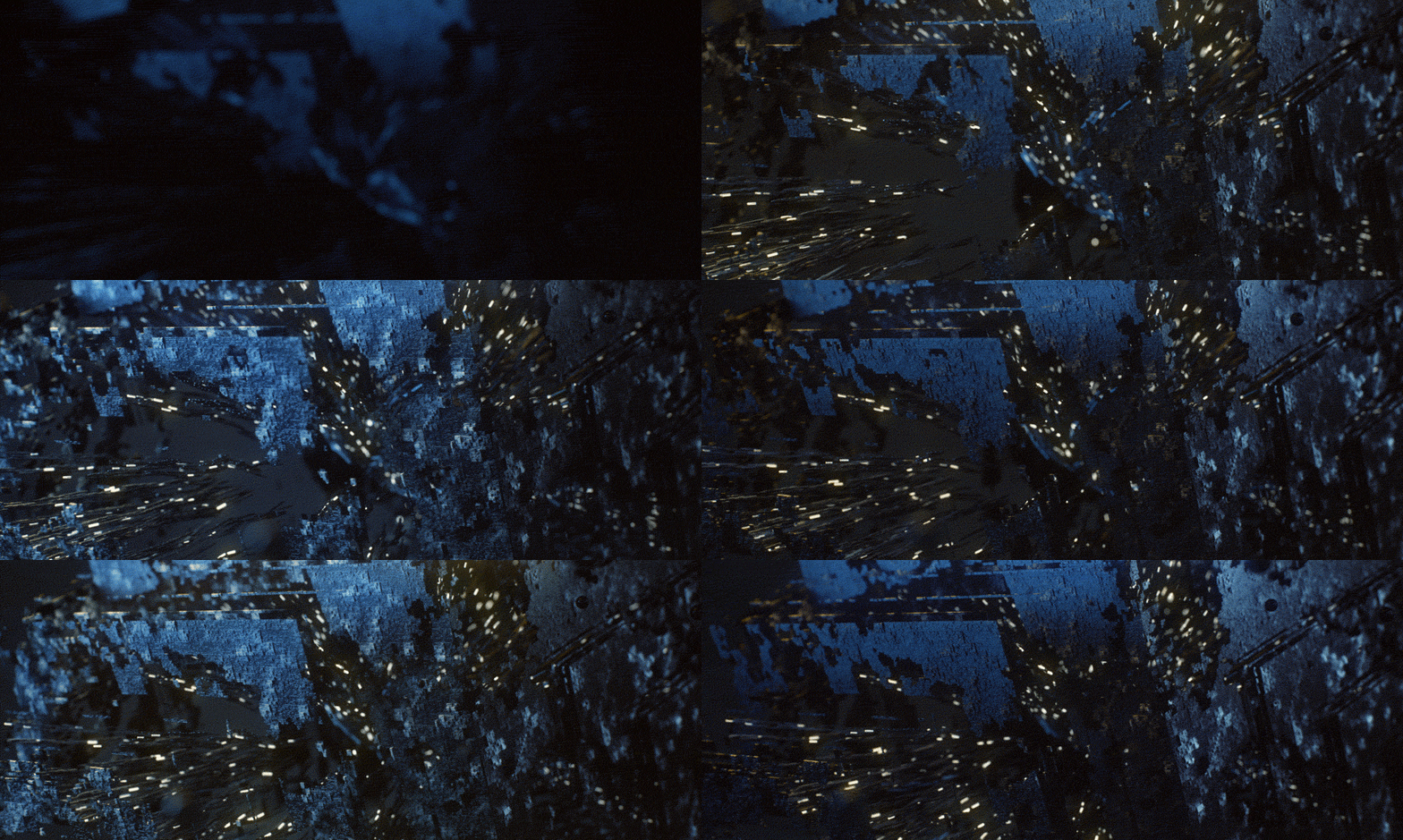
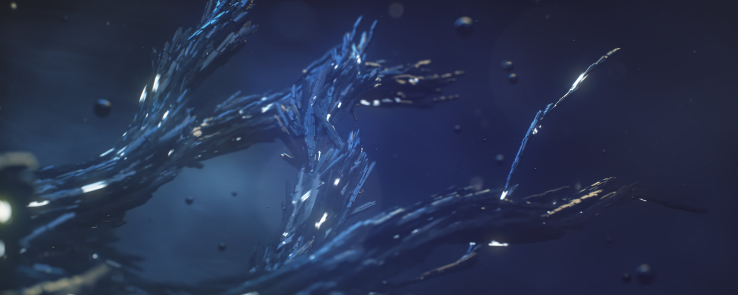
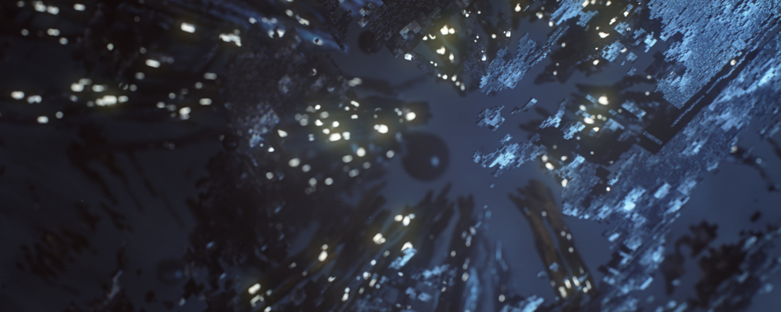
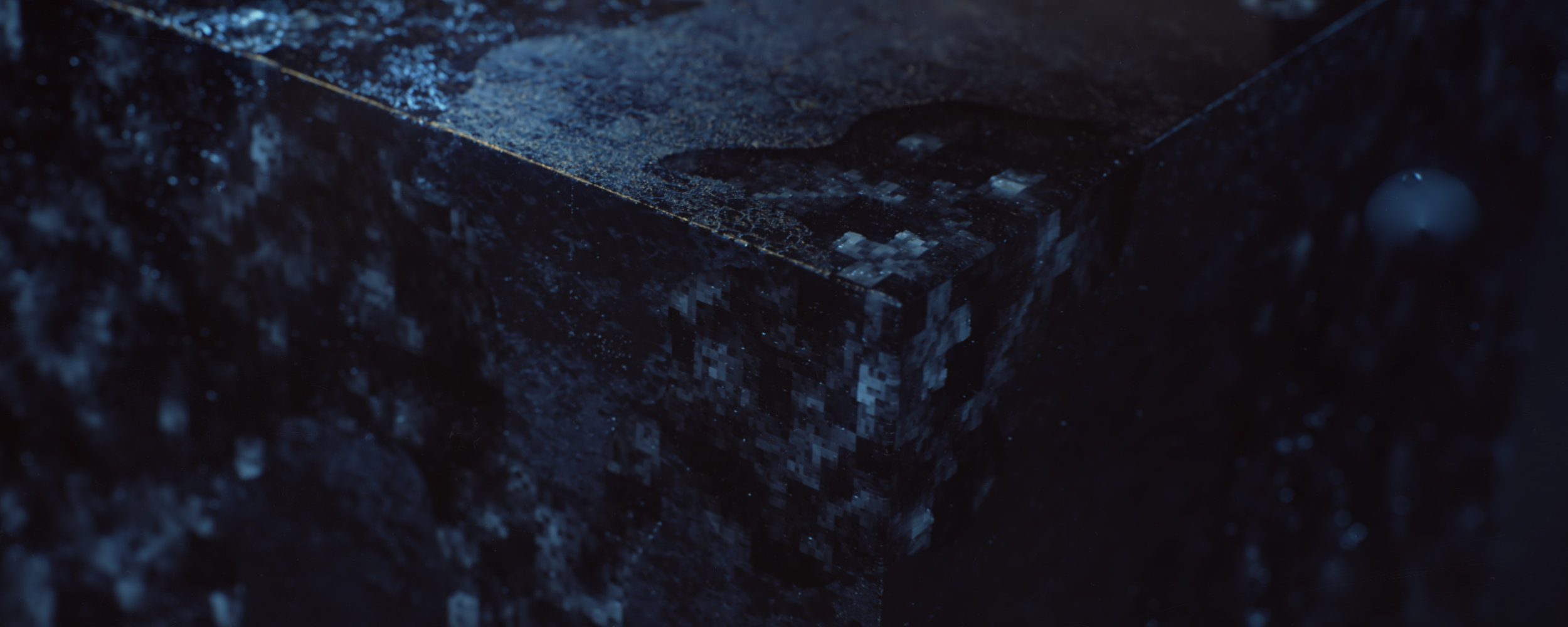
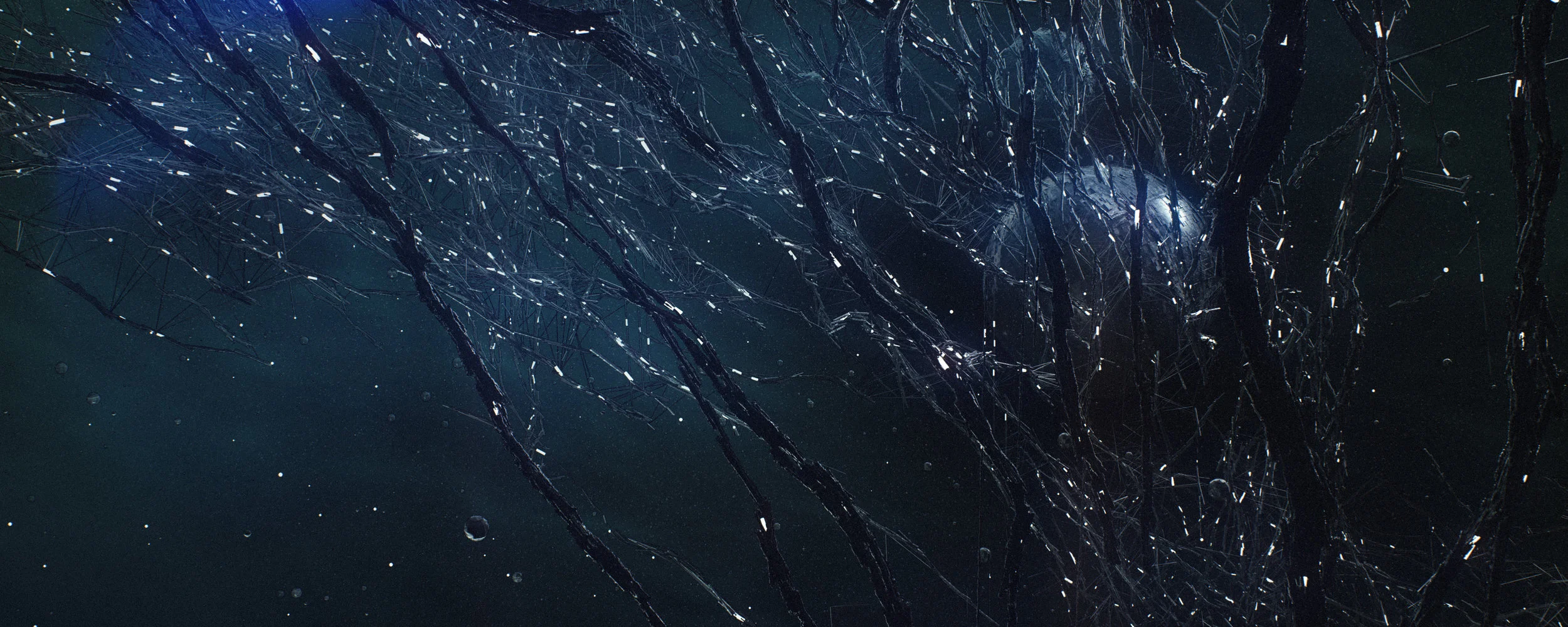
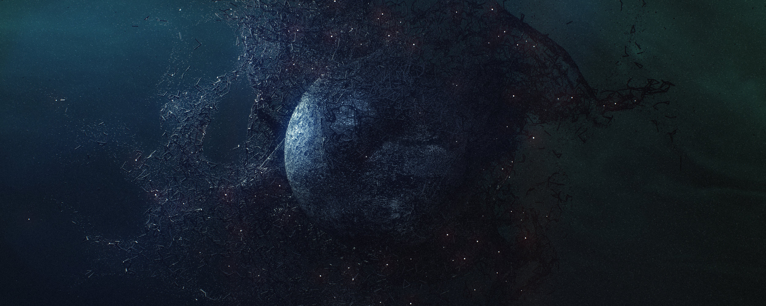
Metric captures the transitory state of matter as it evolves from an illusive Volume⁰¹. As compounds react in an unprecedented manner, they begin to develop the systematic traits of inorganic material – a Density⁰² not observed in Volume⁰¹. Its ambivalence of material not to be misunderstood, it must qualify as a solid Mass⁰³.
Metric is a design example created for my Design for Production training series. It acts as a formal study of both design and process, following the creative brief and curriculum outlined in the course. The class asks students to design a concept around three key words: Volume, Density and Mass. The most recent release in the series walks through the production process I used to create this piece and will help students progress their still concepts into animation.
Learn more about Design for Production.
CREDITS
Design / Creative / Production: Michael Rigley
Music: Zelig Sound
STILLS


MAKING METRIC + DESIGN FOR PRODUCTION
Creating Metric was a unique challenge. Designing a project to be broken down and taught as a training series is both an enlightening and exposing process. It makes you hyper aware of your own process and at times can have you questioning your decision making. Whereas decision making in a typical project is influenced by what the client and/or director may want, the key influence here is wondering if the process is teachable and if the techniques are worth sharing.
I wanted to create a project and class that used real world techniques in both the design and production phases. But at the same time, I didn’t want the class (or my project for that matter) to have a spec feel to it. I wanted the students to be able to generate creative works from the brief and not end up with a project that felt as though it were imitating a client job.
As a starting point for the project, I designed an open ended brief - the interpretation of three metrics of measurement: Volume, Density and Mass. The words were kept purposefully ambiguous as I didn’t want to influence the creative interpretations students may have. However, I feel its important to have a starting point as the idea of doing anything can be overwhelming and counter productive.
I followed the same brief the students would, interpreting our three words. The first step to that would be sketching frames, ideating and designing style frames which you can see below. This process is outlined in my Workflow class.
STYLE FRAMES
Launching Workflow was a great experience and it was exciting to see such positivity towards learning process-oriented design and not just tips and techniques (although there are a lot of those too). It was definitely a challenge making the classes - Learning to slow down my process and breakdown each step. Second nature decision making has to be further investigated and sometimes traced back to its source, then unraveled, outlined, recorded, edited and paired with visuals.
After the launch, it became very clear that my next class needed to focus on production. Even though I had initially planned a different follow up class, there was a definite desire from students to learn more about 3D animation and how to make these images move. This is exactly where Animation comes in.
The course attempts to pack in my entire production process on Metric through the lens of one shot. Obviously creating a class around building the entire spot would be both overwhelming and redundant as essentially the same process applies to each shot (with varying 3D technical execution of course).
So again, I was both following and creating class curriculum simultaneously. Where Workflow required more of a contemplative approach to my process - breaking down small and large habits - Animation was more a study of a project in production. The creative and design had been established and I would document the way forward.
DESIGN TIMELAPSE
Having been on a number of production projects over the years, I was very familiar with the process but trying to define the stages as teachable chapters and packed into 4-6 hours of content was another challenged all itself. Here you can see the key phases of the project I wanted to highlight: Boardomatic, Animatic, Rough Cut, Fine Cut.
PROJECT PROGRESSION
I was trying to create a course that would encapsulate the production process and hopefully enable students to create their own unique animations for their portfolio. So it felt only appropriate that my interpretation of Metric would take on a life of its own and become and independent portfolio piece outside of the training context. Some breakdowns of shots within the piece:
SHOT BREAKDOWN
This whole process of creating Metric and both of the classes has been a massive undertaking for myself and wouldn’t have been possible without the support of the L2 team - a massive thank you to them and the student community that will hopefully enjoy all the content we’ve worked hard to bring forward. I'm hoping to expand this page more in the future with some notes on the courses' apprentices: Ash, Peter and Joey. They all contributed so much to the class and am super thankful to have had them be a part of the process. Lastly just want to thank a group thats always willing to share opinions and collaborations: Munkowitz, Kose, Jernigan, Zelig and Jade.
If you want to learn more about the techniques seen in Metric or join an amazing creative community please visit Learn Squared.
