DOLBy DIMENSION
DOLBY LABORATORIES INC
Creative, Design, Production
Brand Development / Various / 2018
When Dolby invited us to participate in the brand development for Dolby Dimension, they were well underway with brand assets for the new product. Our primary objective: explore the potential audio-visual forms for the blurred figures within the existing branding. What would these shapes look like, what kind of life would they take, and how would they behave once they were pulled into focus?
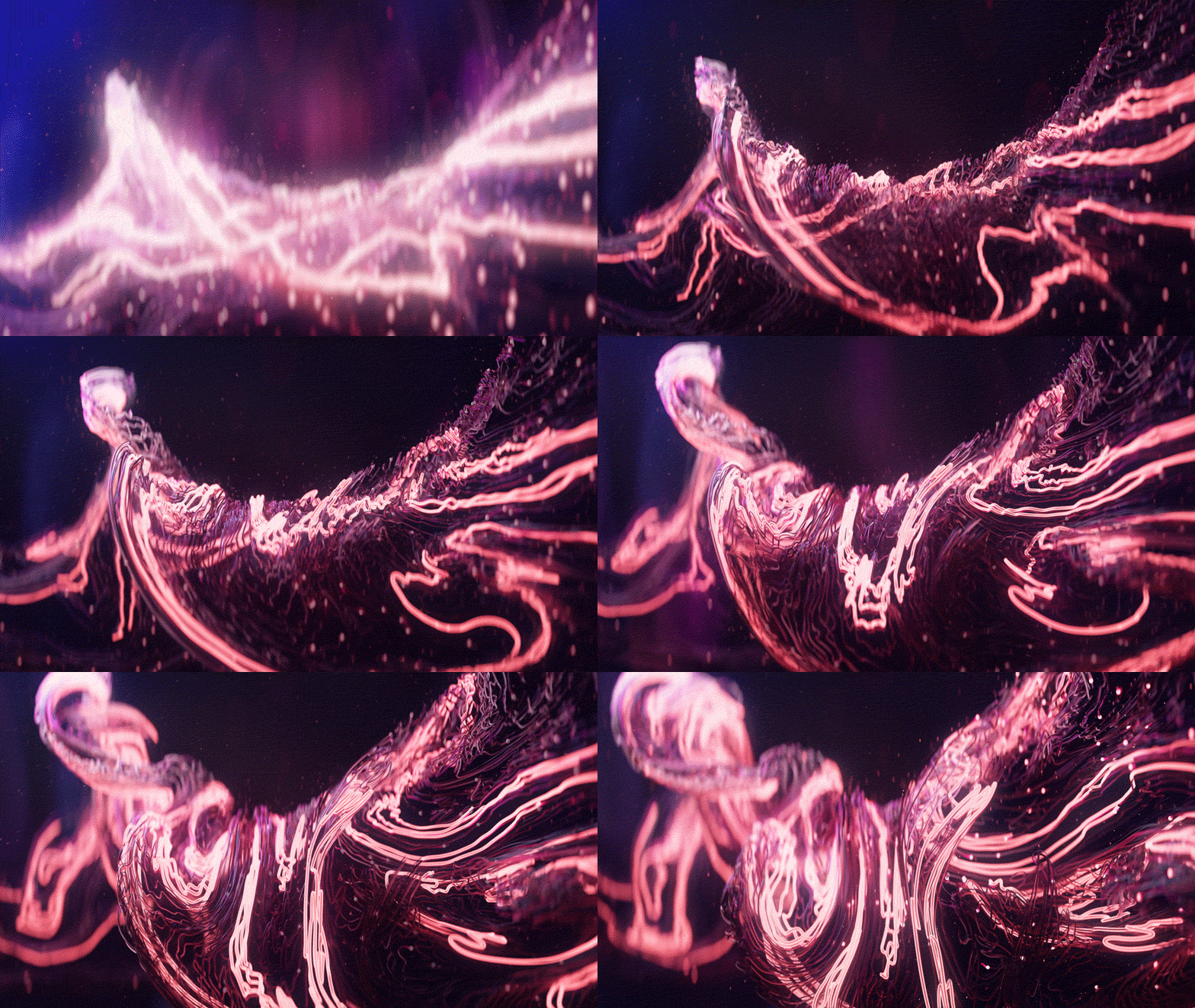
Conceptually, developing the visual language from an array of contrasting elements was essential for representing various aspects of the new technology. After in-depth visual development, we discovered a harmony between two elements: strings and particles. Each element represents contrasting streams of audio – the content users consume and the environmental sounds around them.
CREDITS
Creative / Design / Production: Michael Rigley
Music: Zelig Sound
Onsite Photography: James Ken Butler
STILLS
APP INTRO
For the app introduction we wanted to display the technology at work through the brand language we developed. A core functionality of Dolby Dimension is the ability to dial up or down the influence of the environmental sounds around you. We leveraged the two primary elements of the graphic system to illustrate contrasting streams of audio: particles representing environmental sounds and strings representing the content. We then created an evolution from the dimensional space of the branding into the 2D elements within the user interface.
STILLS
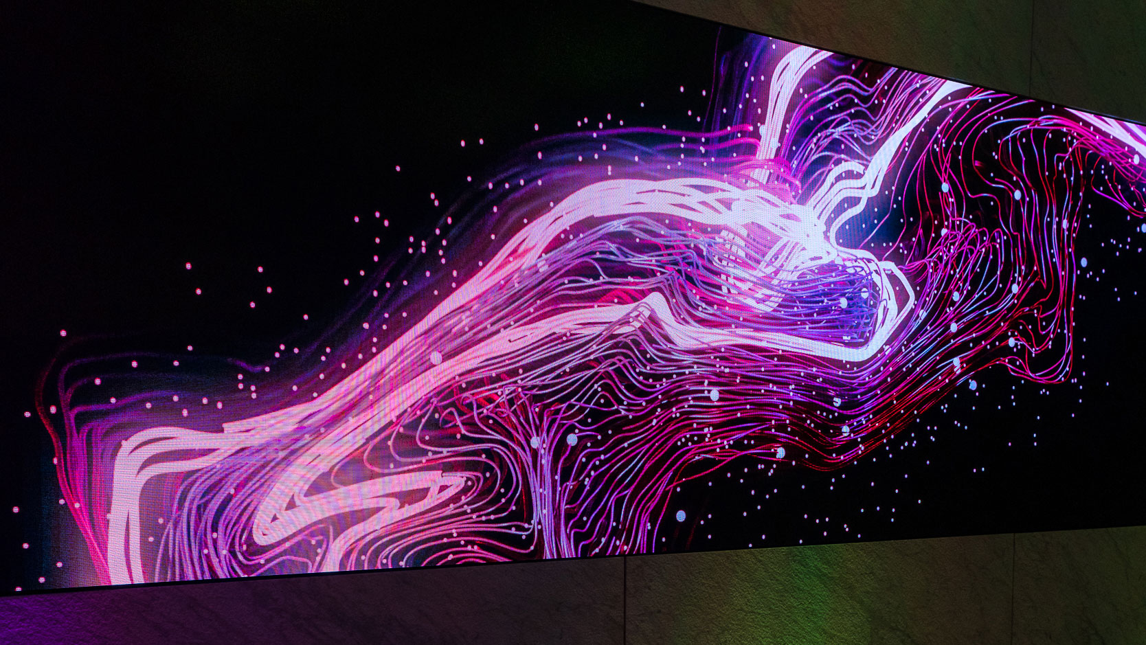
DOLBY GALLERY RIBBON WALL

With music as the driving force behind the films, Zelig Sound composed a custom track that would function at a variety of lengths. The arrangement layers both surprising and contemporary moments to juxtapose the cinematic and the artistic. These compositions established the pacing of each piece and the visuals were tailored to follow the score, creating synergy between the auditory and the ocular.
For the ribbon wall we developed an evolving complexity to mirror the build of the music. Simple graphic shapes grew into sparse particulate, building into isolated sound sculptures, ultimately unfolding into wide sweeping waves of visual and auditory landscapes. The ribbon wall itself was a particular challenge of scale with a resolution of 9920x720 and a duration of seven minutes.


