BATTLEFIELD 2042— CONTENT
GOODBYE KANSAS, cinematic design 2021
Art Direction | Lead Design | Lead Animation
For this film, we used a satellite, revolving around the globe, as the key element of our story. Diving into moments captured across the planet, through the satellite’s lens, we portray the occurrence of events as they unfold between the present day and the world of 2042.
Two of the major elements that we needed to develop were the digital network inside the satellite and the content that existed within it. This collect covers how we develop the style of the content and its role within the narrative.
Initial looks
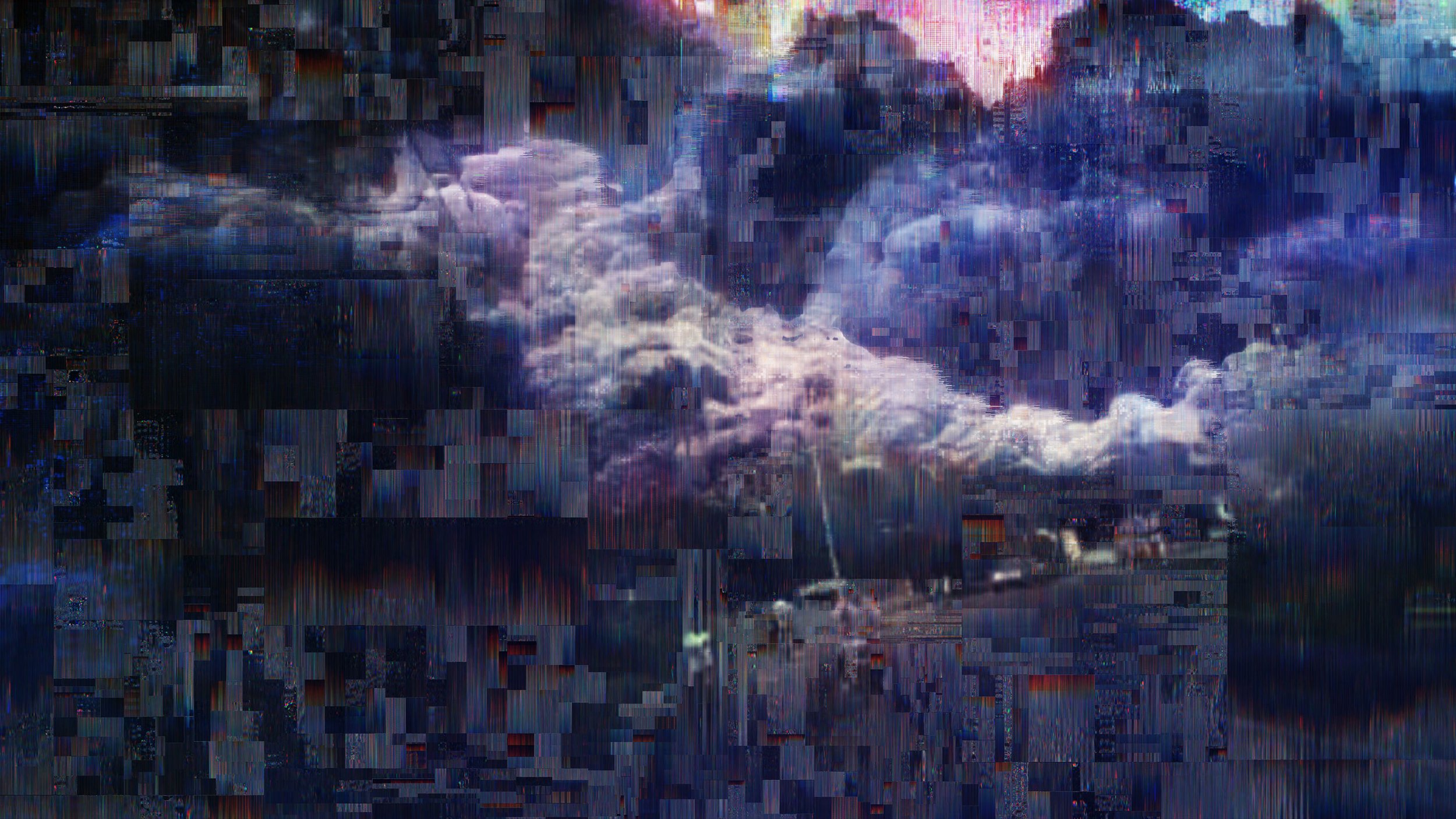
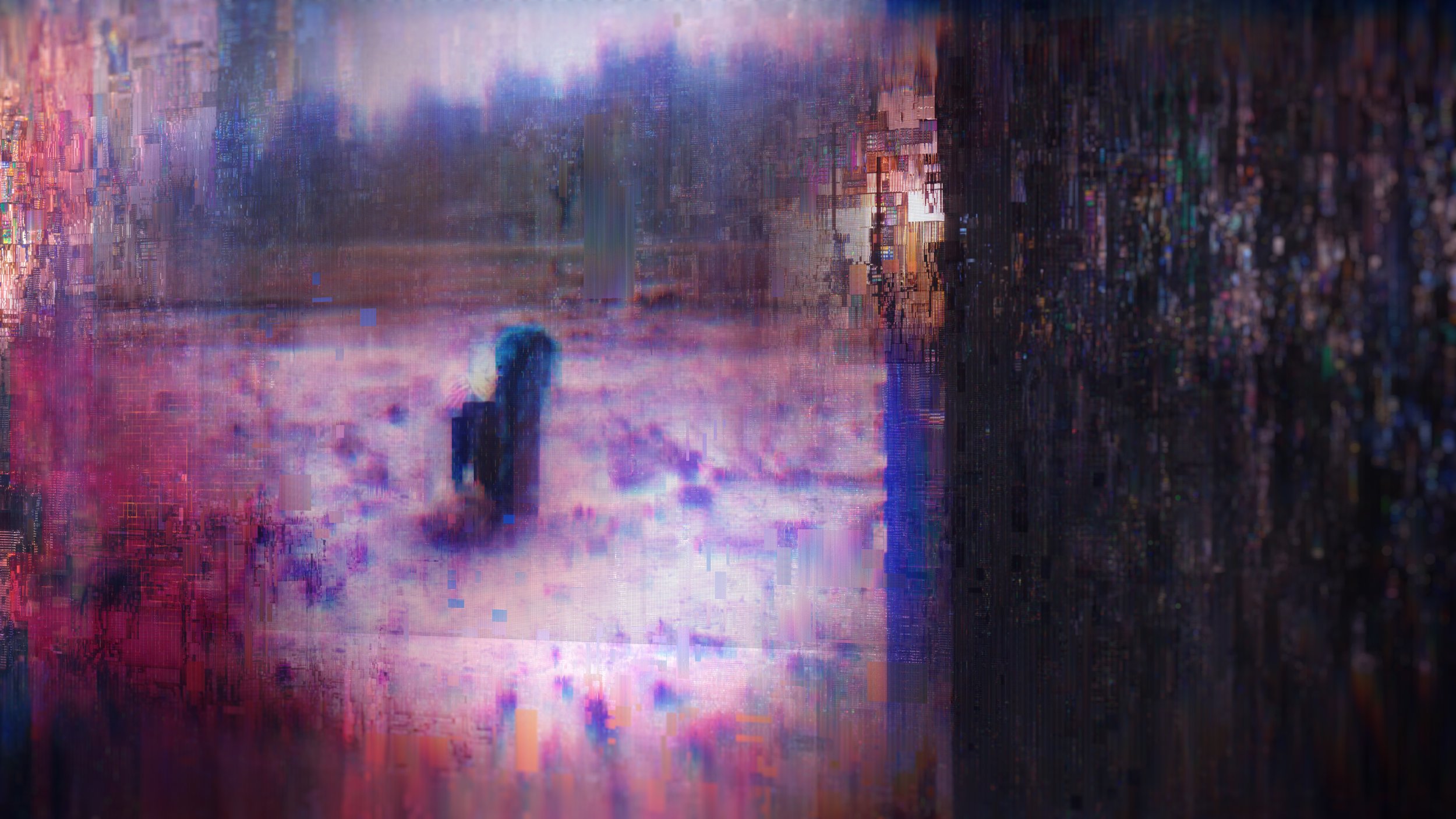
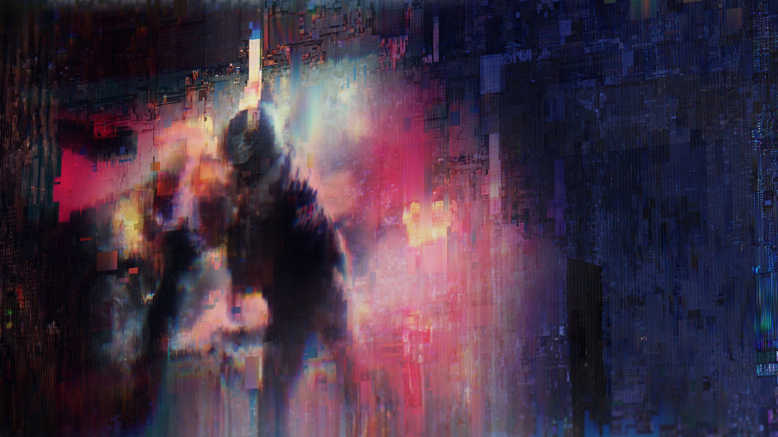
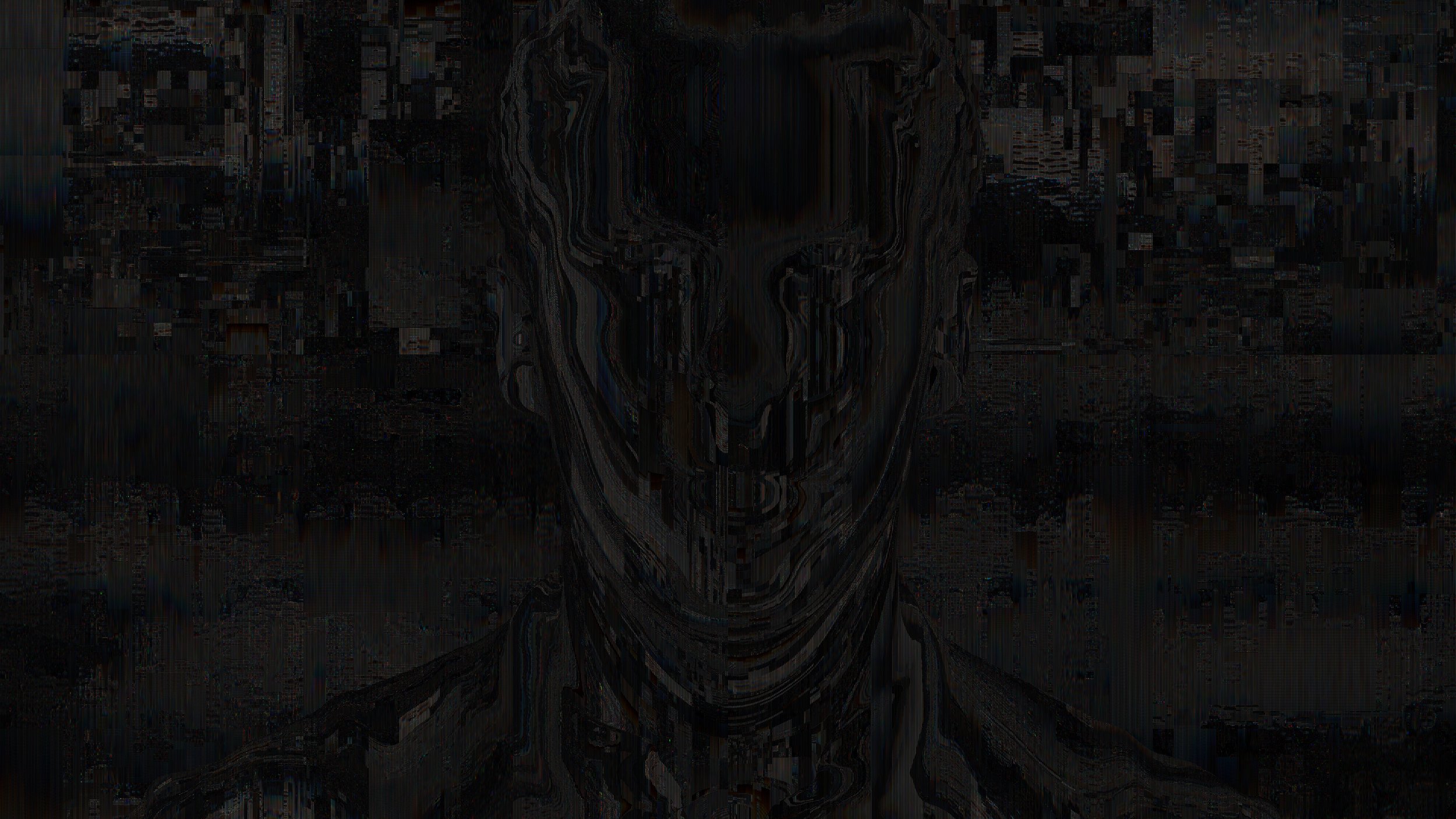
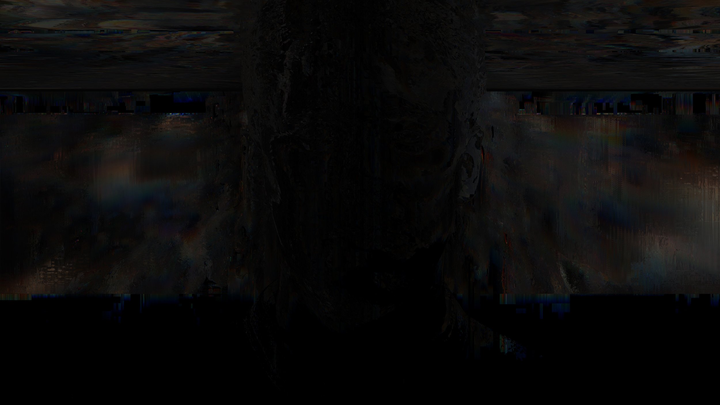
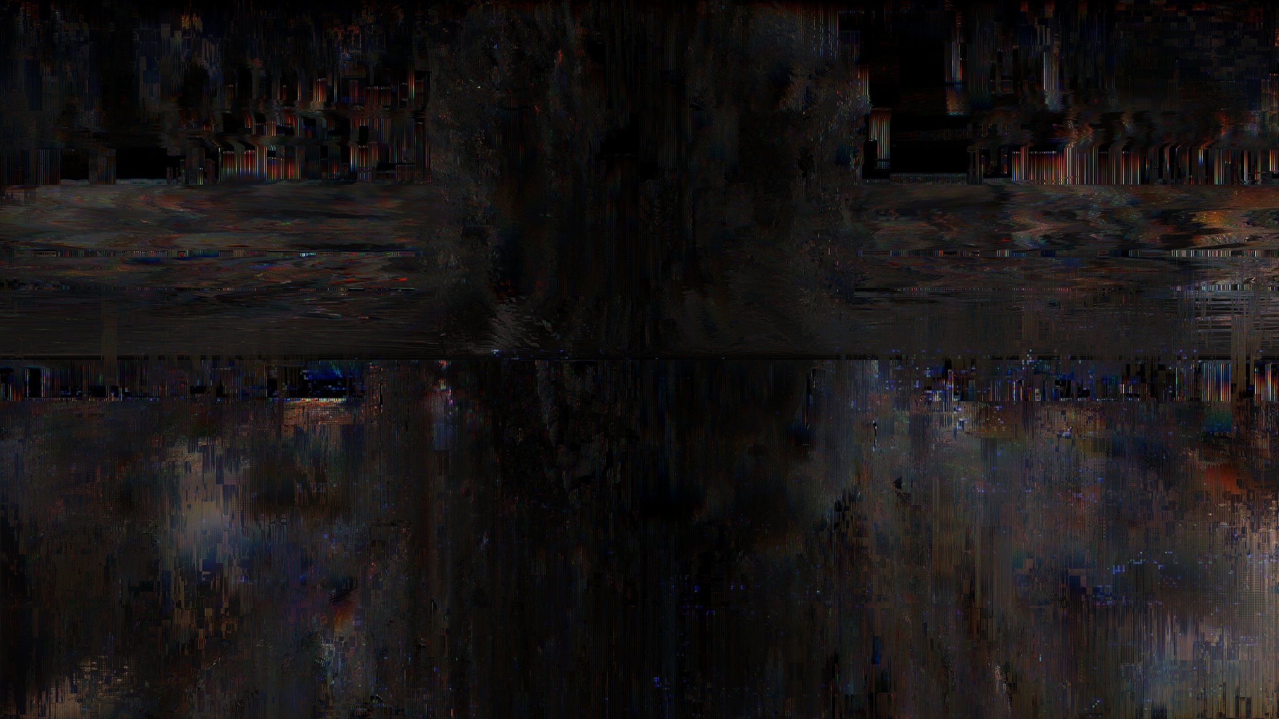
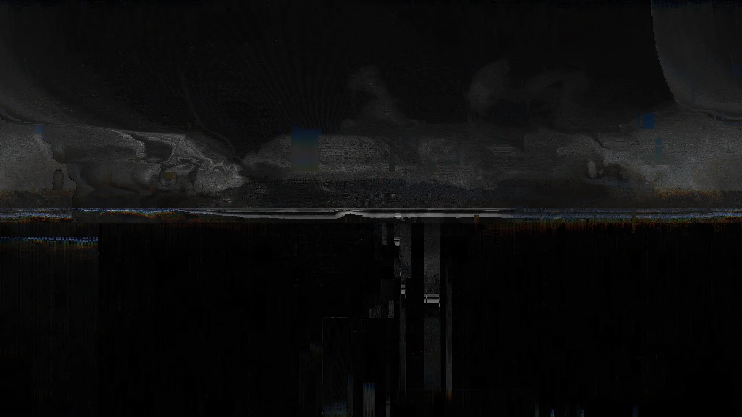
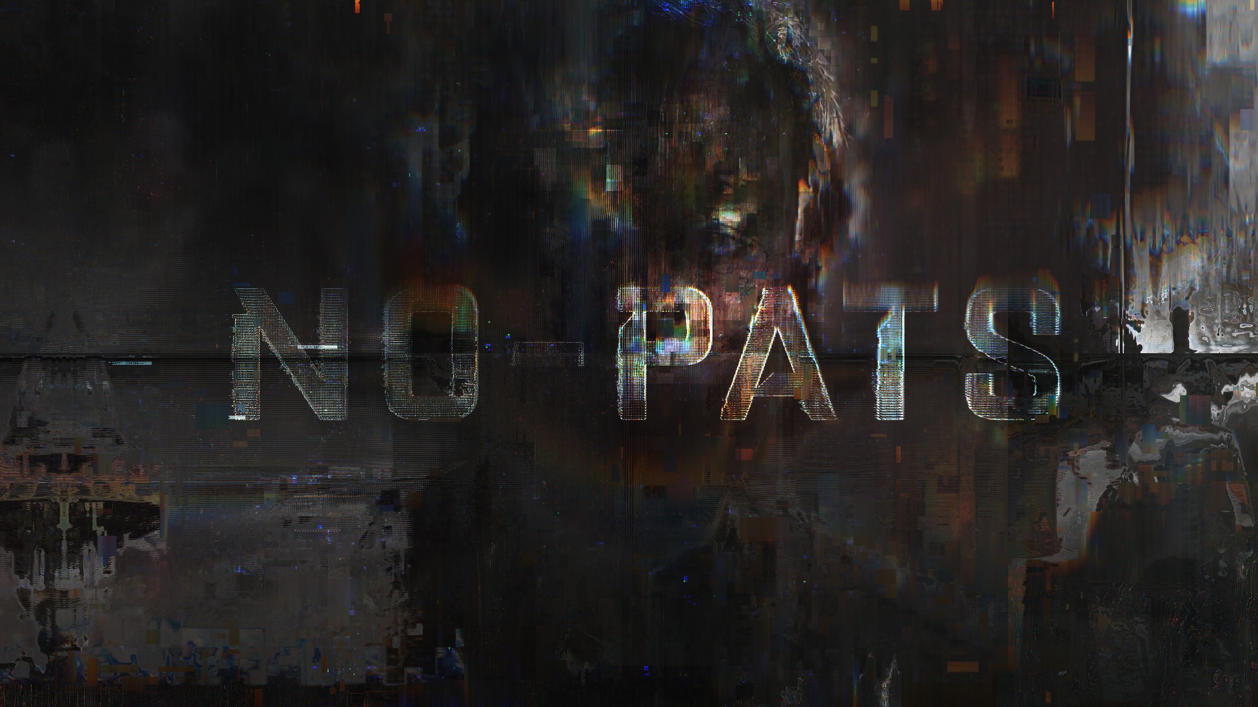
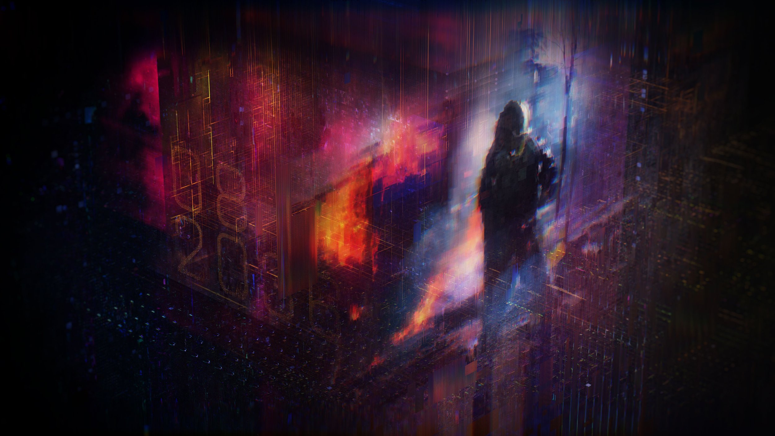
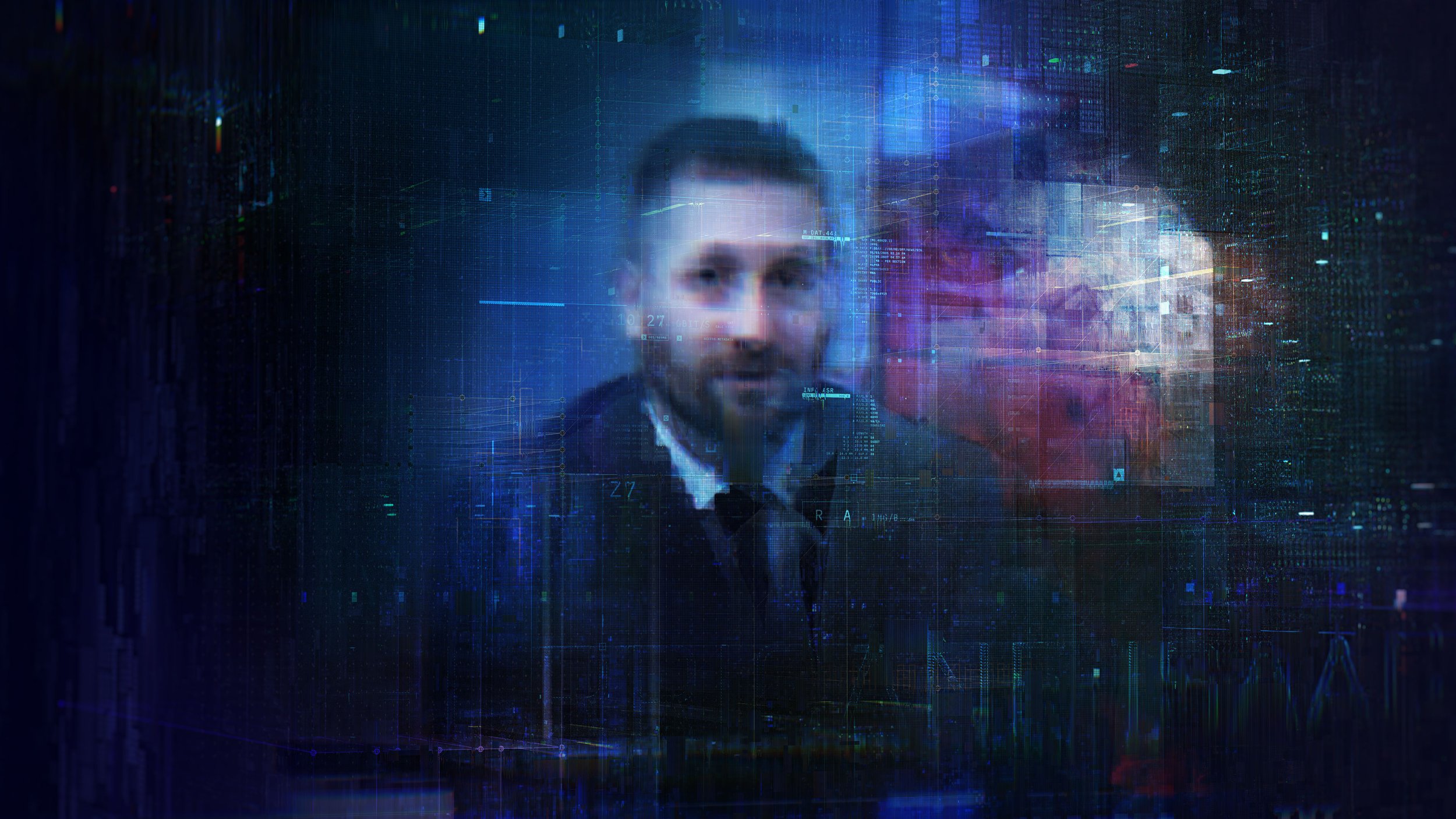
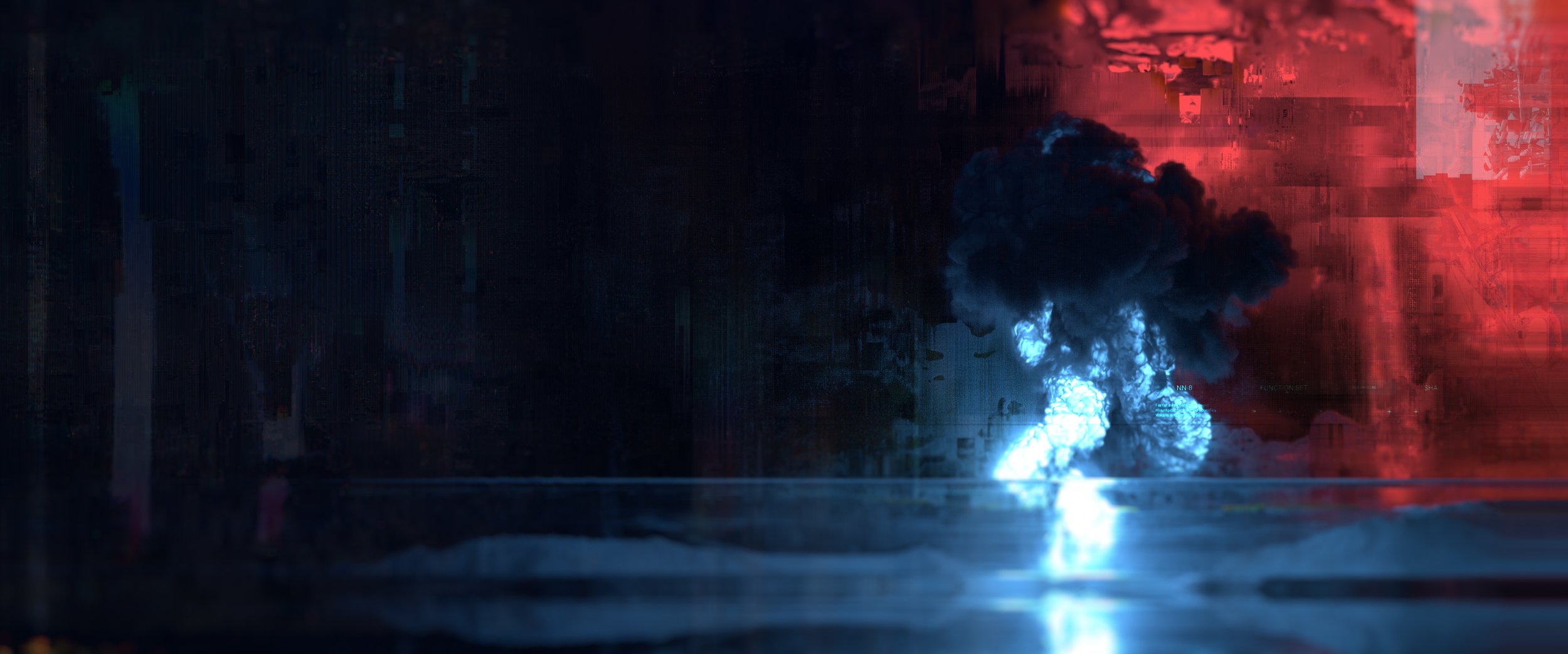
These frames represent our initial look-development. We wanted to avoid the typical visual story that is commonly associated with military interface and glitch graphics. We wanted a more analog finish, to imply that this glitch was captured in-camera.
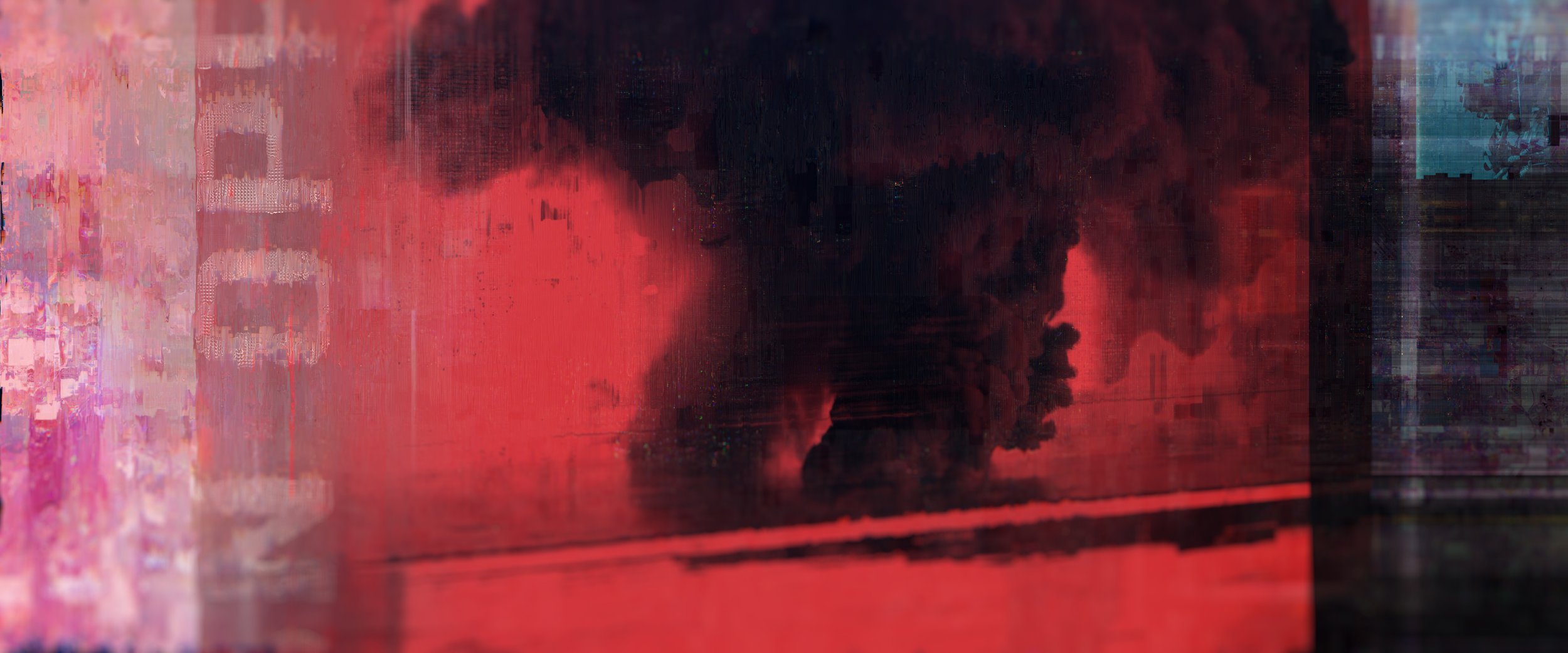
These early studies explored a visual language that was inspired by street art and graffiti, capturing the sense of geopolitical unrest and social revolution that was reflected in the narrative. We wanted our glitch art to feel more painterly and organic in nature, rather than cold and robotic.
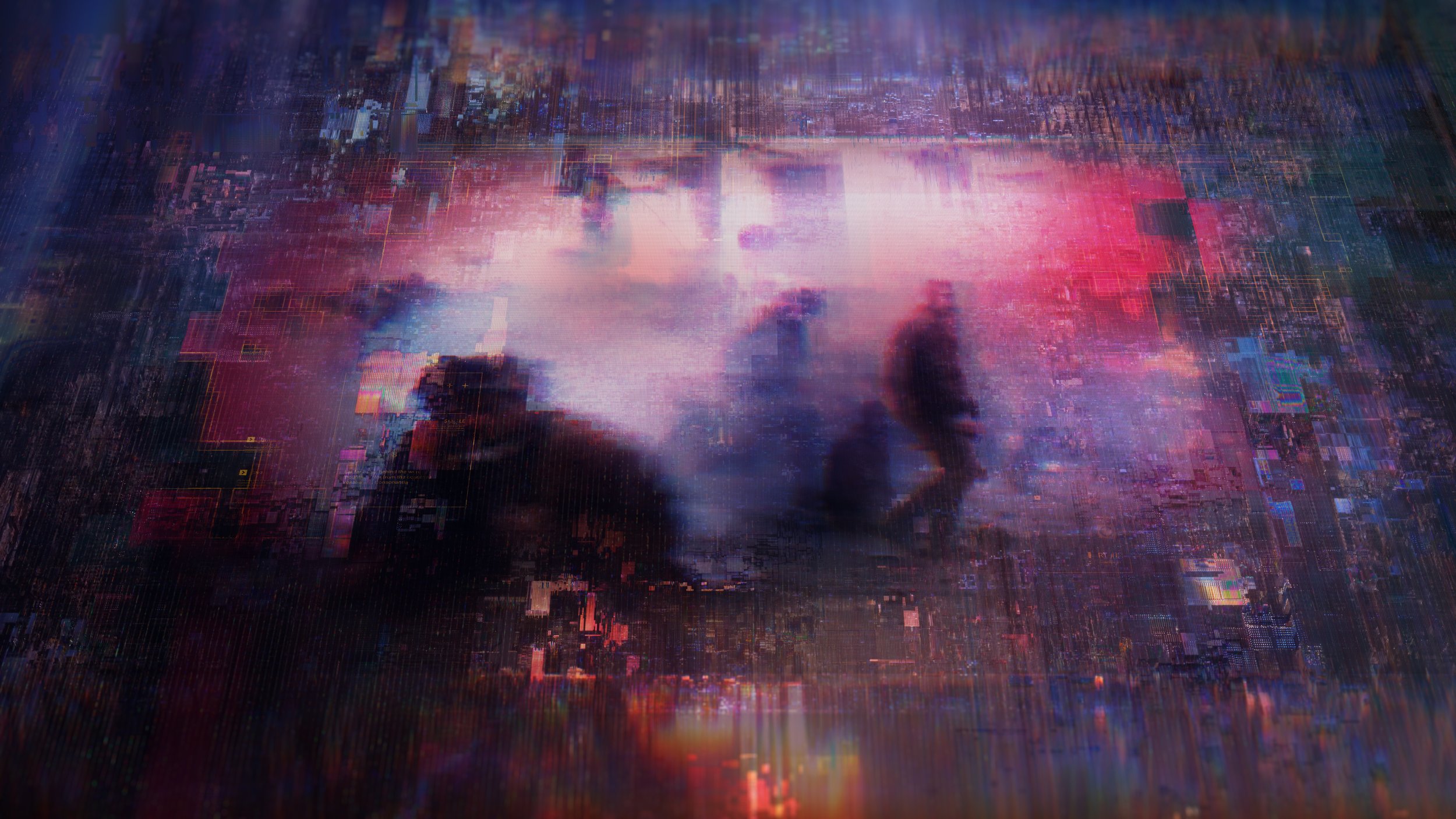
It was important for us to figure out how to make stock feel integrated and curated within our design story. Part of this was avoiding hard edge frames and floating rectangles, making content organically integrated into its surrounding digital environment.
CUSTOM INGREDIENTS
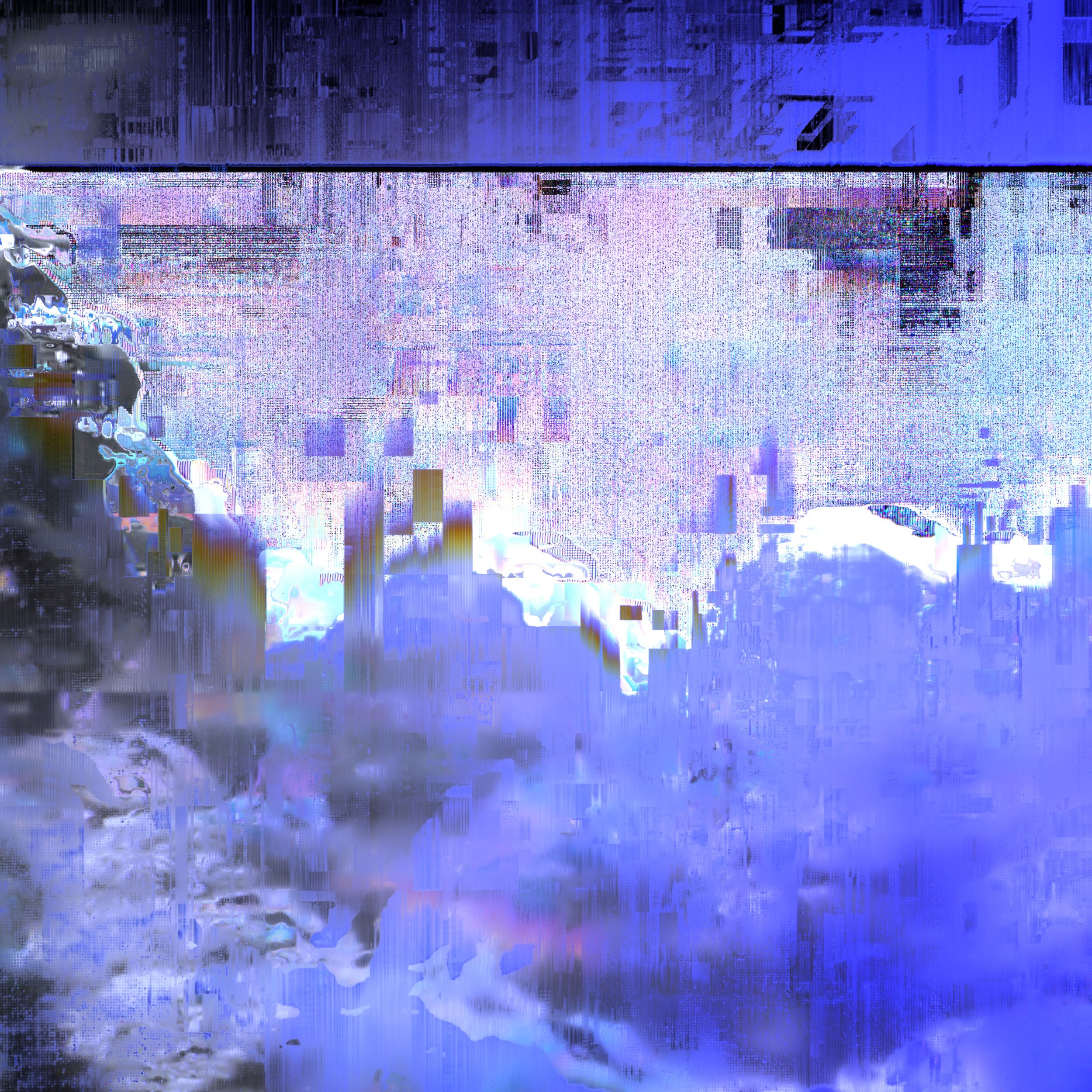
Whenever you’re creating glitch art, the resulting image is dictated by the method in which it is made as well as the assets going into the image. It was important for us to avoid using pre-made effects, presets, or assets that were not completely custom to establish a look that could be uniquely ours. To do this, we developed dozens of custom mattes and graphics to drive a variety of effects throughout the film.
APPLICATION TO CONTENT
Initially the film was conceptualized as a two-dimensional, editorial style film. Quickly, that evolved into an immense three-dimensional space, our network, which was populated by endless content that could carry our narrative.
With that thematic device in mind, it was important to develop content that was both stylistically appealing but that also could exist in a multi-dimensional environment. These are some early examples of how we tried to break the bounding box of the content, with the stock existing in space as a projected element.
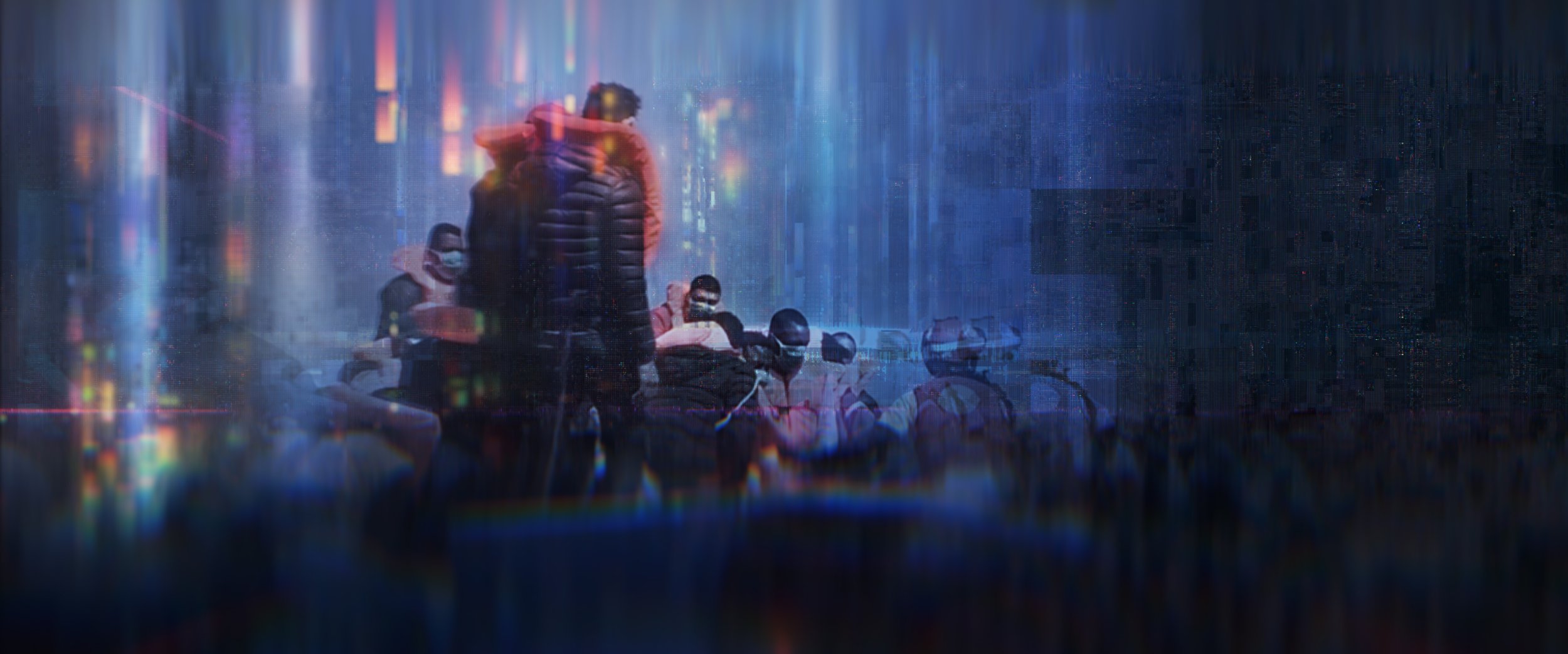
Early content explorations. Layering in custom textures and expanding the visual direction.
ITERATION + DISCOVERY
This set of frames moved us closer to our goal. We had the correct ingredients but the physical geometry was not working for how content would live in the larger network. It was successful for individual clips but did not hold together when we were trying to display hundreds or thousands of pieces of content in a larger environment. We also had issues with this approach accommodating multiple types of content, e.g. video, 3D models, and audio.
Visually, from this approach we carried on the incoming streams of data, the layered grids around the edges, and the way that the content organically merges with its surroundings.


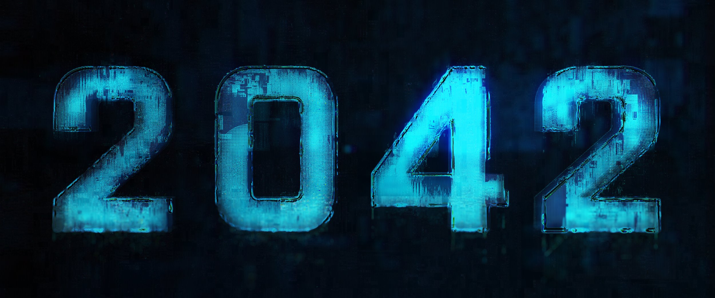
Working to develop the same look without 3D elements.
BLACK OUT
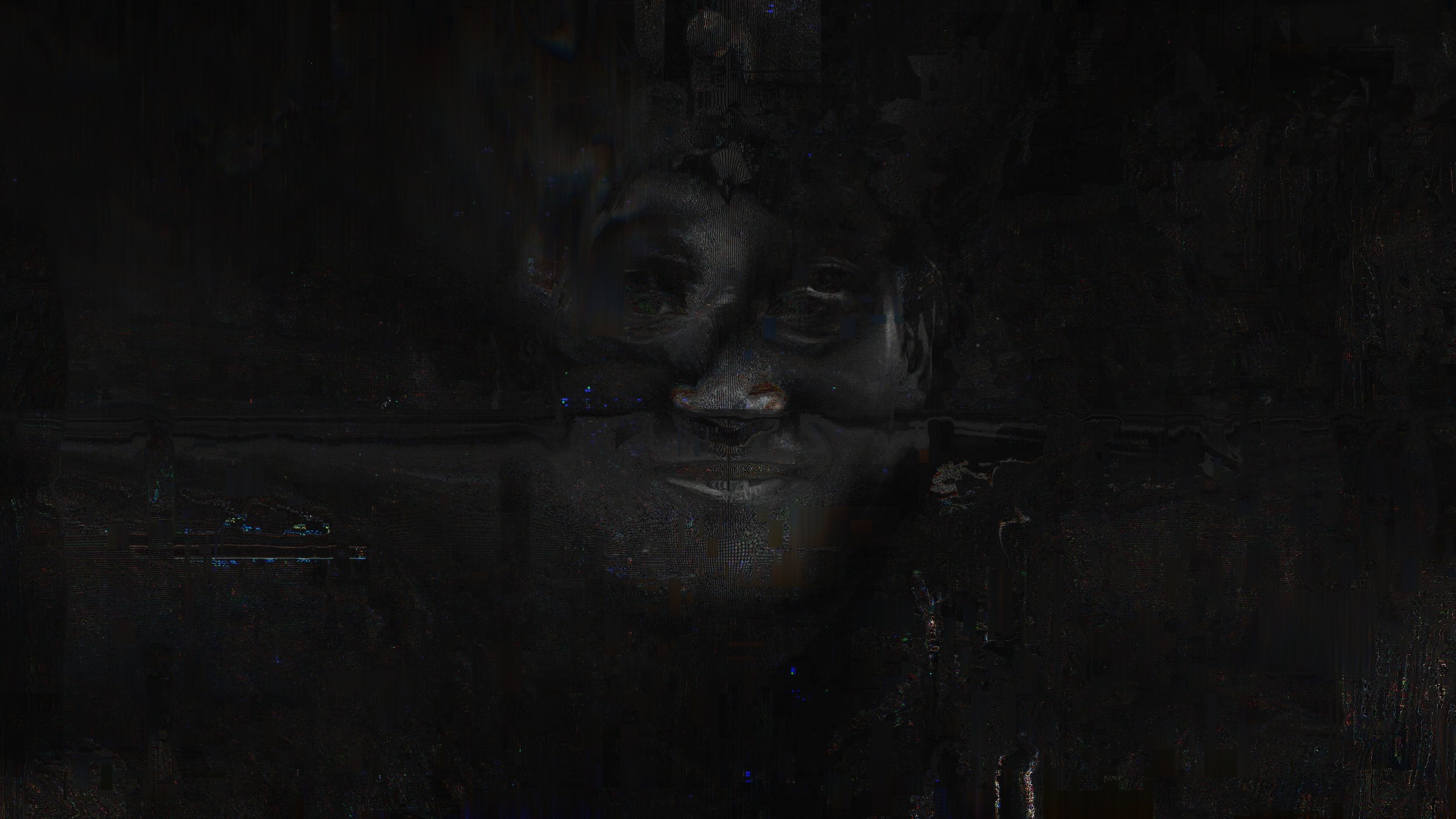
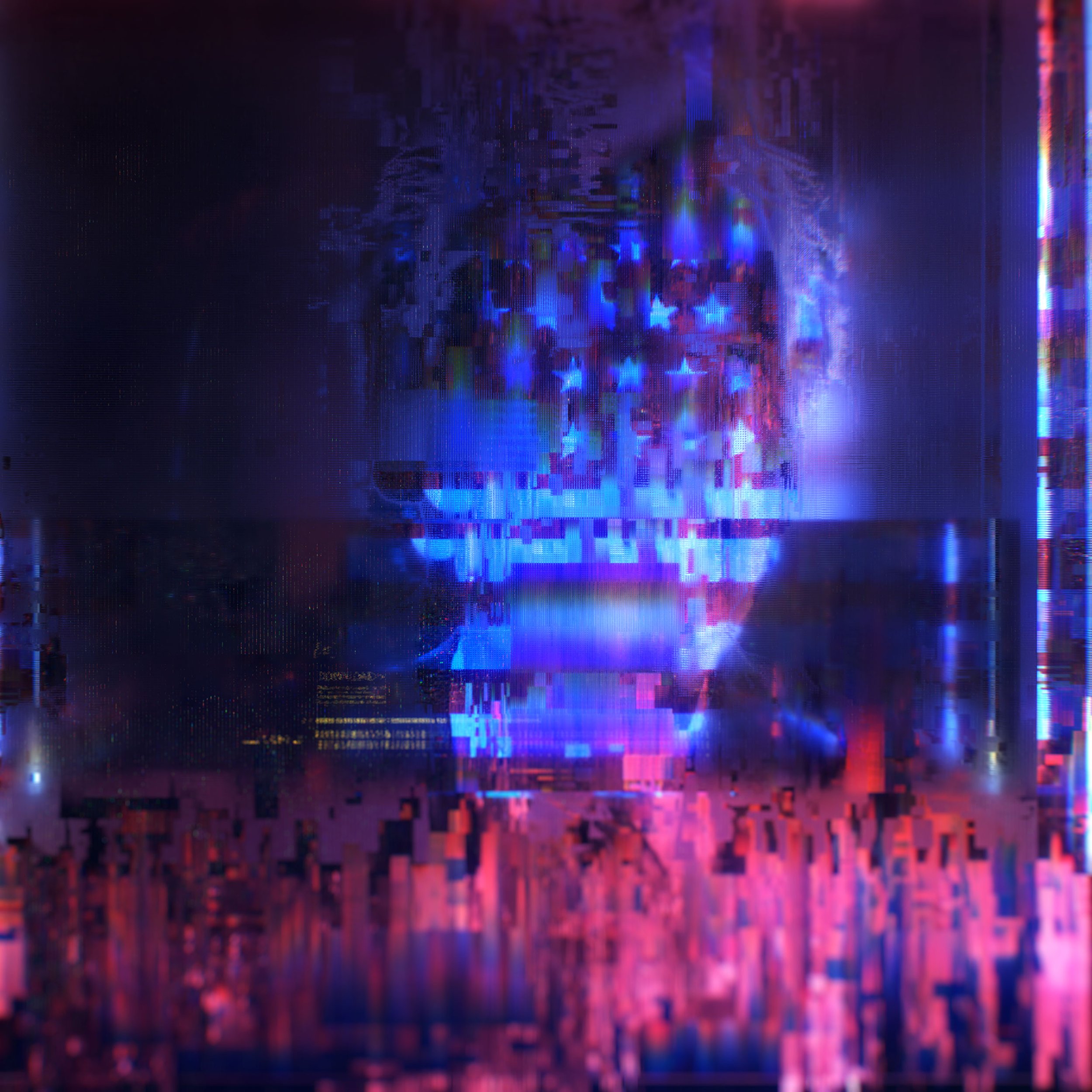
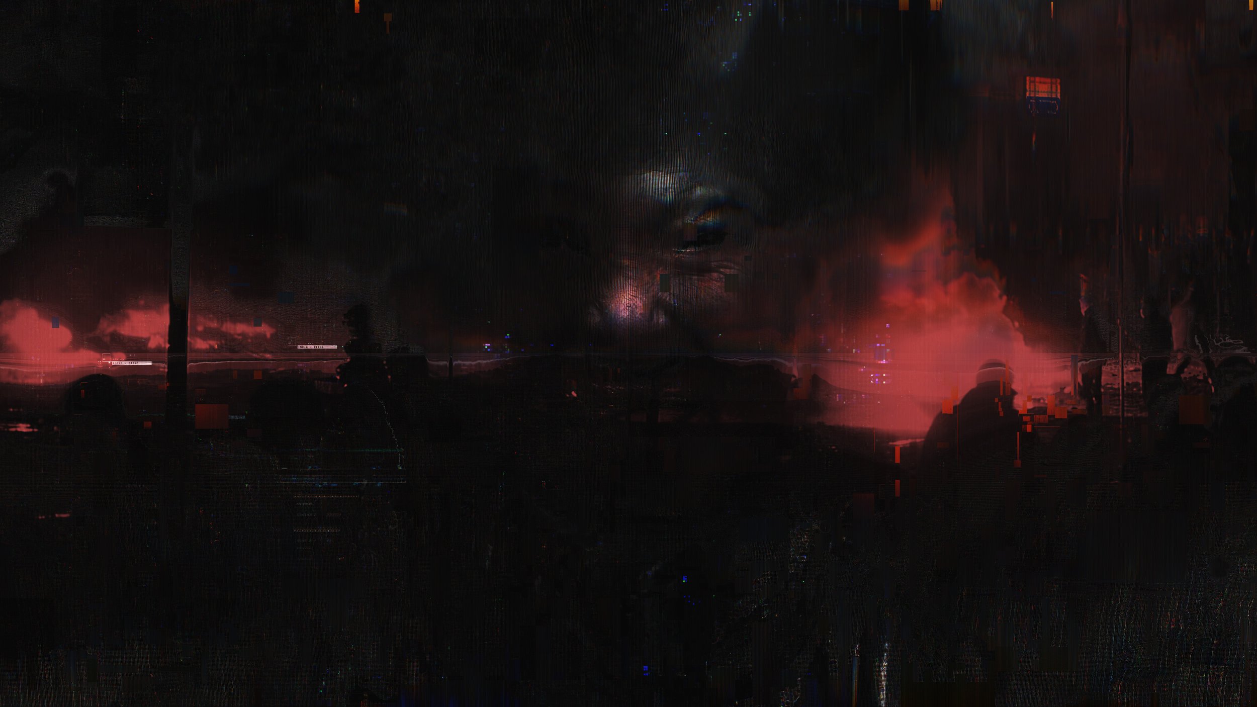
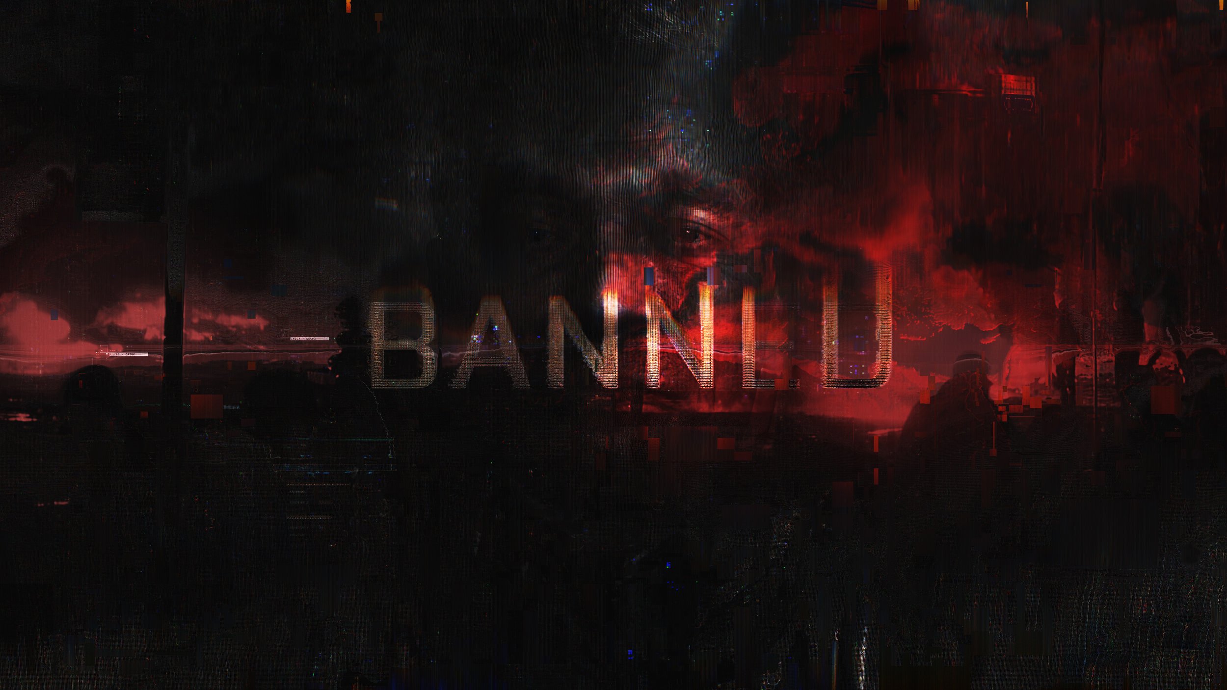
Early in the development of the blackout section, we explored the idea of having a camouflaged face deliver a broadcast from a No-Pat group. This would be an AI generated face and voice that would scramble in and out through the black static. As it spoke it would drift between different voices and faces, furthering the anonymity of the group behind the message. Typography and video footage would punch in through the static during key points in the broadcast. We ultimately tabled this idea, but not after thoroughly exploring the look for this approach.
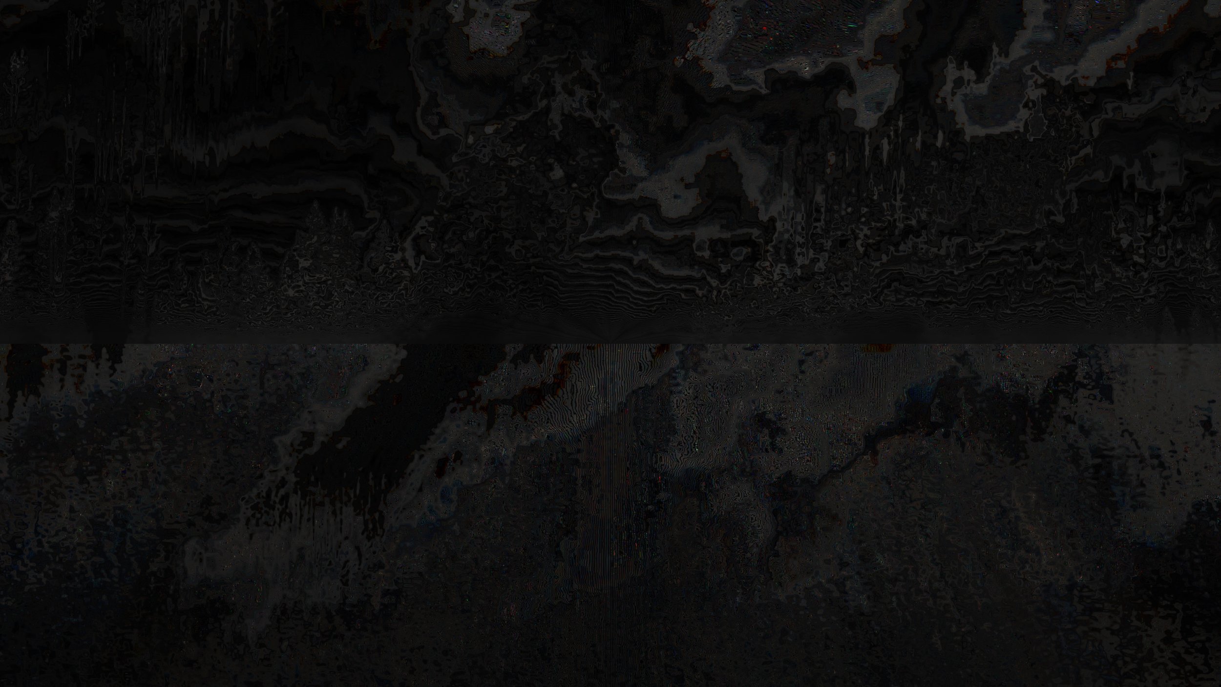
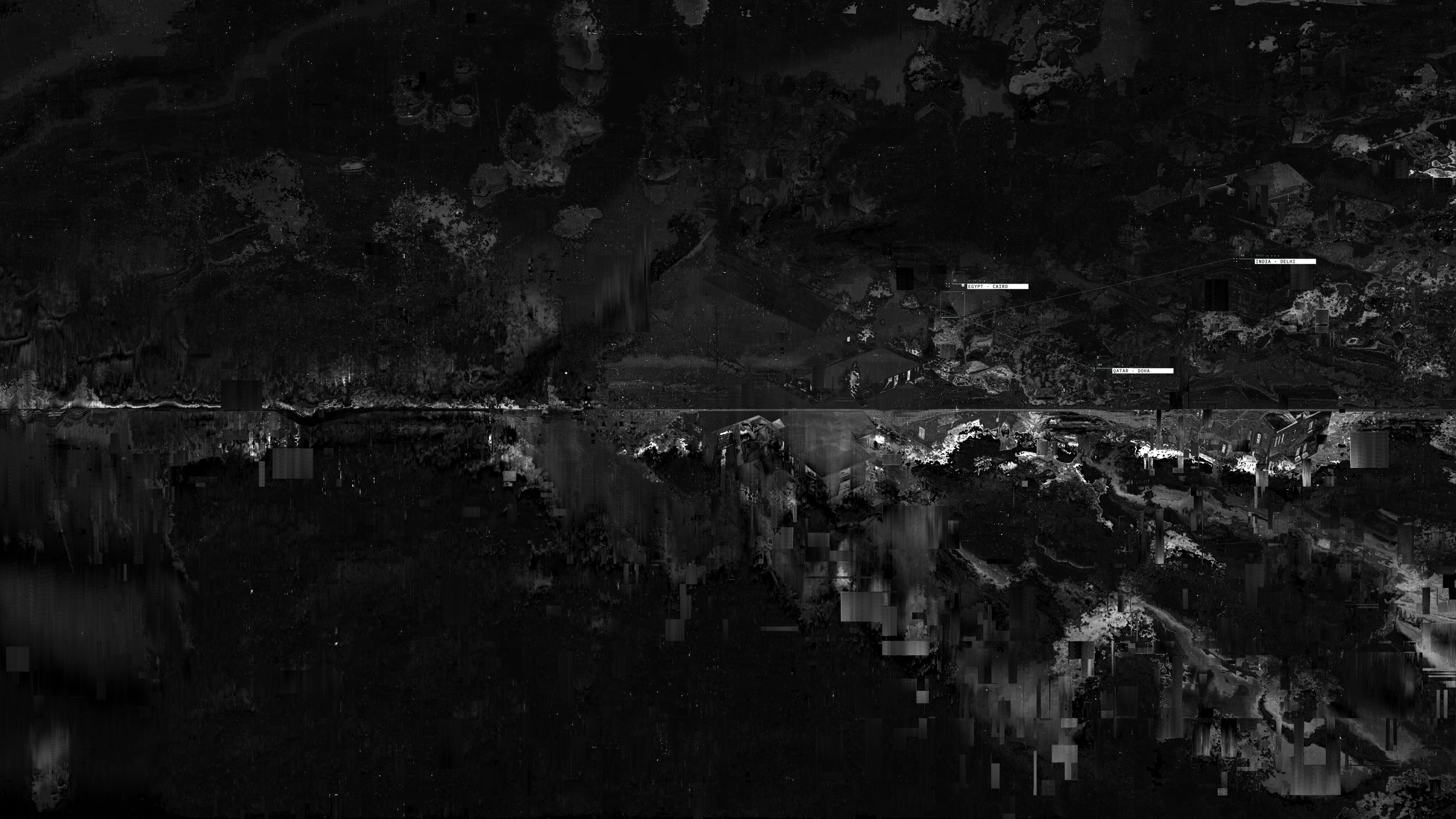
Glitch explorations.
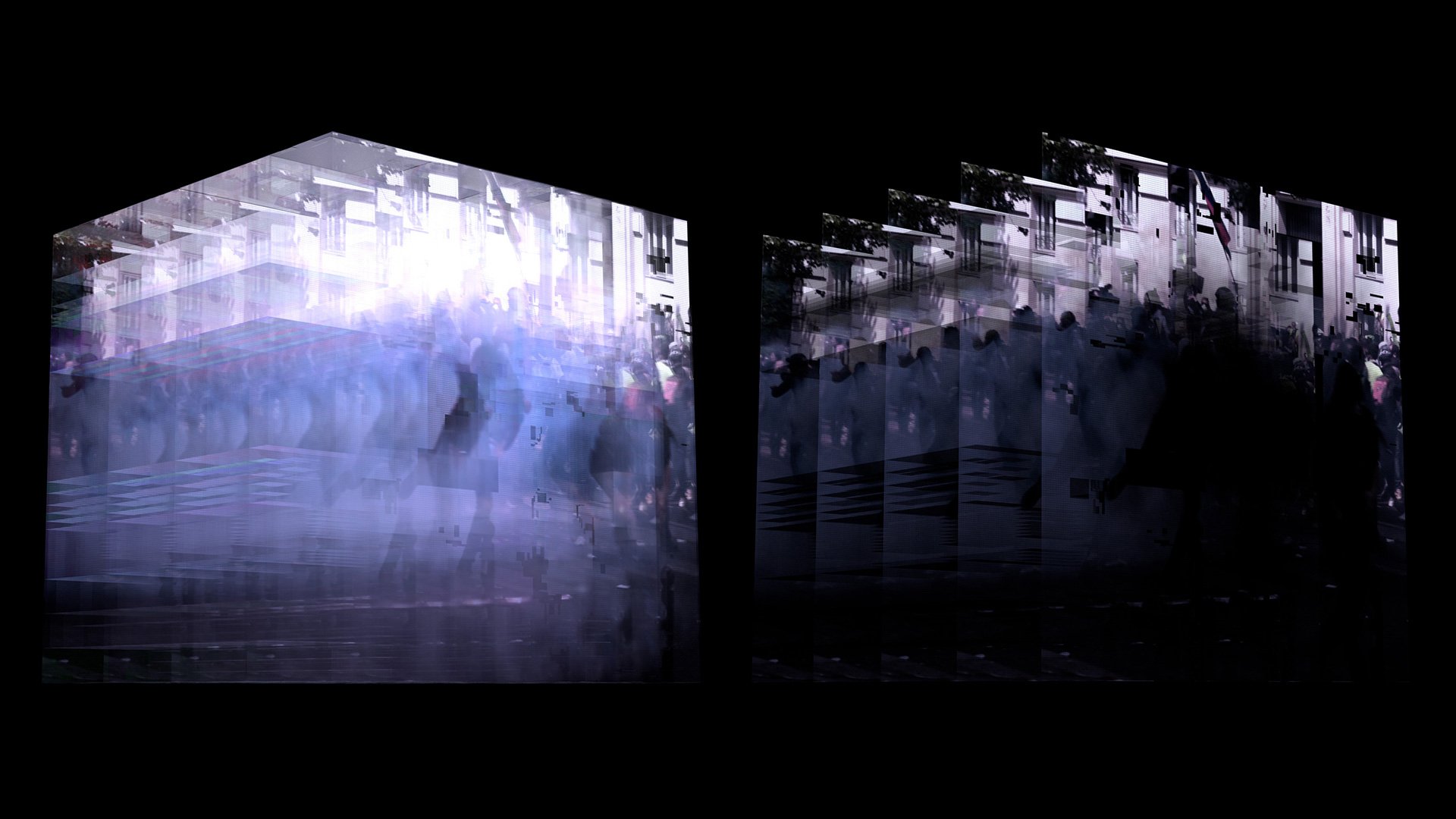
The projection method, which placed content directly on top of the network, never really found strong footing. We needed a solution that could both live in the network environment and exist independently as full screen content. While working on the design frames for the maps, we came up with the idea of using volumetric grids as holographic containers within the network. This would allow us to travel inside the grids, explore scenes more in-depth, and display a massive quantity of content in wider shots, including news articles, audio clips, and video content.
VOXELS
Early network look dev.
3D + holographic content.
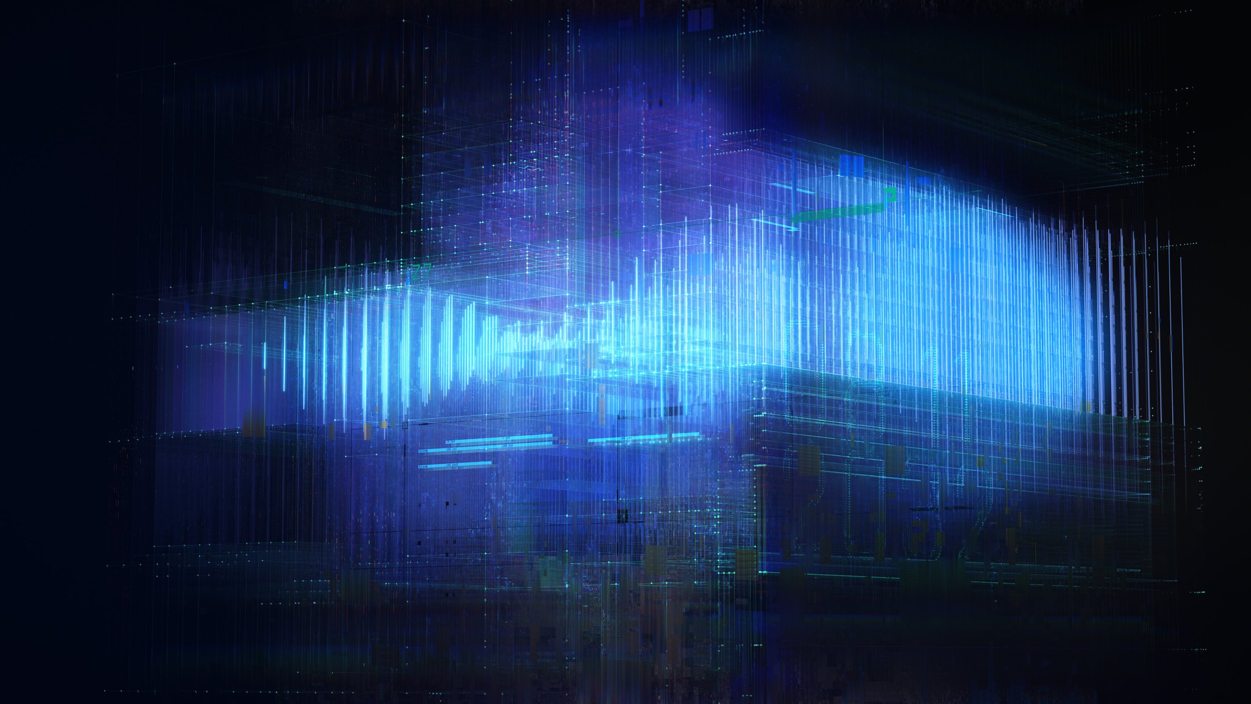
Below are the last round of styleframes, the culmination of all our exploration, that dictated the final look of the network. To see it in motion, check out the full film in Part 1.
Final look
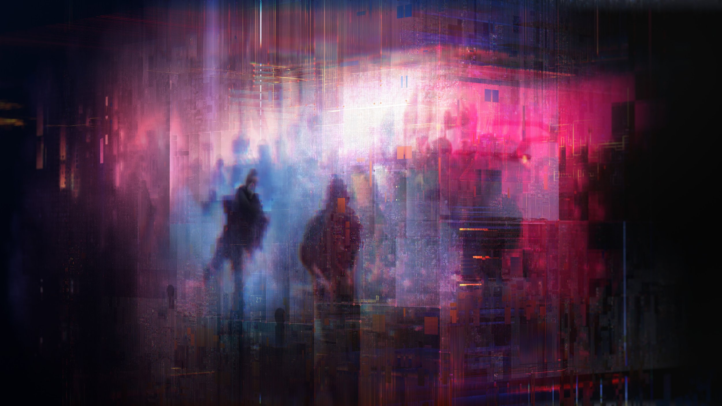
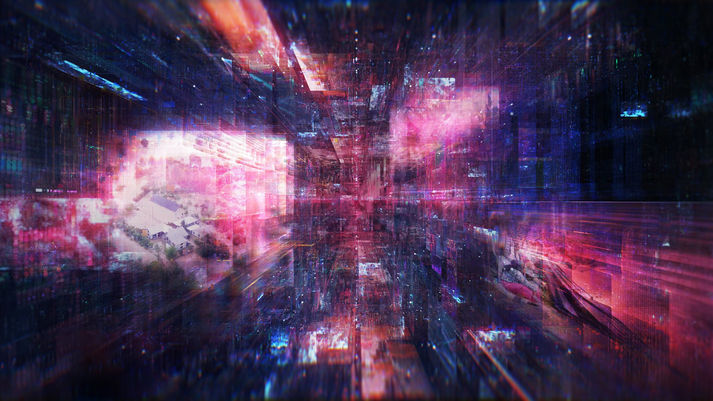
Testing the idea inside the WIP network designs.
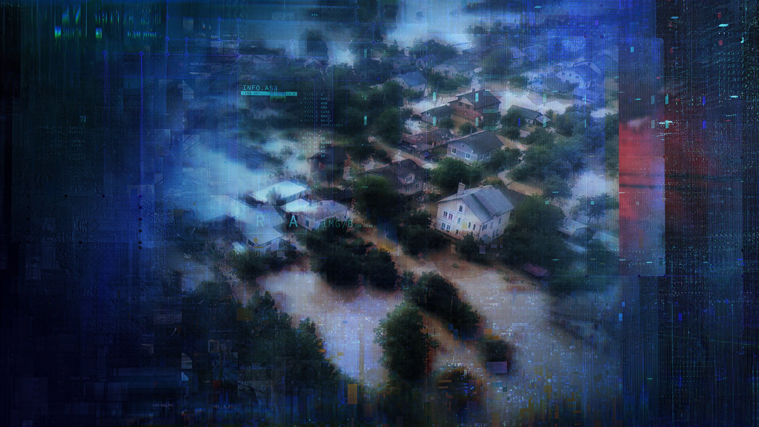
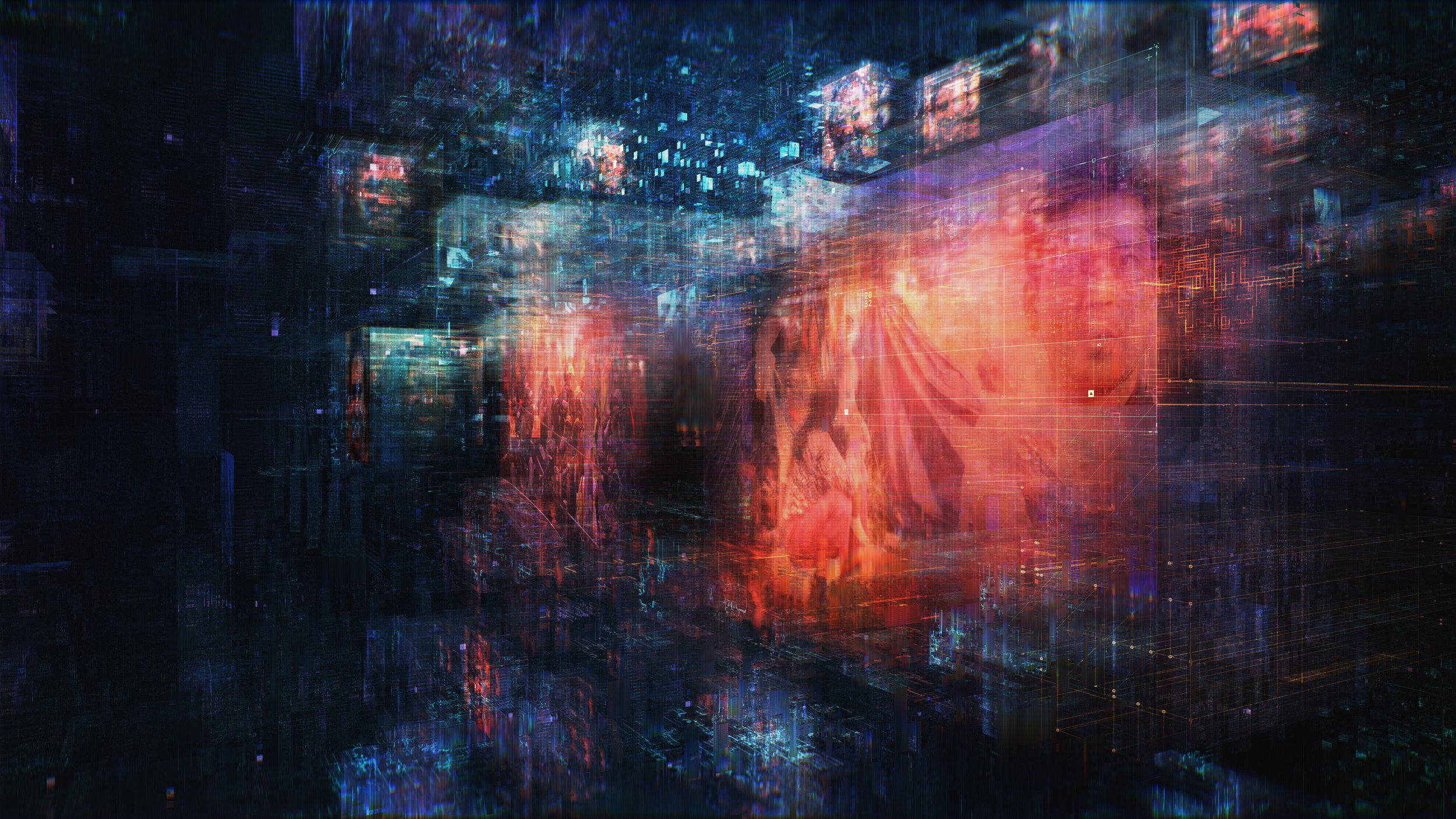

Voxel content in context of network.
Michael Rigley: ART DIRECTION + DESIGN, 2021
CREDITS | PRODUCTION
Client: Electronic Arts | DICE Stockholm | Criterion London
Production: Goodbye Kansas
Executive Producer: Anton Söderhäll
Producer: La-Râ Hinckeldeyn
Score: Hildur Guðnadóttir & Sam Slater
Sound Design: UHORT
Credits | GBK Graphics Team
CREDITS | MOTION GRAPHICS
Director: Will Adams
Art Director | Lead Design: Michael Rigley
Producer: La-Râ Hinckeldeyn
Lead UI Design: Steven Bussey
3D Animation: Michael Rigley, Will Adams
2D Animation: Michael Rigley, Guilherme Ferreirinha, Marcus Melin
UI Animation: Steven Bussey
Lead Glitch Animation: Guilherme Ferreirinha


